The right wedding program makes your ceremony feel complete. It also gives guests a smooth, stylish path through every moment.
Even small details can turn a simple booklet into something people remember for years. You can make it match your venue, your values, and your favorite personal touches.
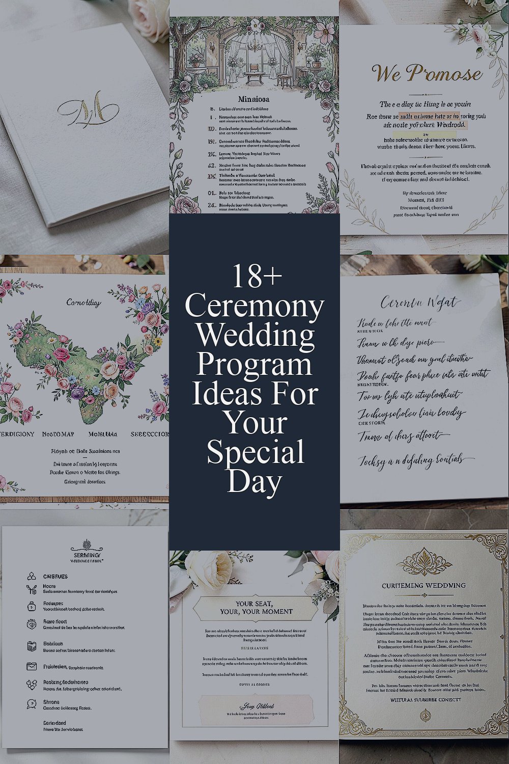
1. Monogram-First Program With a Soft-Texture Cover
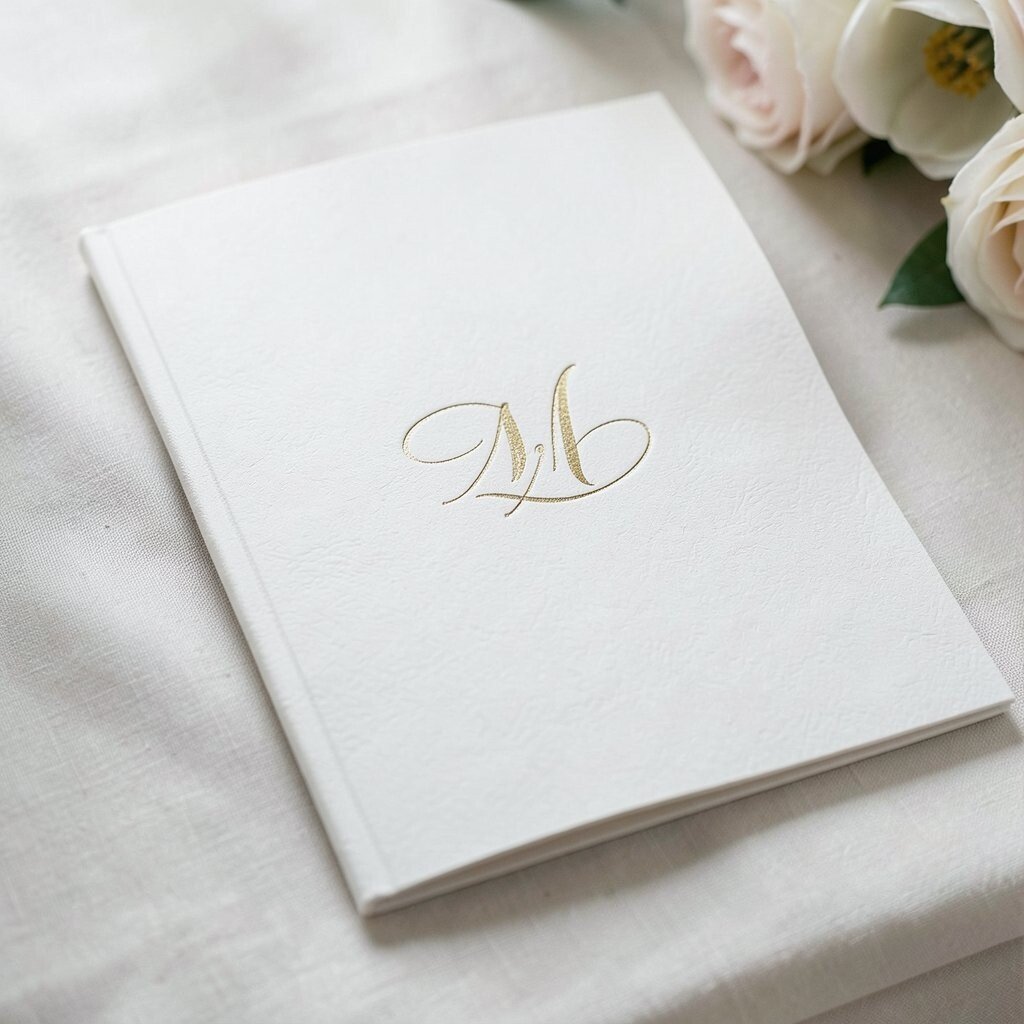
Start with a clean monogram on the front, like an elegant stamp on a keepsake. Choose a cover paper that feels slightly textured, so guests want to hold it for a little longer.
For the inside pages, keep the layout roomy and easy to read. This design looks modern, helps everyone find their place, and adds a quiet luxury without feeling too fancy.
2. Illustrated Timeline Cover That Matches Your Venue
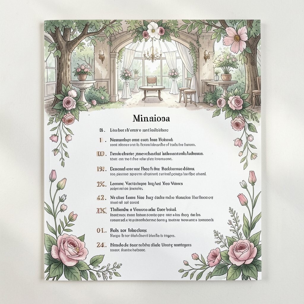
Use a simple illustration on the cover that mirrors your ceremony space, such as a garden gate, a church arch, or a lakeside horizon. A line-art style keeps it timeless and avoids looking overly themed.
Guests will instantly recognize what you planned, and the program feels more like part of your story. When you include a gentle timeline of the ceremony beats, people stay calm and oriented from start to finish.
To keep costs under control, ask a local designer to create one custom illustration and reuse it on the cover, schedule page, and even a small corner logo.
3. “We Promise” Vows Page With Highlighted Words
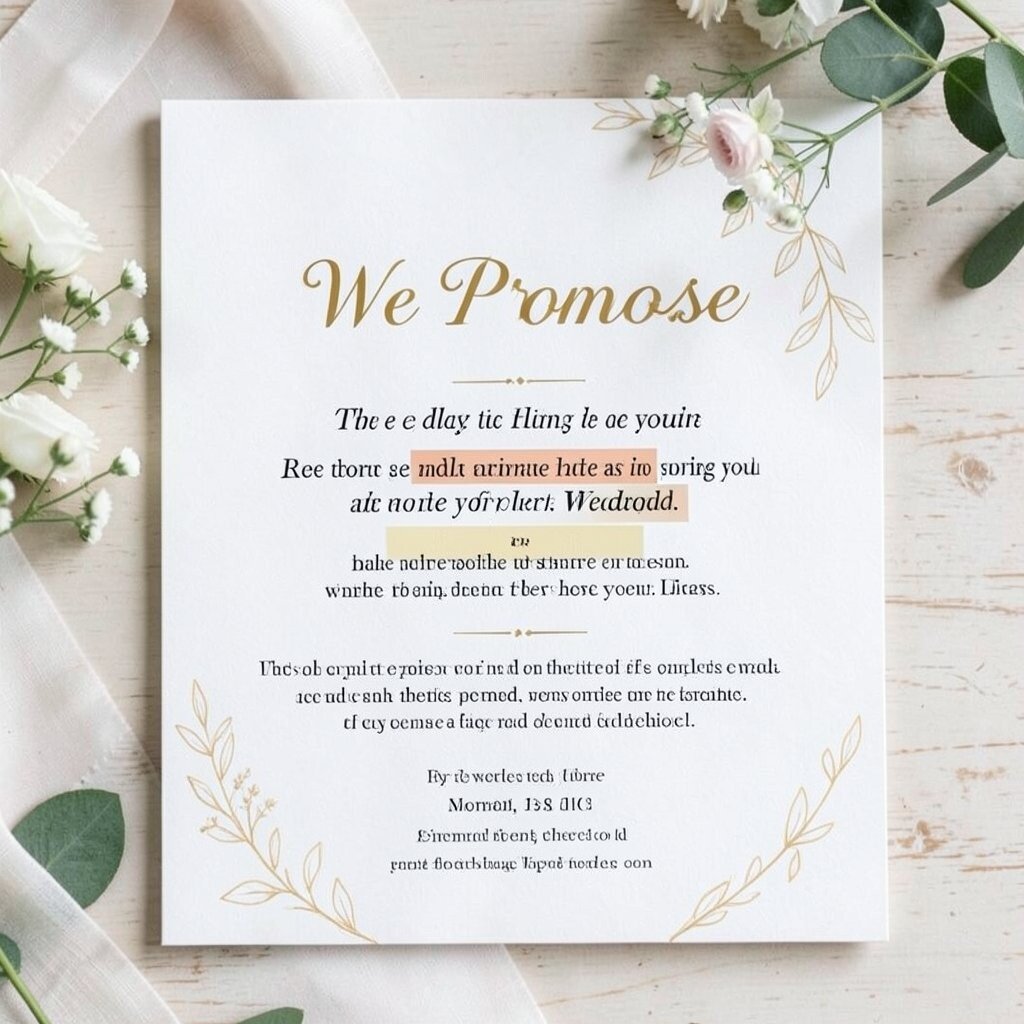
Print your vows on a dedicated page, then emphasize a few meaningful phrases using bold type. Seeing your words in print makes them feel real, even for guests who don’t hear every line.
This approach also helps family members follow along during quieter moments. Keep the font readable and avoid cramming too many lines, because comfort matters during a ceremony.
Personalize by adding a tiny note in your own voice near the vows, such as why those promises matter to you. For trends, this “quote-style” layout is popular because it turns the program into a keepsake, not just a schedule.
4. Mini Flower Map for People Sitting in Sections
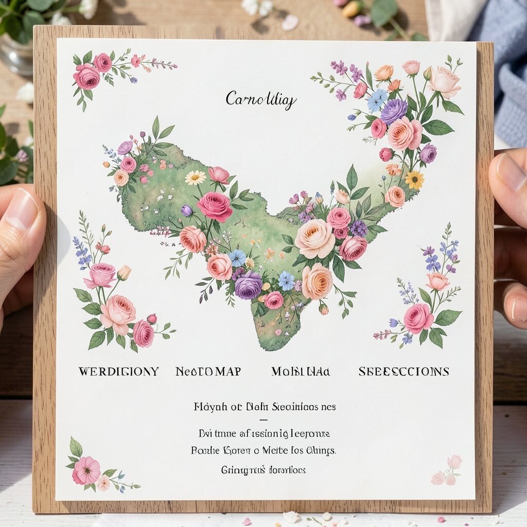
Create a program that includes a small seating map using flower icons that match your decor. For instance, daisies for the front rows and roses for the back sections can guide guests without adding stress.
When guests can locate their seats quickly, the ceremony flow feels smoother and everyone starts in a relaxed mood. This also helps you welcome older relatives or out-of-town guests who may not know the layout.
5. Photo Strip That Captures the Month Leading Up
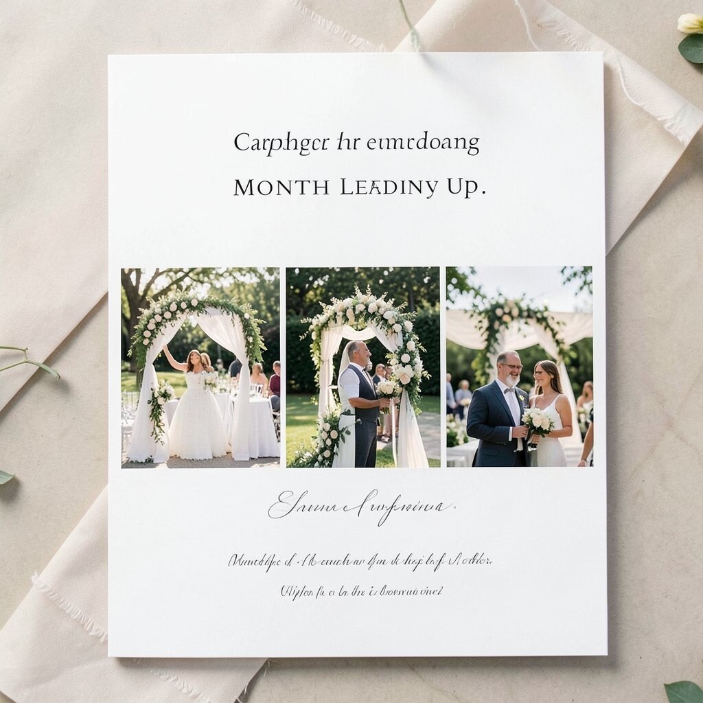
Use a narrow photo strip at the top of the program featuring moments from your engagement month. Think coffee dates, dress fittings, a bouquet test, or a quick sunset shot.
This makes the program feel warm and personal, like it belongs only to you. It also supports a current trend of “small story” design that feels candid rather than staged.
To manage cost, print fewer photos in one long strip and reuse the same images for any matching signage you already plan to print.
6. Calligraphy-Style Script for Ceremony Order
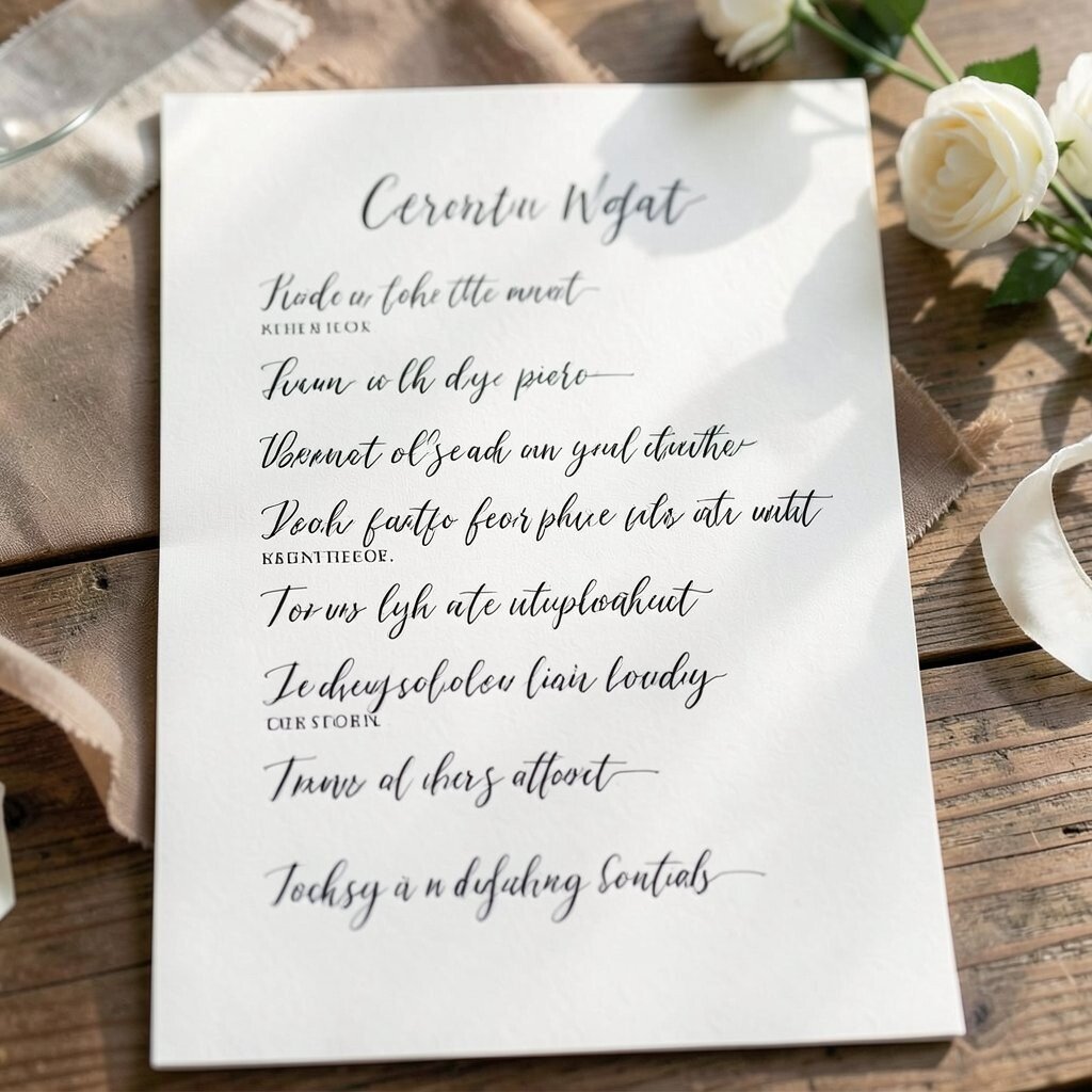
Choose a script font for the ceremony order headings, then pair it with a simple print font for the actual lines. When the text looks like handwritten calligraphy, the program feels romantic and gentle.
Guests benefit because the headings stand out, helping them move through the ceremony steps without confusion. Keep the contrast strong, and avoid tiny sizes so everyone can read comfortably from a few rows away.
Personalize by writing one short sentence in your calligraphy style, like the reason you chose your wedding date or what you’re most excited to share.
7. Icons-Only Program for a Clean, Modern Look
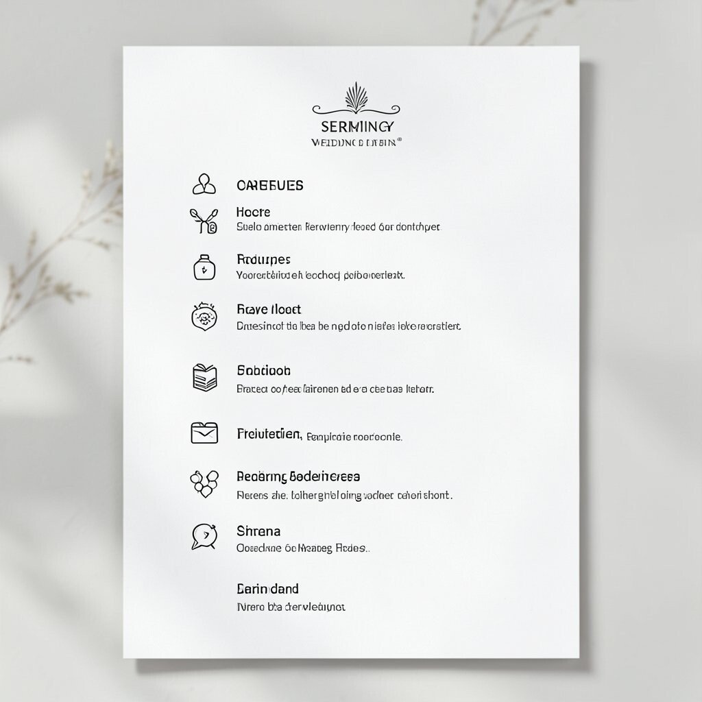
Design your ceremony schedule using icons instead of heavy paragraphs, such as a ring for vows, a candle for unity, and a heart for readings. This style looks sleek and works especially well for minimalist venues.
It’s also a practical choice for guests who want quick guidance without scanning lots of text. You can keep every page balanced by limiting the number of icons and spacing them with care.
8. “Your Seat, Your Moment” Page With Cozy Labels
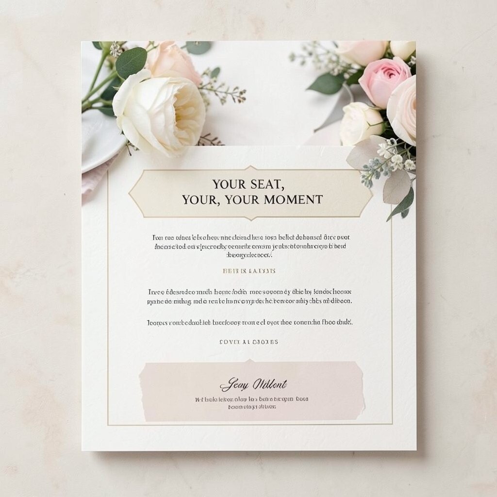
Write a short message that connects the ceremony moments to where people will be sitting. For example, mention how the first reading pairs with a certain aisle, or that the music will feel different from the front.
This makes the program feel like a thoughtful guide, not a formality. It also lets you personalize in a gentle way by speaking directly to guests with your tone and personality.
Keep it simple and friendly, and remember that reading should feel effortless. If your family likes humor, a warm smile line can make the page feel even more inviting.
9. Cultural Symbols Page With Meaningful Context
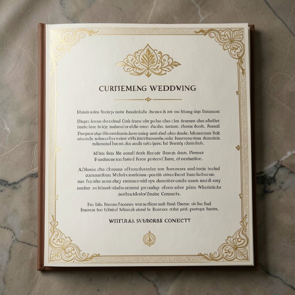
If you have cultural traditions, include a page that briefly explains the symbols used in your ceremony. Use simple language and focus on why each part matters, so guests feel included.
This adds depth and uniqueness without overloading the program with long history lessons. Guests will enjoy learning during a calm moment, and you’ll honor your roots at the same time.
10. Rehearsal Night Highlights as a Keepsake Add-On
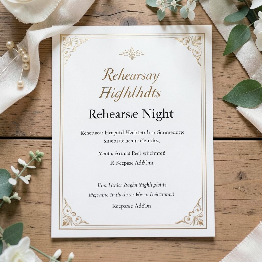
Add a mini section that shares your rehearsal night highlights, such as who read where, the first look practice, or a group photo. Even one or two pictures can make the program feel like a complete journey.
This kind of keepsake stands out because it shows more than the ceremony day. It’s also a fun, modern trend that couples love because it documents the behind-the-scenes moments.
To save money, keep the add-on to one small page and use the same printing size as the rest of your booklet.
11. Seating Etiquette Page With Gentle, Clear Reminders
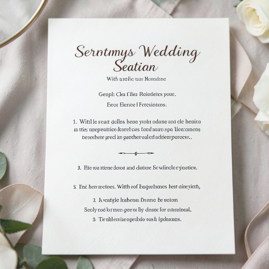
Include a small page that reminds guests about quiet moments, when to silence phones, and how to follow the order. Use kind wording so it feels supportive, not bossy.
This makes the ceremony smoother and helps guests avoid distractions without you having to repeat yourself. It also protects your favorite parts, like vows and readings, from unexpected interruptions.
If you want it to feel current, match the tone to your design, such as a soft serif font for a classic vibe or a bold modern font for a lively celebration.
12. Local Spot Map With a “How to Feel at Home” Section
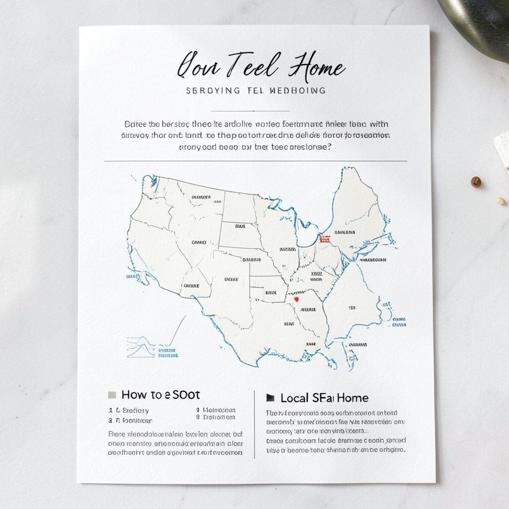
Print a simple map that highlights nearby landmarks like a park entrance, a coffee stop, or a favorite photo spot. Then add a short note that encourages guests to explore and feel at ease.
This is a lovely personalization idea that makes your wedding feel connected to the area. Guests often enjoy it because it helps them plan small breaks without asking lots of questions.
13. Heritage Menu Pairing With Ceremony Moments
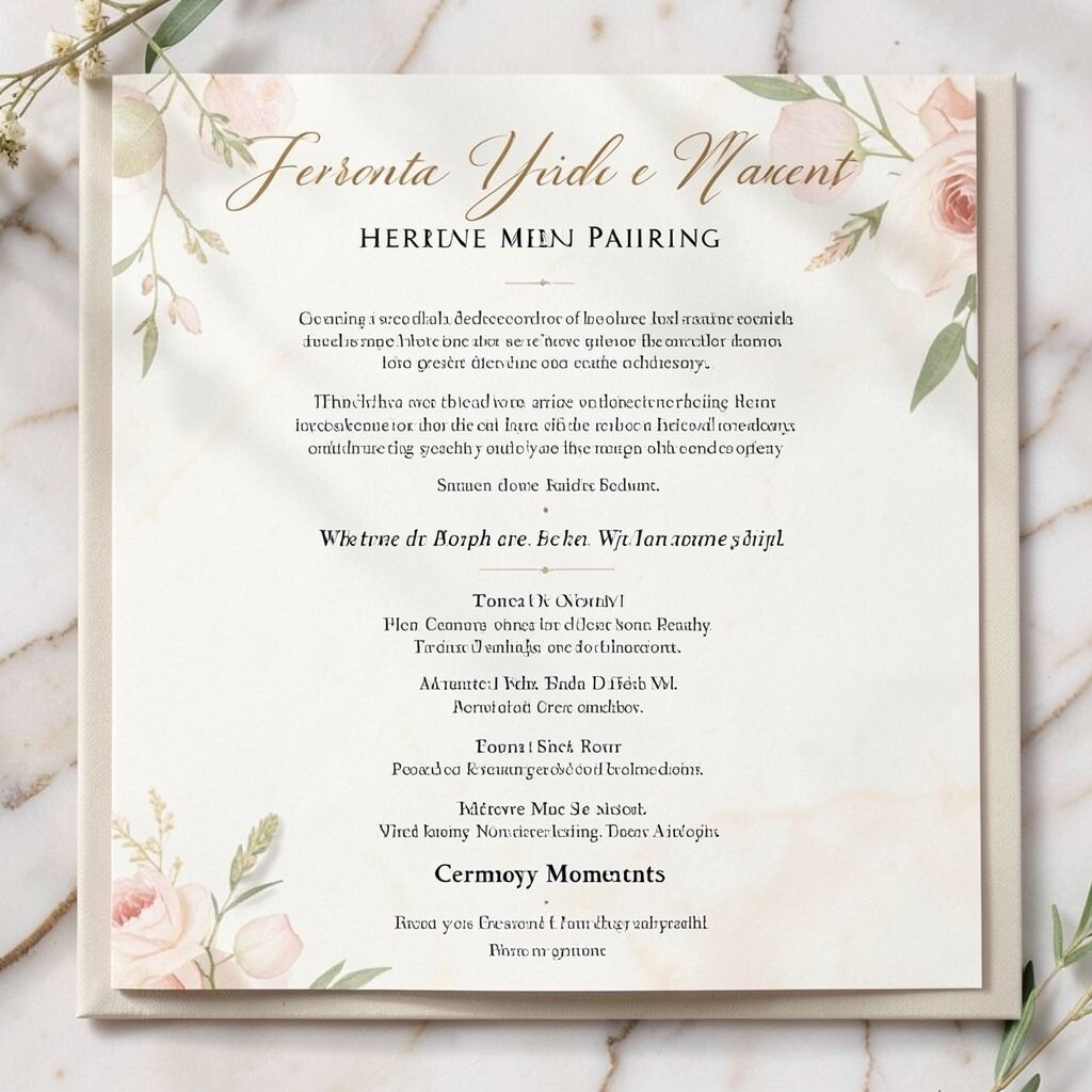
If you’re offering a reception with specific dishes, pair a few menu items to ceremony moments, such as breakfast-style favorites for morning vows or dinner classics for evening celebrations. It’s a creative way to build anticipation.
This program idea stands out because it connects the ceremony to what comes next, making guests curious in a good way. It can also help you communicate the vibe of the day without needing extra signage.
For cost considerations, keep the menu list short and focus on signature items only, especially if you’ll also print a full menu at the reception.
14. Unity Candle Page With a Clear Setup Timeline
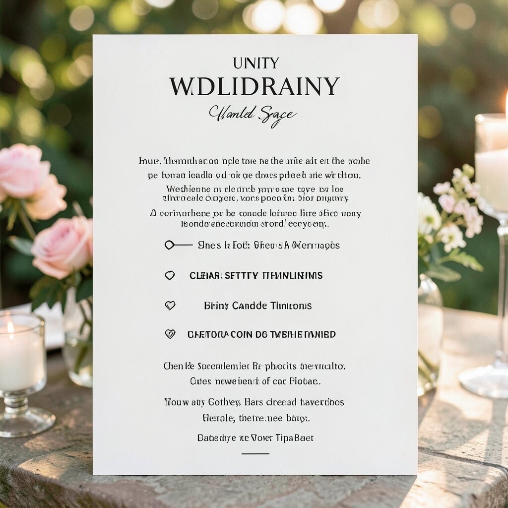
Dedicate one page to the unity candle moment, including a simple timeline of who lights what and when. Visual clarity reduces confusion, especially if you have multiple participants.
Guests benefit because they know what they’re seeing, and that makes the moment feel more meaningful. This page also feels practical for officiants and helpers who want everything to run smoothly.
To personalize, add a line that explains the symbolism in your own words, such as how your light feels like home. Keep the writing short so it reads easily during the ceremony.
15. Glitter-Free Gold Foil Look Using Warm Print Techniques
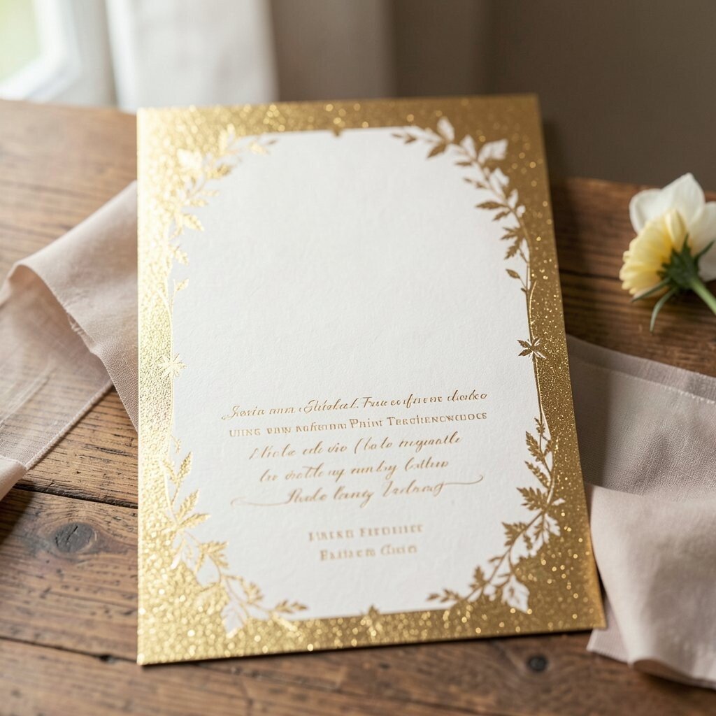
If you love the gold-foil look but want a more budget-friendly plan, use warm-toned inks and high-contrast typography. The result can feel elegant and expensive without the heavy printing cost.
This benefits both your style and your practicality, since ink coverage choices can reduce printing surprises. It’s also a current trend to mimic luxury textures with smart typography and color palettes.
Personalize by selecting your accent color based on your bouquet tones, such as blush, sage, or deep berry. The program will match your florals without demanding extra decor.
16. “Reading by Reading” Page With Guest-Friendly Summaries
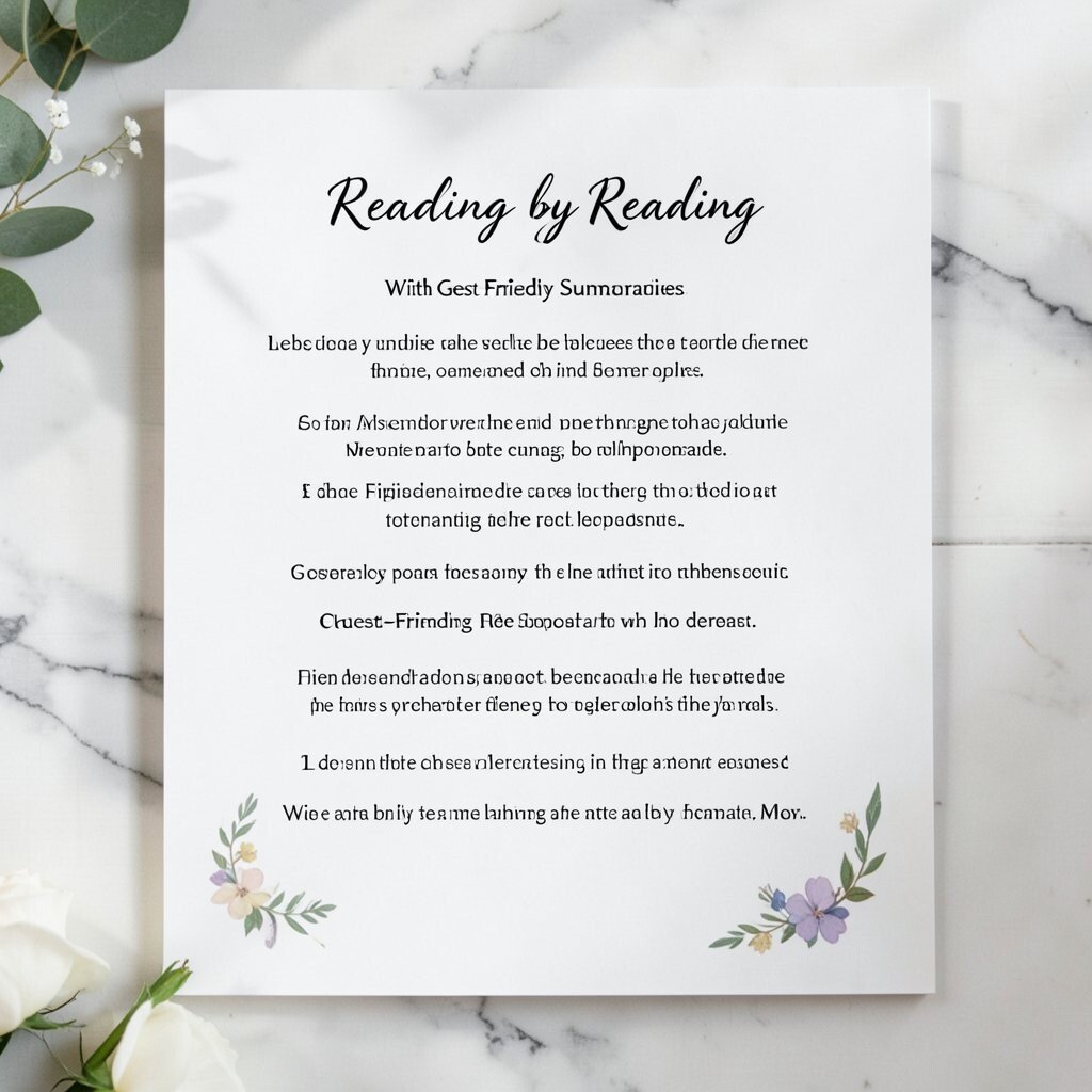
For each reading, add a short summary sentence that tells guests what to listen for. You don’t have to explain everything, just guide attention so the meaning lands.
This helps guests feel included, especially if they’re unfamiliar with the text. It’s also a uniqueness boost because many programs only list titles, while yours adds context.
17. Interactive QR Code Page for Spotify Processional Playlists
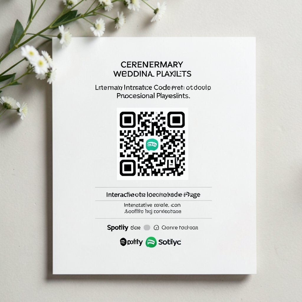
Include a page with QR codes that link to the songs used during your ceremony, like the processional and recessional. Guests can hear the music again later, which turns your program into a lasting digital memory.
This idea is trendy because couples want shared experiences that continue after the last photo. For practical use, make sure the QR codes are large and tested on different phones.
To keep things cost-aware, use QR links instead of adding extra printed pages, and keep the program design consistent so it doesn’t look cluttered.
18. Matching Program and Vow Booklet With a Seamless Design
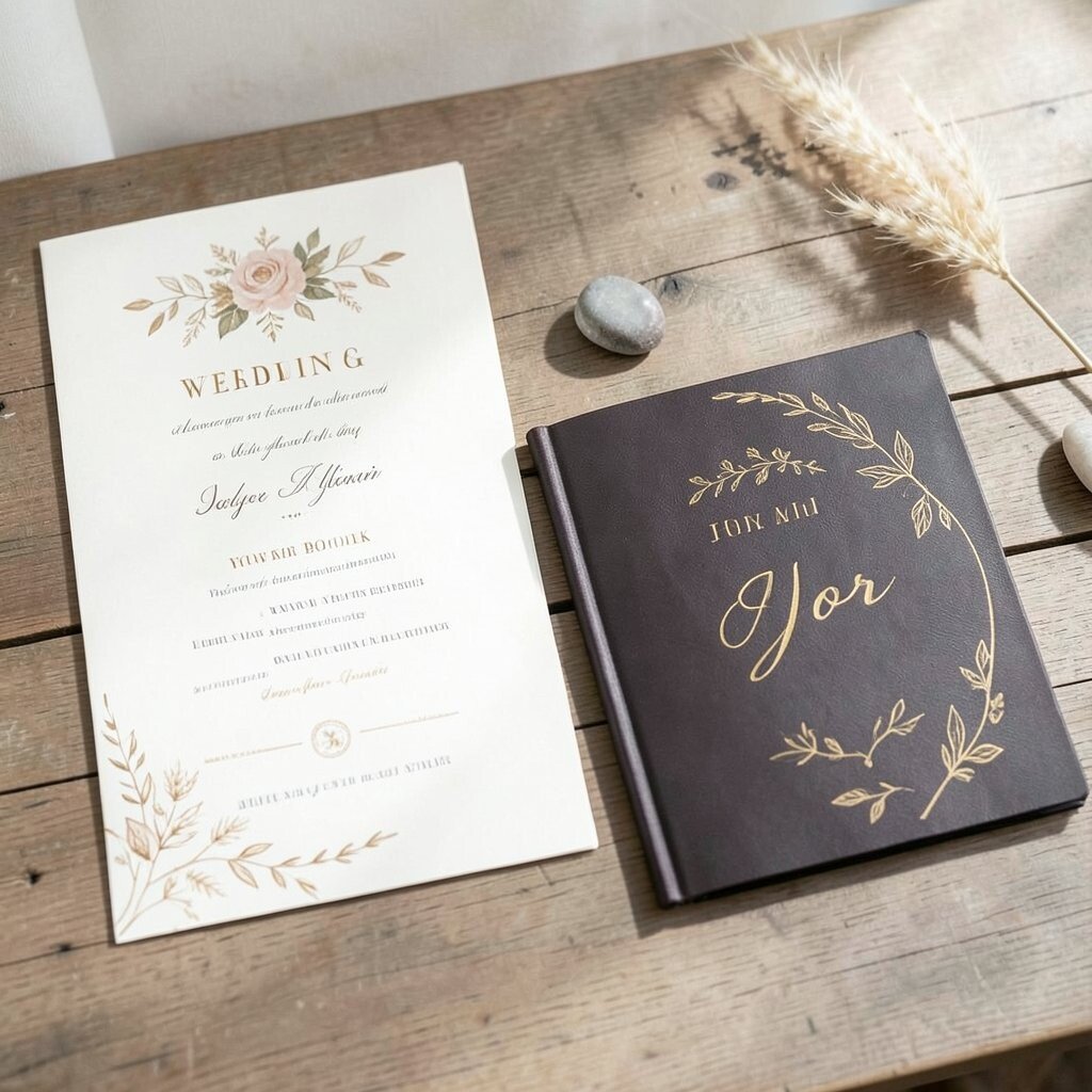
Create a matching set where the ceremony program and your vow booklet share the same cover style and color accents. This makes everything feel intentional, like it came from one design mind.
Guests benefit because they can keep one item for the ceremony schedule and hold another for your printed vows. It’s also a personalization opportunity, since you can tailor each booklet’s page count based on what your ceremony includes.
Consider costs by printing the vow booklet on a slightly heavier paper while keeping the schedule pages lighter. The pair will feel premium without requiring premium prices across everything.
19. Outdoor Wind-Ready Program With Ribbon Bookmark and Pocket Holder
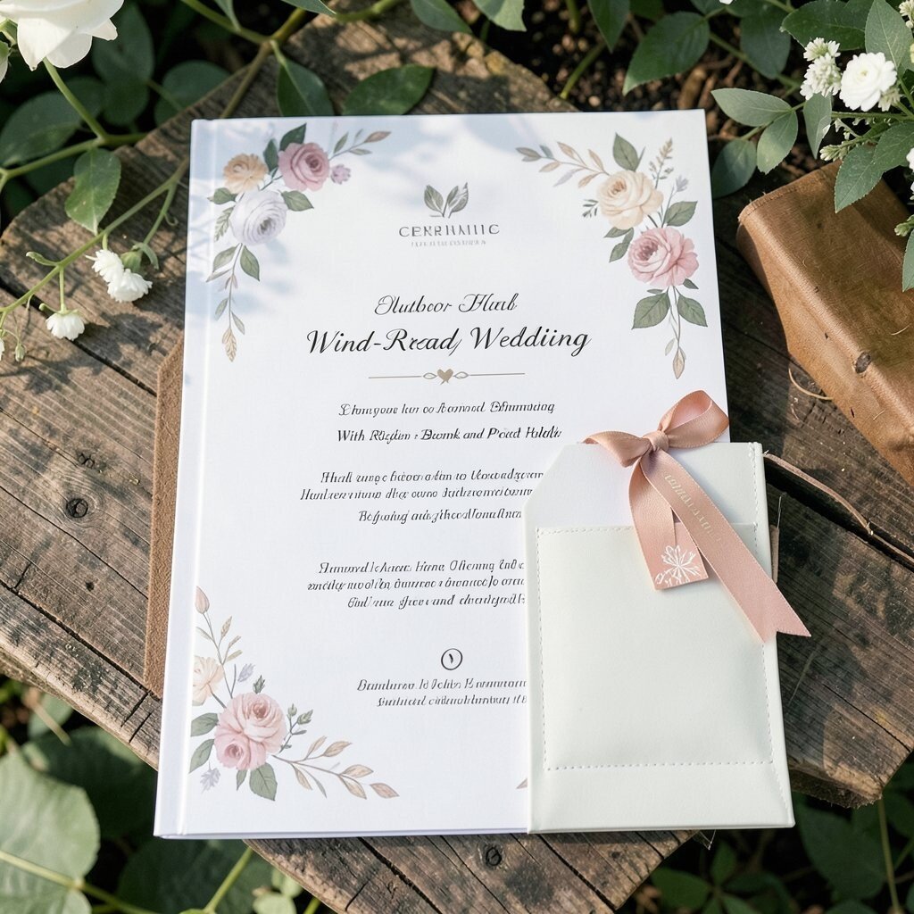
For outdoor ceremonies, choose a design that stays neat in the breeze by using a thicker paper stock and rounded finishes. Add a ribbon bookmark so guests can mark where they are quickly, even if the pages try to flip.
A pocket holder or a small belly band also helps the program stay together, which is a huge practical benefit. This option feels unique because it’s built for movement, and guests appreciate items that work in real conditions.
Personalize the ribbon by matching it to your bouquet wrap or adding a tiny charm that reflects your theme. If you’re budget-conscious, limit the pocket or band to a few key programs while keeping the main design consistent for everyone.