The room can feel like a puzzle, and your seating chart is the picture on the box. When it’s clever, guests feel guided instead of assigned.
Here are creative ways to arrange seats that still feel welcoming, clear, and fun from the first glance.
1. Neighborhood Map Seating
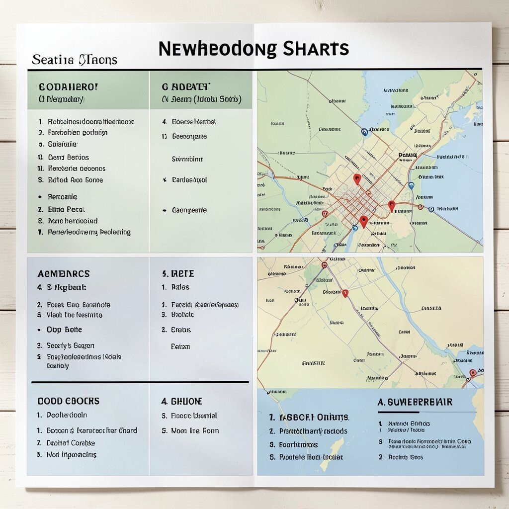
Imagine your venue as a tiny city, with each table representing a neighborhood. A printed map style chart can show streets, parks, and landmarks, then point guests to the right “block” for their seats.
This setup makes the space feel intentional, not random, which helps people settle in faster. To personalize, use neighborhood names tied to your theme, like “Coffee Corner” or “Garden Gate,” and match table colors to each mini district. Keep it practical by printing a simple legend on the chart and adding a clear table number next to every area. For cost, you can use free map icons and textured paper backgrounds to get the look without expensive design work.
2. Magnetic Wall With Rolling Names
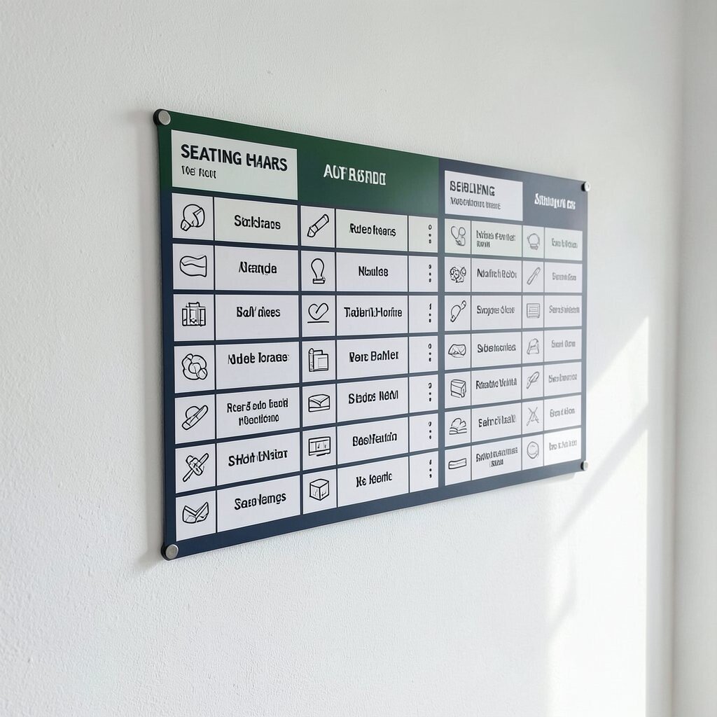
A long wall panel covered in soft colors can hold small name magnets that guests move to find their seats. Your chart can show table outlines like puzzle pieces, so each guest “claims” their spot by placing a magnet in the right shape.
Movement adds excitement, and it reduces the awkward feeling of standing still while others find their seats. Provide a neat key for how to read the board, then include a backup list near the entrance for anyone who prefers a quick check. To make it unique, use magnetic shapes like stars, leaves, or even tiny seats that match your event vibe. For personalization, let guests choose a colored magnet that matches their table drink or party role. If budget is tight, buy one set of durable magnets and reuse them across multiple events with quick name swaps.
To stay current, this approach pairs well with “interactive signage” trends, where guests like to participate instead of only reading. Just remember to plan enough space for lines so the wall doesn’t become a traffic jam. Place the board where lighting is bright so name labels are easy to spot at a glance.
3. Book Spine Seating List
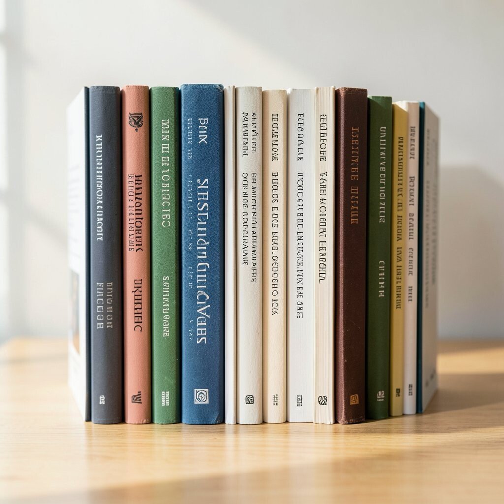
Picture a seating chart that looks like a row of books standing upright, each “spine” labeled with a guest group and table number. Instead of plain names, guests find their seats by locating the book that matches a category, like “Chapter One” or “The Main Characters.”
This design feels warm and creative, especially for readers, teachers, writers, and themed dinners. Keep it practical by using large type for table numbers and clear titles for each section, so guests don’t have to hunt. Personalize by tailoring the titles to your event story, like favorite places, shared hobbies, or the event’s motto.
You can hold the look together with simple cardboard cutouts and a consistent font, which makes cost easier to manage. A trend worth leaning into is storytelling branding, where everything from invitations to signage feels like part of one narrative. If you want a modern twist, use a gradient “shelf” color and sprinkle tiny icon bookmarks to guide the eye.
For placement, mount the chart at eye level and add a small arrow that points toward the room. Guests will walk in, feel like they stepped into a library scene, and then quickly find where to sit.
4. Chandelier-Style Seat Constellations
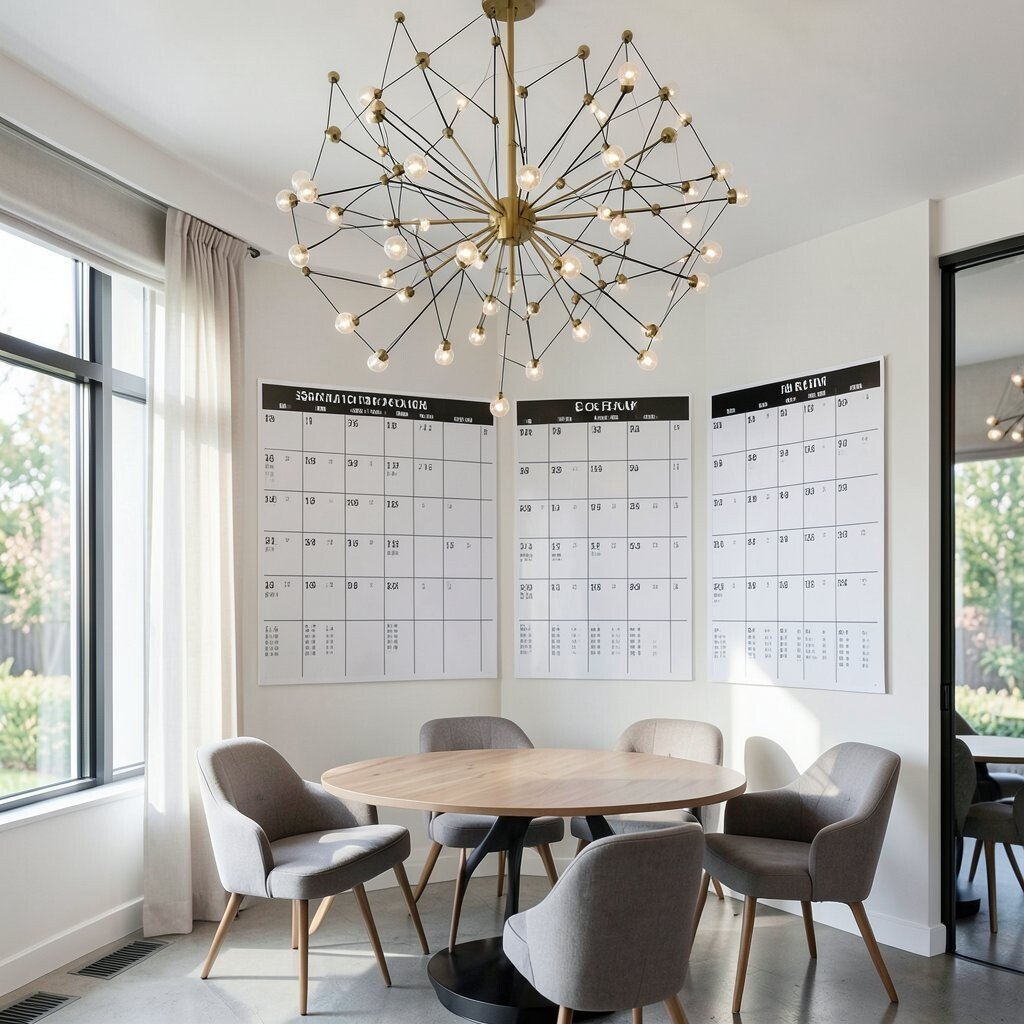
Think of your chart as a star map, where table groups hang like constellations from a central “sky” graphic. Each guest name becomes a tiny label that connects with thin lines leading to the matching table in the room.
This visual is memorable and gives a “wow” moment before the first toast. To keep it clear, limit the number of lines crossing by grouping names into clusters and spacing tables well. Personalize by choosing constellation themes tied to your venue location, season, or a custom hashtag for the event.
If you want it budget-friendly, print the sky background and use reusable string clips or removable adhesive points for the labels. A current trend is celestial aesthetics, and it fits weddings, birthdays, and milestone celebrations beautifully. Make sure every table cluster has a bold number and that the room has matching signs for quick confirmation.
5. Seating as a Garden Layout
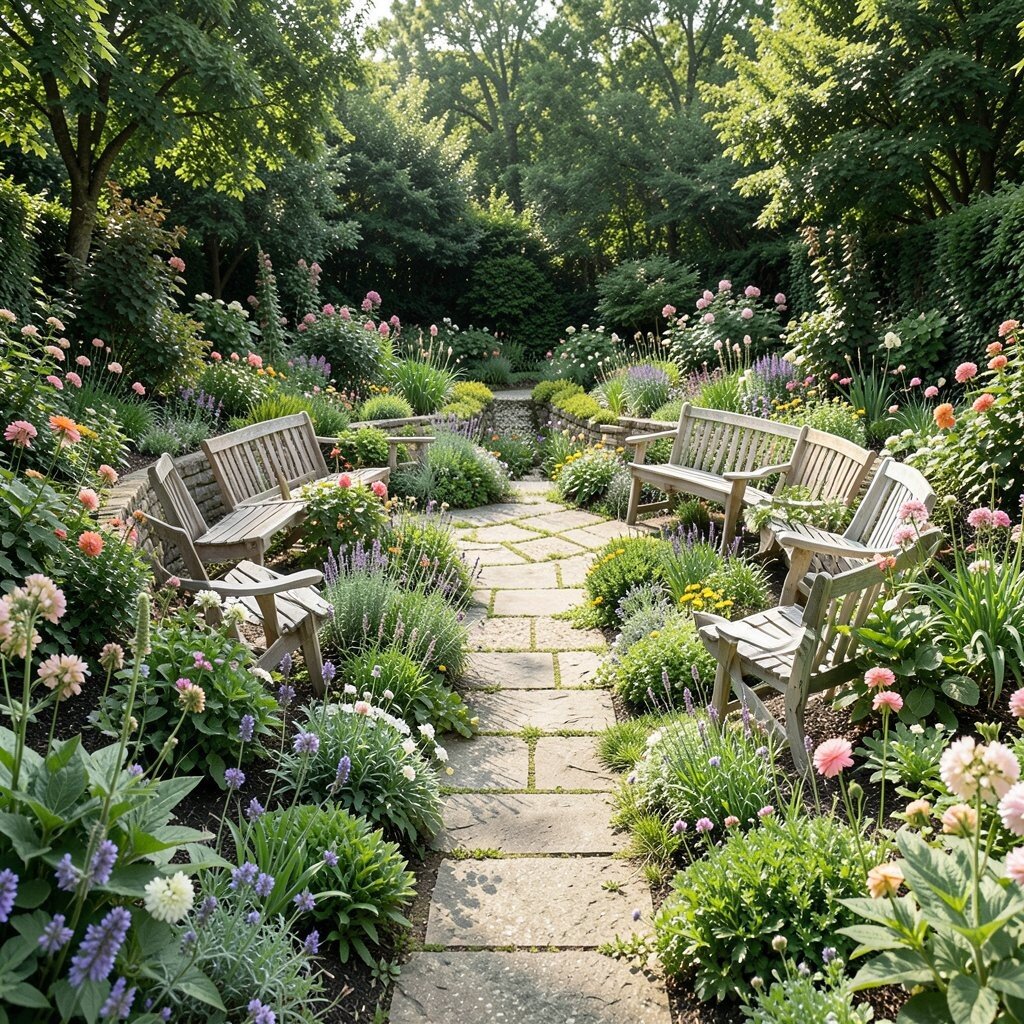
Imagine the entrance signage as a garden plan where tables look like flower beds and each guest name sits on a “plant tag.” Bright greens, leaf shapes, and little sprouts can make the whole chart feel like a fresh spring morning.
This chart softens the whole event, making it friendly for shy guests who want to take their time. Use practical plant tag sizes that are easy to read, and keep your table numbers stamped in a consistent spot on each tag.
For uniqueness, match each “bed” to a table theme, like roses for romance or sunflowers for cheerful groups. Personalize by writing guests’ hobbies on the tags as short phrases, like “Board Games,” “Singing,” or “Sunday Walks,” so the chart sparks conversation. Cost stays reasonable when you craft tags from cardstock and laminate them for reuse. To match current trends, lean into sustainable style by adding small “seed packet” envelopes with the guest names printed inside for a cute extra.
6. Rotating Table Bands on a Central Stand
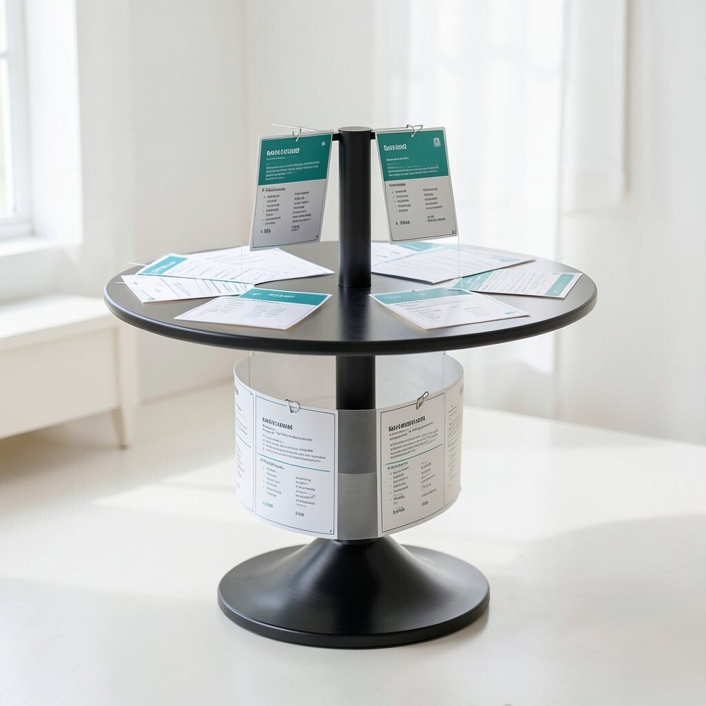
Picture a central stand that holds several wide bands, each band labeled for a table range and stacked like rings. Guests find their band, then slip a name card into the correct slot as if loading a record player.
This gives people control and keeps the seating process lively instead of stressful. It also helps staff manage changes quickly because swapping cards is simple. Keep it practical by making each slot large enough for easy reading and adding a clear table number strip along the edge.
For personalization, use bands with different textures, like linen for classic events and metallic finishes for a party vibe. If cost matters, use one central stand design and print multiple rounds of cards for different events. A modern trend here is “modular signage,” where one system can be reused and updated with minimal labor.
7. Passport Stamp Seating Map
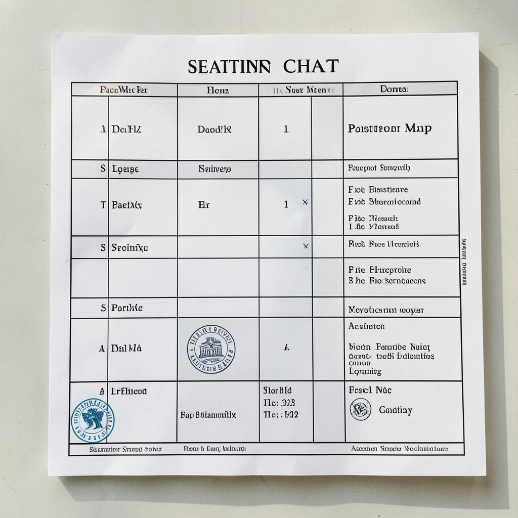
Imagine your chart as a world map where each table is a country and each guest gets a passport stamp label. The stamps can be playful and colorful, with a stamp-style date that matches your event day.
This approach feels unique and instantly invites guests into a theme, especially for travel-style parties. Keep it practical by pairing the map countries with table numbers in large type, so nobody gets lost in the fun. Personalize by choosing countries that match guest interests or your favorite places, and keep the stamp design consistent across all labels.
Cost considerations are easier when you print the map background once and reuse it, then only replace the stamp labels. This matches current trends in “experience branding,” where even seating becomes part of the guest journey. If you have a small venue, swap the world map for a regional map and still keep the passport theme.
8. Place Cards as Mini Art Frames
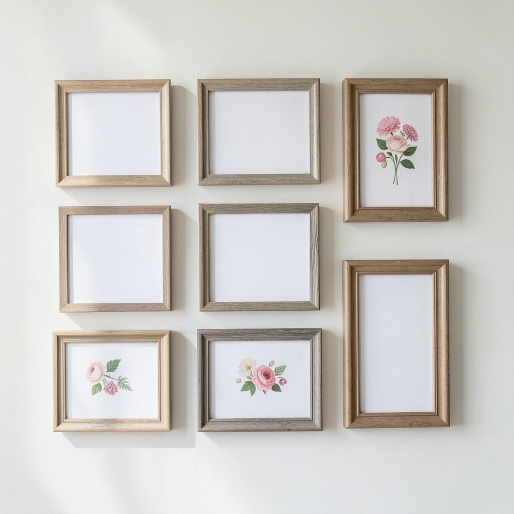
Picture each seating assignment displayed in small “frames” arranged in a gallery wall grid. Guests walk along the wall, find the frame with their name, and then locate the matching table label nearby.
This feels classy and playful at the same time, and it makes guests feel like they’re part of an art show. To make it practical, use bold table numbers on the frames and place a matching table sign at the entry to each seating zone.
Personalize by matching the frames to your palette, or by printing guest names in different art styles like watercolor, sketch, or bold lettering. For cost, you can use thrifted frames or simple foam board squares with paper overlays, then reuse the frame backing for future events.
A current trend in event design is “gallery-inspired decor,” and this seating chart version fits perfectly. Add a small sign that explains how to match frames to tables using a simple icon, like a color dot. With bright lighting on the wall, the whole layout becomes easy to scan quickly.
9. Color-Block Seating With Icon Codes
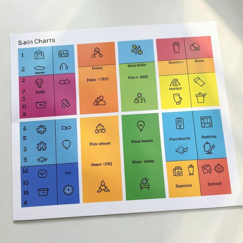
Think of the chart as a bright set of color blocks where each color stands for a table group and each guest name appears next to an icon. The chart can look like a design poster, with simple shapes like circles, triangles, and stars guiding people to the right place.
This helps guests who skim, because the colors and icons make the chart faster to read than long lists. It also creates a fun visual rhythm that looks great in photos. Keep it practical by using a limited number of colors and repeating the same colors on actual table signs.
To personalize, pair icons with guest interests, like a music note, hiking boot, or cupcake for dessert lovers. Cost considerations are friendly here because you can print color blocks and icons on standard paper and mount them on foam board. A current trend is “bold graphic design,” and this chart style fits the look without needing fancy tools.
Make the process smooth by placing the chart at the main entry and adding a second smaller chart at the bar or check-in station. That way, even late arrivals can match their icon code quickly.
10. Seating Like a Train Line Schedule
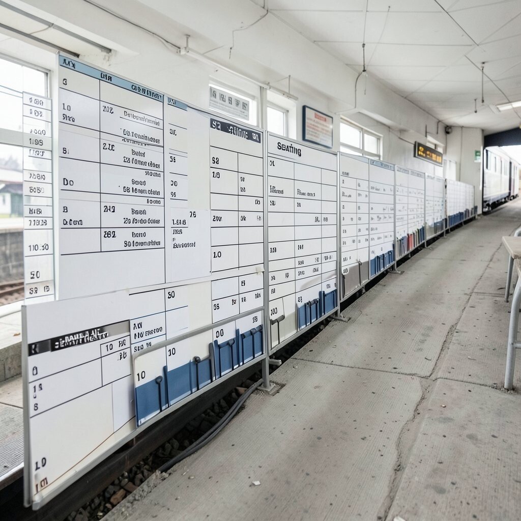
Imagine a chart that reads like a train schedule, complete with “platform” headings for each table. Guests find their “departure line” by searching for their name under the right table, then follow signage like platform arrows to the seats.
This is charming and easy to follow, especially for groups that enjoy playful structure. Keep it practical by writing table numbers clearly and using a short “final stop” line that points to the room layout. Personalize the schedule by naming platforms after local landmarks or using time-themed wording tied to your event story.
Cost considerations stay manageable when you print the schedule style once and reuse the layout template. A current trend is “themed wayfinding,” where signage mimics real-life maps or systems to guide people smoothly. Use consistent colors for each platform so guests can glance and go, rather than standing around reading every line.
11. Storybook Page Seating With “Characters”
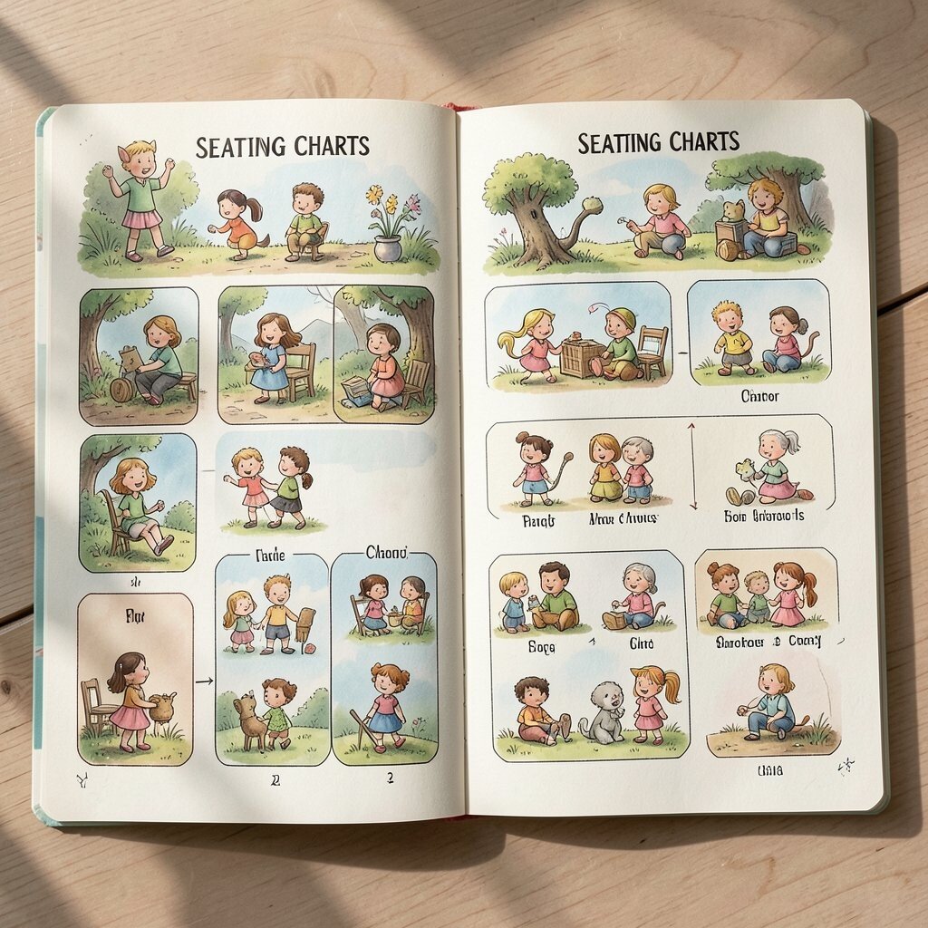
Picture your seating chart as a set of storybook pages, each page representing a table with a small cast list. Guests search for their name like they’re looking for a character in a book, then they head to the table “scene” marked on the map of the room.
This creates a warm, personal vibe and encourages conversation because people can talk about why they’re in each “chapter.” Keep it practical by keeping page titles large and ensuring each table has a matching sign that repeats the page number. Personalize by tailoring the story themes to your event, such as a “romance novel” for a wedding or a “mystery plot” for a party with games.
For cost, you can print pages on cardstock and clip them into a simple display binder or hang them with clothespins for a bookish effect. This aligns with current trends toward tactile, story-driven decor that feels more than just signage. Make it interactive by adding small prompts on each “page,” like a short line about the best way to meet new people at that table.
Guests will love the feeling of being included in a narrative, and you’ll love how quickly they can find their seats without confusion.
12. Dessert-Centered Seating With Sweet Shapes
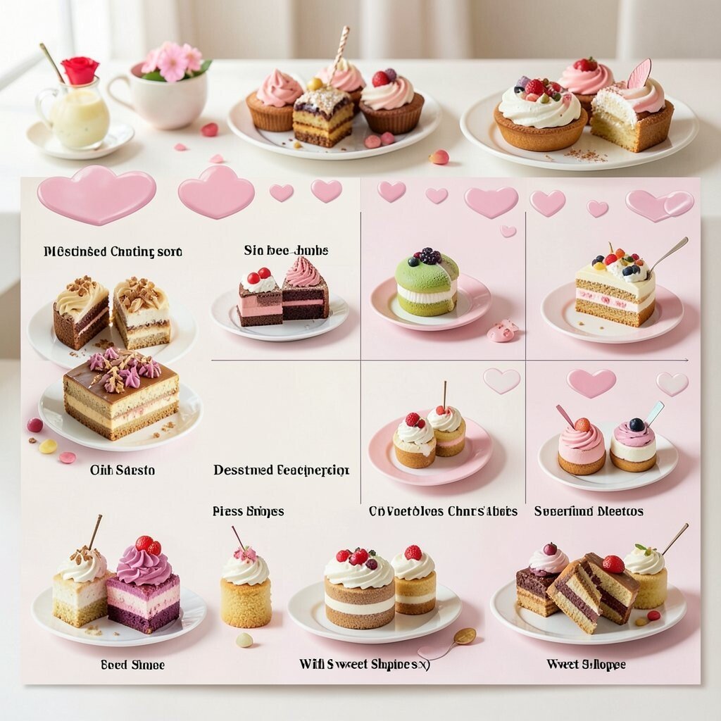
Imagine the seating chart as a dessert menu board where tables are listed as treats, and guests find their placement by “ordering” their name onto a tray. Each table can be shaped like a cookie tray, cake slice, or cupcake box, with names placed on the corresponding pieces.
This is a fun way to connect food and seating, especially for events with dessert stations or coffee bars. Keep it practical by placing table numbers on each dessert shape and by keeping fonts readable from a distance. Personalize by choosing dessert names based on your menu or by using guest-friendly flavor themes like “citrus,” “chocolate,” or “berry.”
Cost considerations are easier when you print dessert shapes and mount them on lightweight foam board, then use erasable markers or removable name stickers. To match trends, lean into “menu-first” visuals where guests see treats and arrangements as one unified experience. If you want to reuse the system, store the trays and swap only the printed guest labels for future events.
13. Floor-Plan Pathway Seating With Step Markers
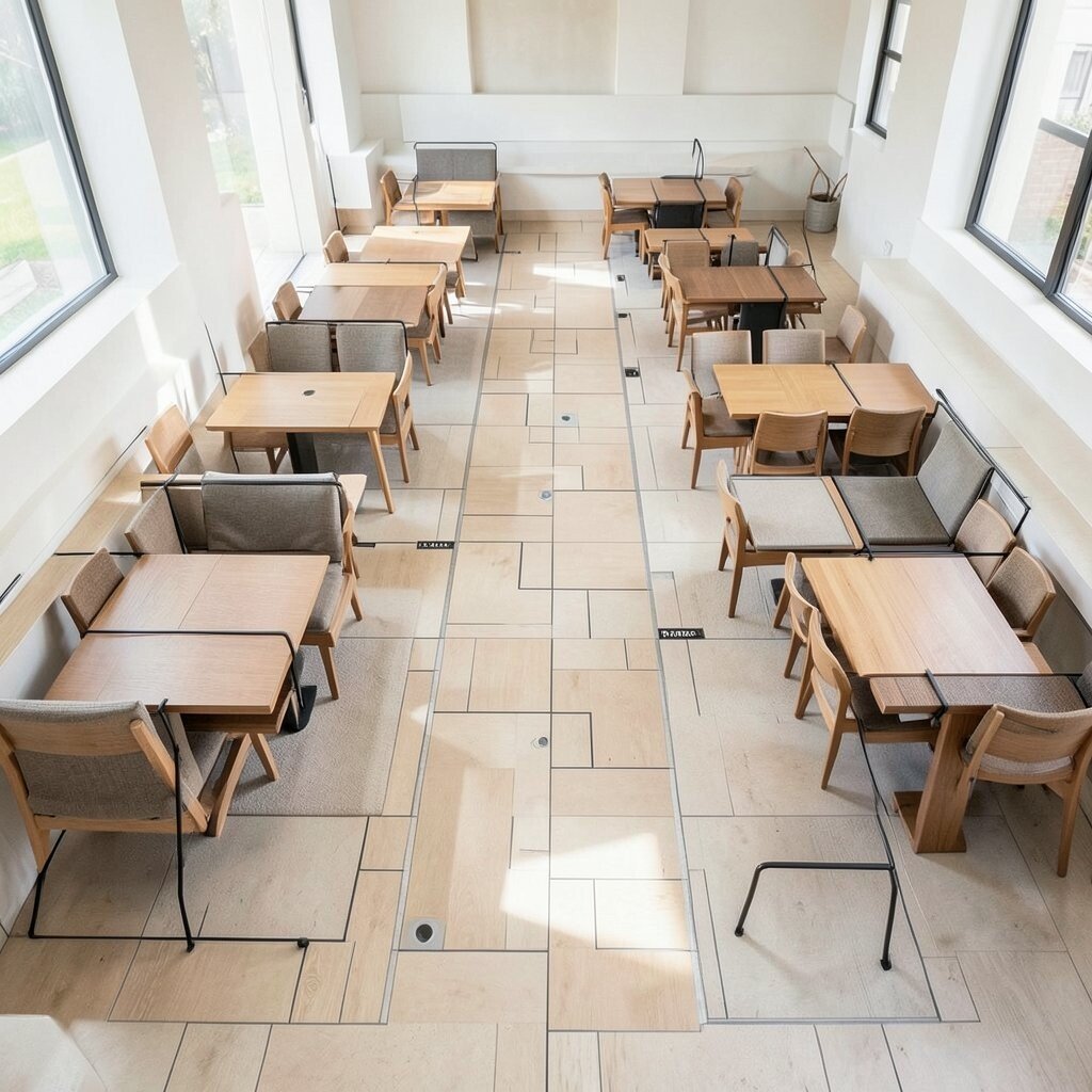
Think of your chart as a friendly floor plan with “step markers” that guide guests from the entrance to their seats. The signage can include simple arrows, colored walking paths, and footprints that lead people past each table marker until they reach their assigned area.
This option is wonderfully helpful for larger venues because it reduces back-and-forth and keeps guests moving. Keep it practical by using clear table numbers at the end of each path and confirming locations with signs near the seating zones too. Personalize by choosing footprint colors that match your palette and writing small, upbeat phrases next to major turns.
Cost considerations are manageable when you print a floor-plan style map on vinyl or durable paper and place it where guests naturally pause. This fits a current trend toward “wayfinding with personality,” where guidance feels playful rather than strict. If you’re hosting outdoors, you can use chalk-style printouts on boards or temporary floor decals that are easy to remove.
For a smooth flow, stagger where guests check the map so the entrance doesn’t get crowded. When done right, the whole arrival feels like a guided walk, and guests arrive at their seats feeling confident and excited.