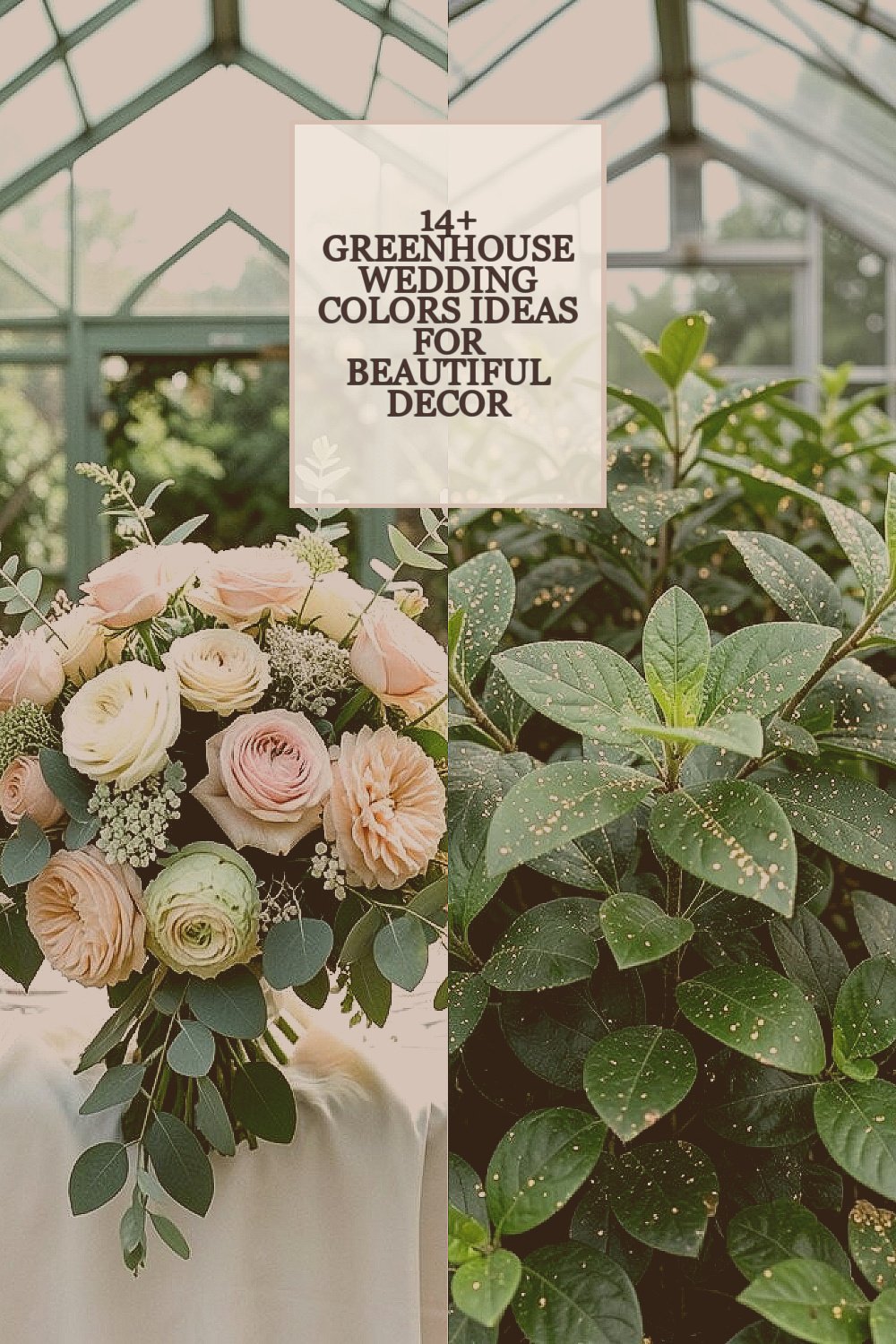
The air feels soft in a greenhouse, like everything is wrapped in light. The right colors can make that glow look intentional and unforgettable.
From crisp florals to moody foliage tones, you can shape the mood without making décor complicated.
1. Sage and Blush Bloom
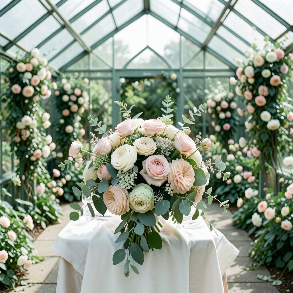
Picture pale sage fabric draped along the aisle, with blush petals scattered where sunlight lands. These gentle colors feel fresh, airy, and easy on the eyes.
Sage and blush work beautifully with greenhouse greens because they blend without fighting the environment. You can use blush in florals, napkins, and signage, while sage shows up in table linens or ribbon around glass vases. For practical styling, choose one main blush tone and repeat it across bouquets, boutonnieres, and candle labels so your look feels planned. If you want it to feel more personal, add a family color accent through small details like custom monograms on menus or a keepsake ribbon in your bouquet wrap.
From a cost viewpoint, blush blooms can stay budget-friendly when you lean on seasonal pinks instead of rare imports. Local greenery, such as eucalyptus or seeded local foliage, stretches your floral budget while keeping the palette cohesive. A current trend is mixing soft pastels with real plant textures rather than relying only on tinted sprays or artificial flowers.
2. Emerald Foliage with Gold Spark
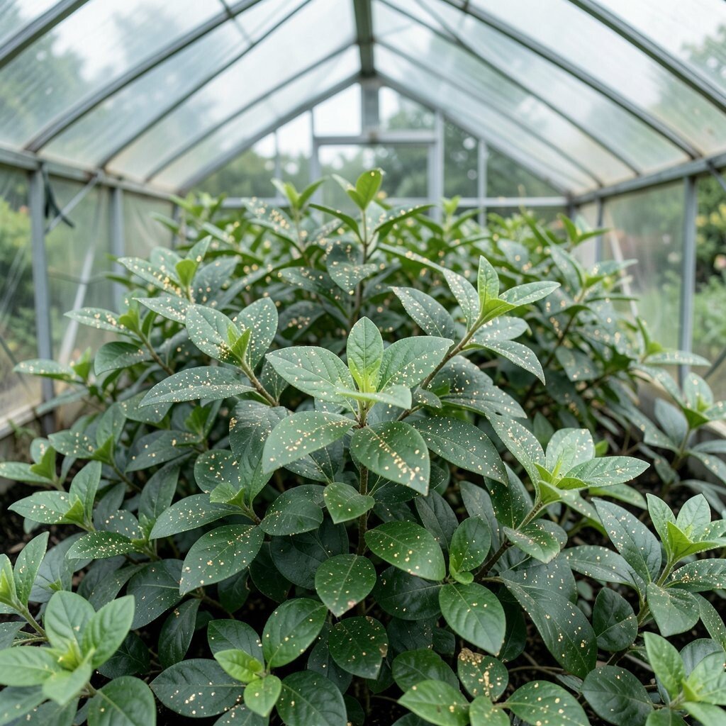
Think deep emerald ribbons floating against clear greenhouse walls. Then add warm gold light through candle holders, frames, and small hardware details.
Emerald and gold give a rich, elegant look that still feels natural inside a glass space. The emerald mirrors the greenhouse plants, so your décor feels like part of the setting instead of something pasted on.
To make it practical, use gold mainly in reflective spots where the sun can bounce light, like atop cake stands and around the bar. Choose fewer gold pieces but place them where guests will notice, such as near the sweetheart table and ceremony backdrop. Personalization can be as simple as engraving gold-toned tags with your wedding date on favors or plantable seed packets.
Emerald florals may cost more if you chase every deep green bloom, so it helps to mix in affordable filler greens and focus color in statement areas. A current trend is pairing jewel tones with plant-based centerpieces, especially in greenery-forward venues like greenhouses.
3. Creamy White with Sunbeam Yellow
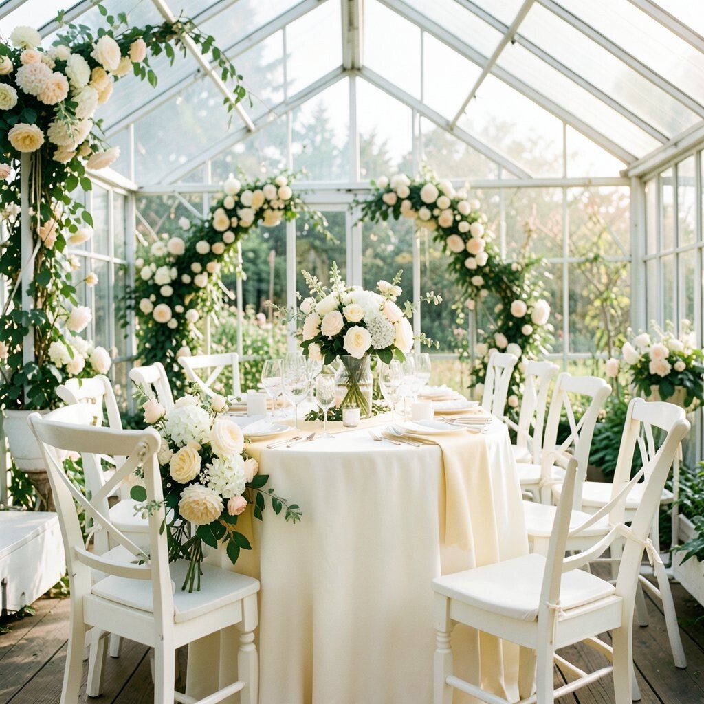
Imagine creamy white tablecloths glowing beneath sunbeams, with sunbeam yellow flowers tucked into airy clusters. It feels bright, friendly, and like the day itself is part of the décor.
This palette benefits you because it photographs well in natural light, and it won’t clash with greenhouse glass tones. Yellow also creates a cheerful focal point for bouquets and statement installations, so you get visual interest without heavy styling.
For practical tips, keep yellow concentrated in your largest arrangements and let cream handle the background. You can also use yellow in small ways like lemon-themed place cards, mustard-toned ribbon, or even a soft yellow runner on the bar. Personalize it by using a shade you love from your wardrobe or a color tied to your story, then pull that exact tone through flowers and stationery.
On cost considerations, creamy white often lets you stretch budget because you can use more greenery and fewer specialty flowers. Yellow blooms can vary in price, so choose seasonal yellow varieties or use mixed citrus-toned textures like preserved seed pods. A current trend is letting natural light do the heavy lifting by using light colors and open, less crowded centerpieces.
4. Charcoal Gray and Soft Rose Drama
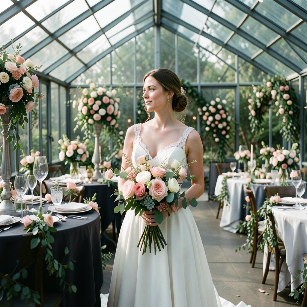
Picture charcoal-gray runners across tables, grounded like smooth stone, with soft rose blooms rising beside them. The greenhouse setting adds a gentle warmth that keeps this look from feeling too heavy.
This combination brings a modern edge while still staying romantic, which is perfect if you want more than typical pastels. Charcoal also helps your floral colors pop, so pink, rose, and even coral details look vivid in photos.
To keep it practical, use charcoal in textiles like table runners, chair covers, or stationery accents rather than trying to darken every surface. Then choose one rose shade for flowers and one for stationery so nothing looks mismatched. Personalize by adding subtle metallic accents in rose gold or warm copper for a small signature sparkle.
Cost-wise, charcoal fabrics can be an affordable way to make the whole event feel styled, since the cloth does a lot of visual work. You can save on florals by using fewer statement bouquets with more greenery and letting textured foliage provide bulk. A current trend is moodier palettes in bright spaces, especially when couples want something stylish without looking themed.
5. Terracotta Clay with Sage Green Stitching
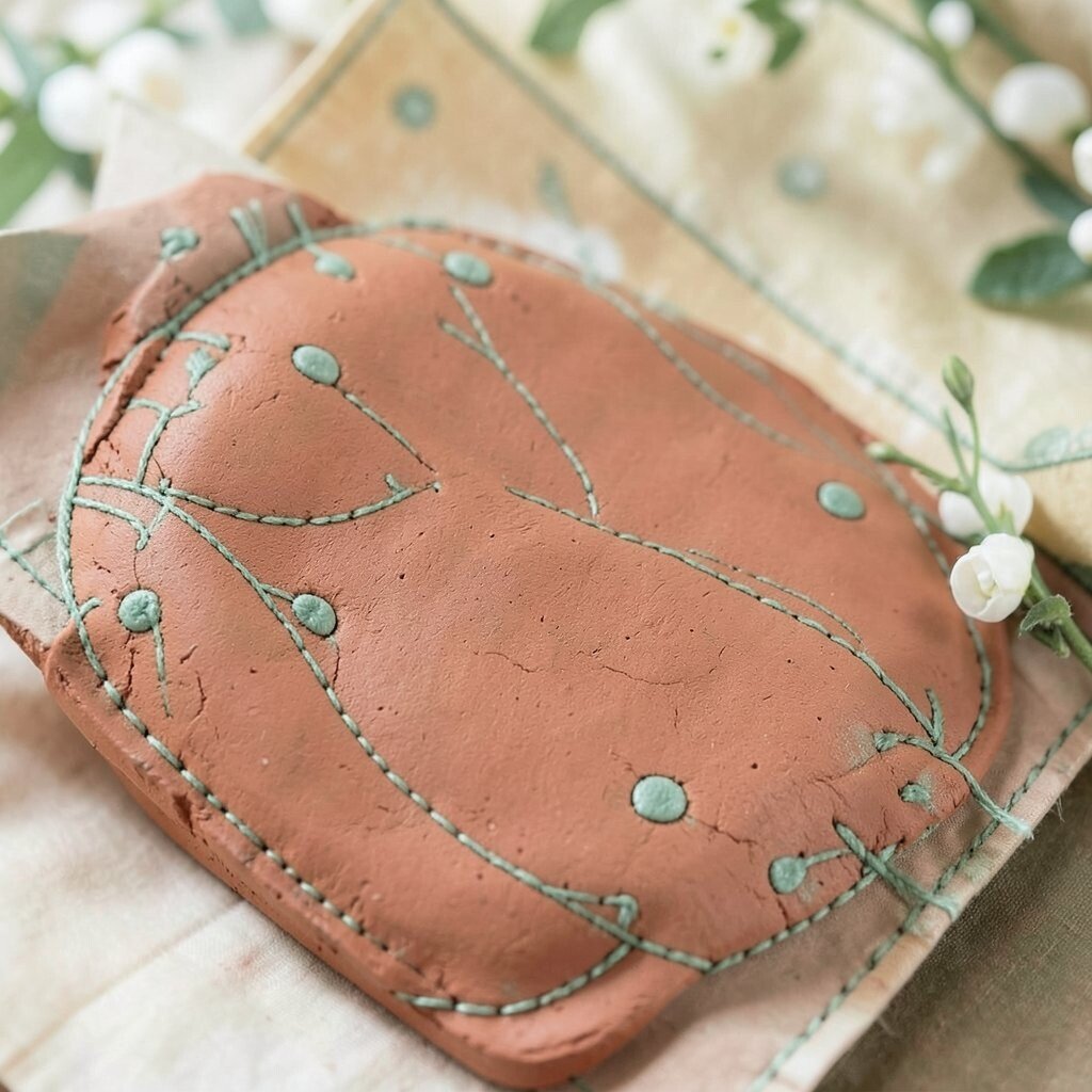
Think terracotta bowls holding stems that look sun-warmed, with sage green details that feel like stitched embroidery. The whole palette reads cozy, earthy, and inviting.
Terracotta is unique in a greenhouse because it warms the glass light, while sage keeps the décor balanced and fresh. This color pair benefits you by creating depth even with simple flowers.
To style practically, choose terracotta in vessels, candle sleeves, and perhaps your guest favor jars, then use sage in ribbons and greenery. Personalization can show up through small hand-painted touches on place cards or a custom stamp on favor tags that matches your terracotta tone. If you want a more polished look, repeat the terracotta in at least three places, such as centerpieces, ceremony accents, and bar décor.
On cost considerations, terracotta décor can be cost-effective because you can rent or source clay-toned items that look expensive. Many seasonal flowers can work with this palette, including rust-orange, peach, and creamy whites. A current trend is embracing warm terracotta tones and pairing them with lots of real plant texture for a natural, lived-in feel.
6. Ocean Blue with Sea Glass Teal
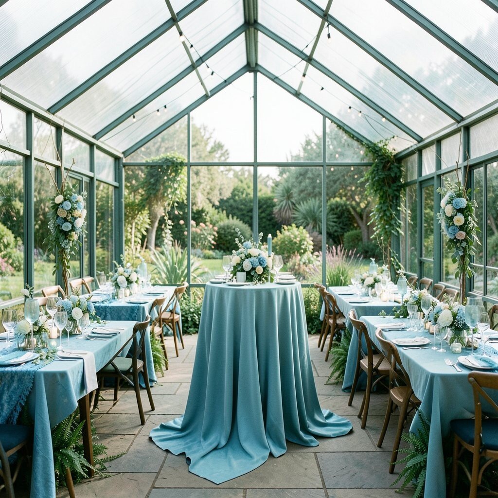
Imagine ocean blue fabric and blooms floating alongside sea glass teal leaves and accents. The greenhouse light makes the blues look softer, like sky reflections.
This palette benefits you because it feels fresh and cool, which is a great contrast to warm sunlight. It also looks striking with clear glass, since blues naturally play with reflections.
For practical tips, choose ocean blue as your main color in larger pieces like drapes or napkins, then use teal for smaller accents such as ribbon, table numbers, and small flower clusters. You can keep it easy by choosing one flower type in blue and one in teal and repeating them across bouquets and centerpieces. Personalize it by adding a small element that matches your favorite seaside memory, like subtle wave motifs in stationery or a charm on wedding favors.
Cost-wise, blue and teal can stay manageable when you use mixed greenery and choose seasonal colors. If blue blooms cost more than expected, use blue-toned filler flowers sparingly and lean on teal leaves and eucalyptus for the bulk. A current trend in greenhouse weddings is using ocean-inspired palettes with airy, non-heavy arrangements for a breezy look.
7. Raspberry Wine with Deep Green Heritage
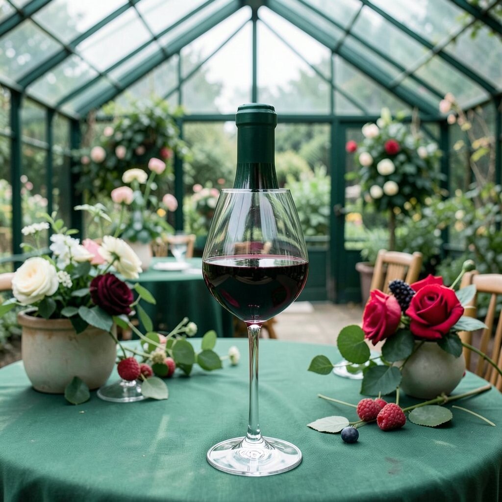
Picture raspberry wine tones in bouquets and table florals, with deep green leaves framing the whole design like a velvet border. It feels bold, romantic, and full of character.
This color combo works well because greenhouse plants already provide the deep green foundation, and your raspberry tones become the exciting star. The result is a cohesive look that feels intentional rather than accidental.
To style it practically, choose deep green foliage as the base in all centerpieces, then place raspberry pops at varying heights so arrangements look lush. Personalize by adding a family heirloom color accent through a ribbon color or by matching raspberry shade to your bridesmaid dresses or groom’s tie. If you want extra meaning, include a raspberry-colored detail in your ceremony reading or unity moment items, like a small ribbon tied around a keepsake box.
Cost considerations matter here because berry-toned blooms can be pricier depending on season. You can save money by using berry-toned petals in a smaller number of statement stems while keeping the rest of the bouquet filled with greenery and budget-friendly flowers. A current trend is leaning into jewel-like fruit tones instead of classic red, especially for couples who want a richer vibe.
8. Lavender Mist with Fresh Mint
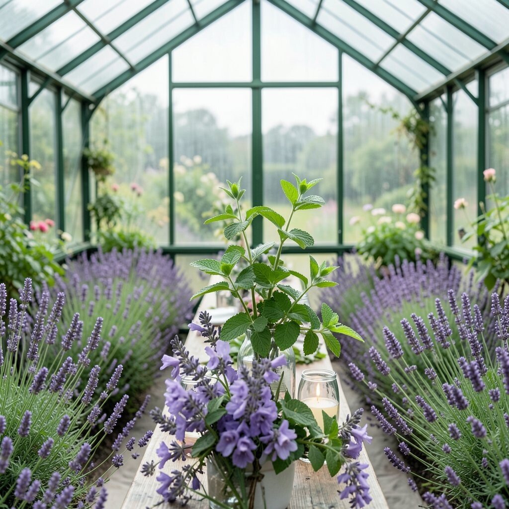
Imagine lavender mist florals floating near mint green details, like a garden cooling down after a warm day. It feels dreamy and calm, perfect for a romantic greenhouse setting.
Lavender and mint benefit you by creating a light, soothing contrast that still feels colorful. They also pair nicely with glass because the cool tones look crisp and airy.
For practical tips, use lavender in focal flower clusters and let mint show up in smaller accents like ribbon, table runners, or tinted candles. Personalize by choosing a lavender shade that matches a meaningful outfit detail, then repeat it across stationery and signage for a smooth, coordinated feel. You can also incorporate minty herbs in centerpieces if your venue allows it, which adds both scent and texture.
On cost considerations, lavender tones can be budget-friendly when you use seasonal purples and mix with plenty of greenery. Keep your arrangements open and not too dense, because greenhouse light makes airy designs look special. A current trend is herb-forward décor, where minty greens or fresh greenery add realism and charm without expensive specialty items.
9. Buttercream with Blush Orchid Accent
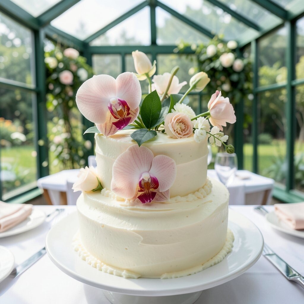
Picture buttercream table décor with soft orchid accents that look almost like real greenhouse flowers turned into wedding magic. This palette feels elegant without turning formal.
The benefit here is balance, since buttercream keeps the background gentle while orchid tones provide refined contrast. The result looks especially beautiful in glass spaces where light naturally highlights textures.
To make it practical, use buttercream as your base color across linens, candles, and signage, then choose orchids or orchid-like flowers as the accent only in key areas. Personalize it by matching the orchid accent to your bouquet focal flower, or by selecting a specific blush shade you love and using it in bridesmaid accessories. If you want an easy upgrade, add a small orchid arrangement on the ceremony doorway or behind the cake table.
Cost-wise, orchids can be expensive, so use them strategically rather than everywhere. You can often get a similar look with mixed blush florals and preserved orchid stems, or by renting statement arrangements and reusing containers. A current trend is using one luxurious accent flower in a broader, softer palette so décor looks high-end without overspending.
10. Blackberries and Plum with Bronze Details
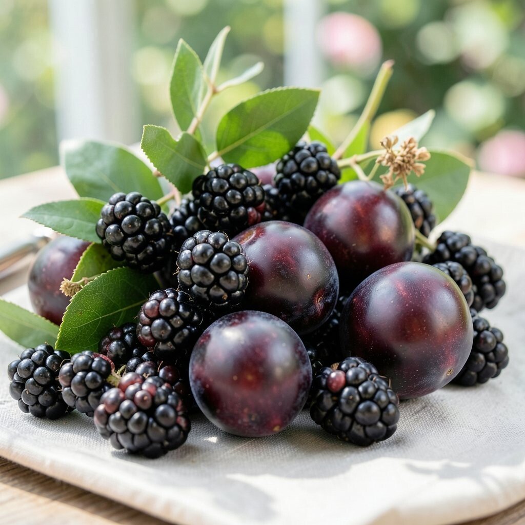
Imagine plum and blackberry shades in cascading flowers, softened by bronze candle holders and warm metallic accents. It feels like a modern romantic storybook inside a natural greenhouse garden.
This palette benefits you because plum brings depth while bronze adds warmth, helping everything feel rich instead of cold. The contrast looks especially good when greenhouse sunlight creates highlights on metallic surfaces.
For practical tips, use plum tones in statement pieces like your ceremony arch, main bouquet, and head table florals. Then bring bronze into smaller items such as frames, table numbers, and cake décor. Personalize by selecting a plum shade tied to your history, like the color of a favorite wine label, then mirror it in your wedding favors or matching ribbon.
Cost considerations can be manageable if you focus on one or two bold floral installations and rely on greenery for volume. Dark berry palettes also allow more flexibility with flower types since many varieties can match the look. A current trend is pairing deep fruit colors with warm metal tones for an elegant, evening-friendly vibe even during daytime ceremonies.
11. Peachy Apricot with Light Green Citrus
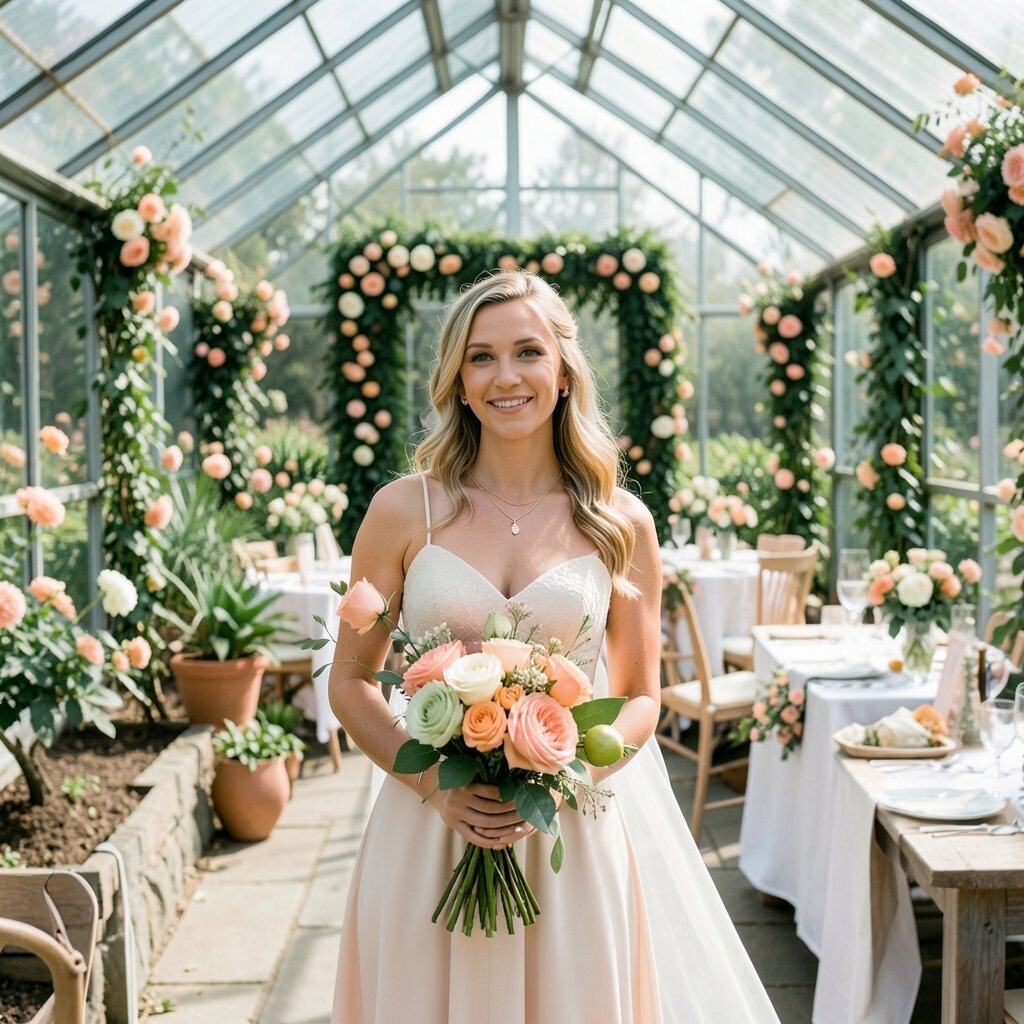
Picture apricot and peach florals sitting beside light green citrus accents, like sunlit fruit arranged in the breeze. This palette feels playful, fresh, and perfect for a greenhouse that already looks alive.
This color pairing benefits you by adding warmth without going too loud, so it works for both casual and upscale styles. Light green also ties directly to the greenhouse leaves, making décor feel natural.
For practical tips, use apricot as your main flower tone and bring in light green through leaves, ribbon, and small citrus-like details on tables. Personalize by using your favorite peach shade in place cards and programs so guests see your palette everywhere. You can also choose centerpieces that include fruit-inspired elements like apricot-toned blooms or citrus-colored candles if the venue permits scents.
On cost considerations, peach and apricot tones often have seasonal options, which can help keep prices reasonable. If certain blooms are pricey, you can create the same feel with a mix of peach-toned roses or ranunculus substitutes and plenty of greenery. A current trend is bringing soft fruit color stories into décor using both flowers and gentle, natural textures.
12. White Perfection with Clear Glass and Champagne
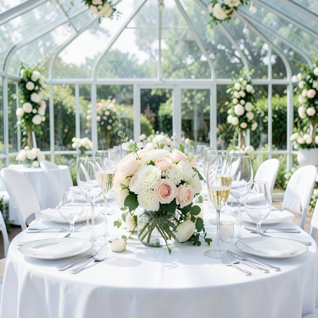
Imagine crisp white linens, clear glass vases, and champagne-toned candles arranged so sunlight refracts through every surface. It feels clean, elegant, and quietly luxurious.
This palette benefits you because it lets the greenhouse do the decorating, while still looking intentional in photos. Clear and champagne details also match the venue lighting, which helps your décor stay cohesive.
For practical styling, keep white consistent across tables and florals, then use champagne in small reflective items like candle holders, cutlery wraps, and framed menus. Personalize it by adding a meaningful symbol in your programs or napkins, such as a small icon in your monogram style. If you want more interest, mix in different textures of white like satin ribbons, cotton table runners, and frosted glass accents.
Cost considerations are usually friendly because you can reduce expensive florals and focus on clean styling with greenery and white blooms. You can also reuse glassware across settings if your venue allows it. A current trend is minimalist greenhouse décor that still feels elevated through texture and light rather than heavy color.
13. Coral Rose with Spring Green Energy

Picture coral rose florals brightening the greenhouse, then ground everything with lively spring green accents. It feels fun, modern, and full of daytime sparkle.
This palette benefits you by adding energetic warmth while keeping the overall look fresh thanks to spring green. It also photographs well because coral stands out beautifully against natural greens and glass light.
For practical tips, use coral in statement bouquets and the largest arrangements, then bring spring green into smaller elements like ribbon, napkins, and leafy table runners. Personalize it by repeating coral in your stationery design or cake topper details, so the theme feels connected from invitation to dessert. You can also add a few playful coral-colored accessories like colored glass stones or coral-toned place card holders.
Cost considerations are often manageable since coral flowers can be seasonal and versatile. If coral blooms are expensive, use coral-hued petals in mixed bouquets and fill the rest with greenery and budget-friendly white flowers. A current trend is pairing warm coral with crisp greens for a “fresh garden” look that still feels chic.
14. Teal Nightfall with Soft Linen Warmth
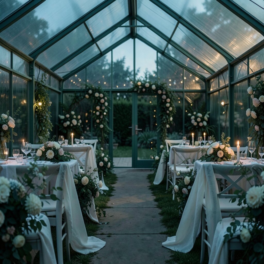
Imagine teal nightfall décor paired with warm linen tones, like a cozy evening inside a bright greenhouse. The setting will still feel airy, while your palette gives it depth and sophistication.
This combination benefits you because teal looks rich under sunlight, and linen adds a gentle, welcoming texture that prevents the look from feeling too formal. It also works great if you want something different from classic green and gold.
For practical styling, use linen warmth for tablecloths and lounge fabrics, then add teal through florals, ribbon, and candle shades. Personalize by matching teal to a tie, bridesmaid dress, or a favorite piece of art, then use that same shade in small repeated details. If you want a more dramatic effect, choose taller centerpieces so teal accents catch the eye as guests walk by.
Cost considerations can be optimized by keeping expensive teal blooms concentrated in a few key arrangements and using greenery for volume. Teal tones are sometimes easier to match using dyed ribbon and foliage than relying on specific high-cost flowers. A current trend is using deeper colors in outdoor-bright venues to create a “sunlit evening” mood that feels stylish and memorable.
15. Antique Rosewood with Botanical Olive
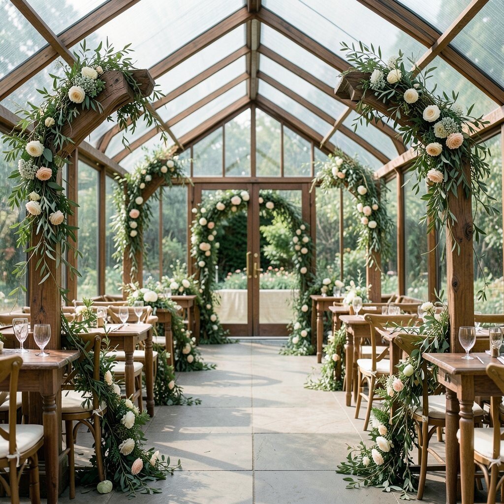
Picture antique rosewood shades in florals and décor accents, paired with botanical olive greens that feel grounded and calm. It creates a vintage-meets-garden mood that fits a greenhouse perfectly.
This palette benefits you because olive provides natural depth and rosewood brings soft romance, so the look feels layered rather than flat. It also offers uniqueness since rosewood tones are less common than classic blush, making your wedding feel special and personal.
For practical tips, keep olive in your base greenery, table runners, and large foliage arrangements, then use rosewood in bouquets, napkin details, and small decorative elements. Personalize it by using rosewood as the color highlight in your monogram stamp or on a custom bar sign, so guests recognize the palette throughout the day. If you want a hands-on touch, add small handwritten notes on place cards using a rosewood ink tone or a matching ribbon wrap.
On cost considerations, this palette is often budget-smart because you can build most of the volume with affordable greenery and then add rosewood pops where it counts. Depending on season, rosewood can be matched with warm pinks, mauves, and deep peach shades, which gives you flexibility. A current trend is using vintage warm neutrals and botanicals together for a greenhouse wedding that feels timeless, not trendy for a single season.