The right suit details can make your whole wedding look feel sharp. Small contrasts create a big impression in photos and in person.
When you plan your outfit like a stylist, you feel more confident and you look more you.
1. Velvet vs. Matte Lapels

Imagine stepping into the light and seeing subtle shine at your lapels. Velvet adds depth, while matte fabric keeps the rest of the suit calm and clean.
Choose a suit where the lapels have a velvet texture or a rich satin sheen. That contrast makes your face look brighter and helps your outfit stand out in candlelight. Keep the rest of your styling understated so the lapels do the talking.
For personalization, match the velvet tone to your wedding mood. A black velvet lapel looks bold for evening, while deep navy or burgundy feels classic for daytime. If you want cost control, look for velvet trim on ready-to-wear suits instead of fully velvet jackets. Current looks favor quiet luxury, and this detail fits right in without feeling flashy.
2. Crisp White Shirt vs. Cream Shirt
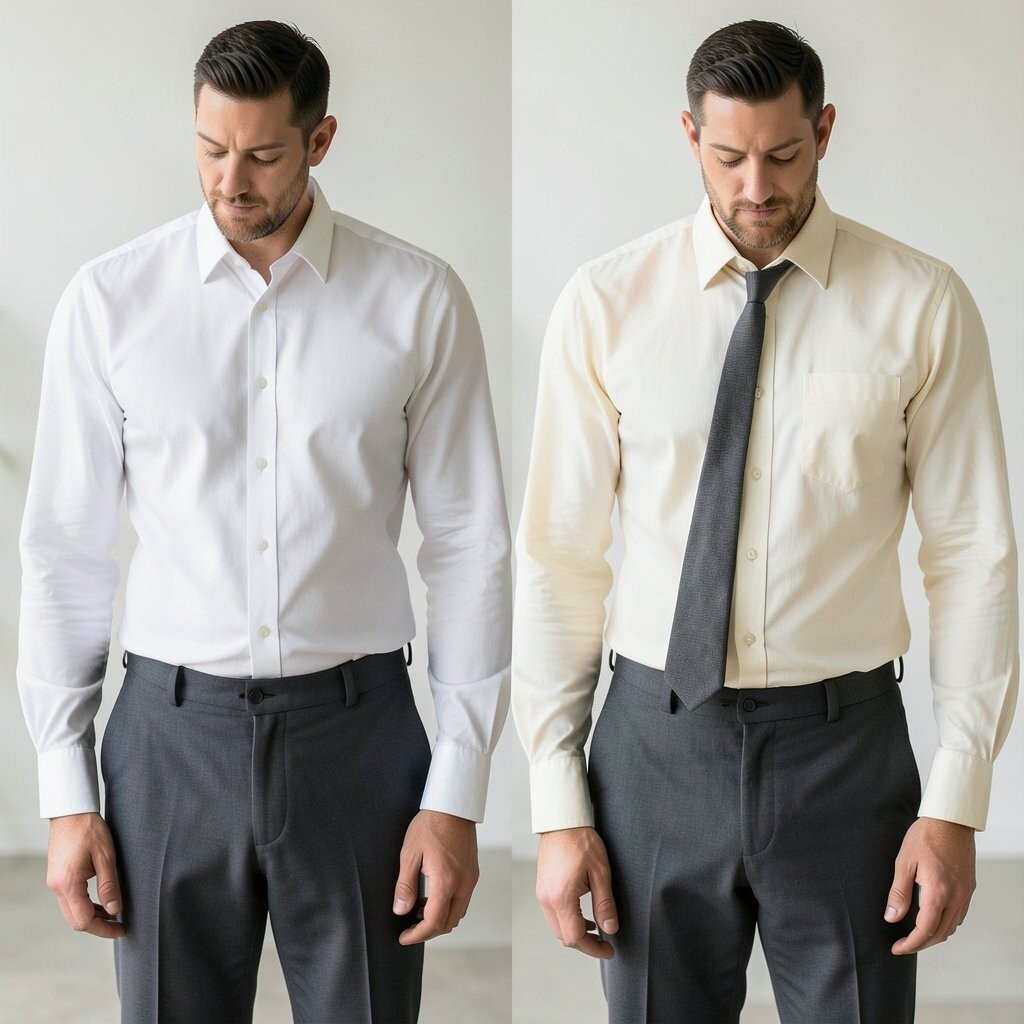
A crisp white shirt can make you look instantly fresh and formal. A cream shirt softens the whole look and gives it a warmer vibe.
If your wedding colors lean beige, sand, or warm neutrals, cream will look harmonious. In photos, cream can reduce harsh contrast on your skin and help your features feel gentle. To keep it practical, choose a fabric that resists wrinkles since weddings include a lot of standing and movement.
3. Black Trousers With a Charcoal Jacket
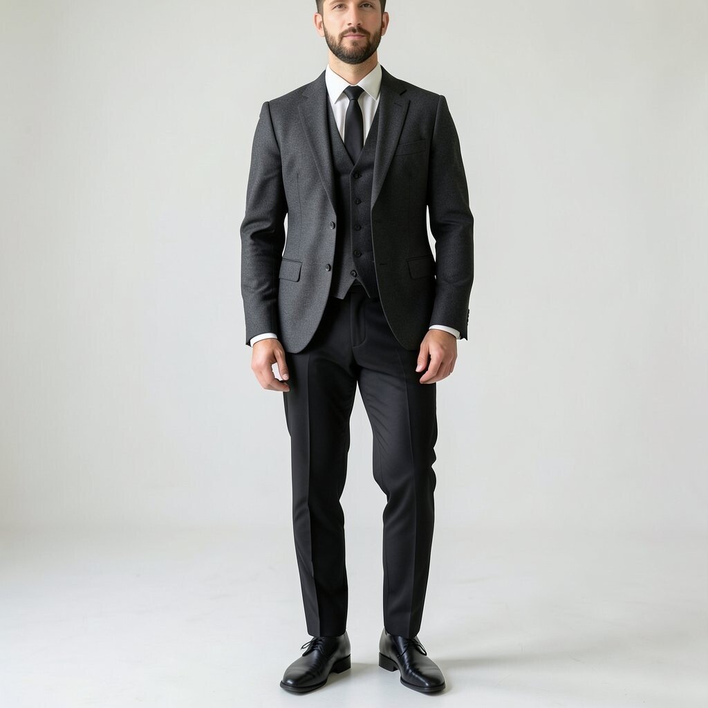
Mixing black trousers with a charcoal jacket creates a sleek, layered look. You get contrast that still reads as one outfit.
This combination looks modern because it avoids the too-easy match. It also flatters many body types since the darker base can ground your silhouette. For a clean finish, press the jacket and keep the trouser crease sharp, especially if your wedding involves photos outdoors.
Personalize by adding a pocket square in a color that echoes your tie or boutonniere. If you’re thinking about cost, this contrast is easy because many suits come in separates or have a matching set with minor flexibility. The current trend toward tonal separation makes this pairing feel stylish without extra shopping stress.
When you coordinate accessories, stick to one metal tone for belt buckle and cuff links. That way the contrast stays focused and your outfit feels deliberate.
4. Satin Tie vs. Woven Tie Texture
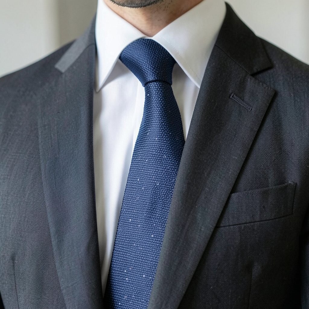
A satin tie catches light and looks smooth from every angle. A woven tie adds a gentle pattern and texture that feels handmade.
When you wear satin, your suit looks more polished for evening ceremonies. When you choose woven, the outfit feels relaxed but still elevated. Pick the tie texture based on your venue, because glossy fabrics can look too bright in some daylight settings.
Try matching the tie texture with your pocket square choice. A solid silk pocket square suits satin ties, while a textured fold works better with woven ties. If you want a practical win, buy a tie set in two textures so you can switch looks for the ceremony and reception. This is also a smart cost approach since ties are smaller purchases than new jackets.
For personalization, add a subtle color in the tie weave that matches your wedding palette. Many grooms like muted jewel tones now, and woven textures help those shades feel rich instead of loud.
5. Patterned Bow Tie With a Solid Jacket

A patterned bow tie brings personality right at your face. Pair it with a solid jacket so the look stays balanced and easy to wear.
Choose a pattern that echoes your wedding theme, like tiny checks for a classic feel or micro-dots for something playful. The benefit is that your photos will show clear detail without overwhelming your suit. Keep your shirt simple so the bow tie stays the main character.
If you want practical styling, pick a bow tie with a shape that sits neatly against your collar. For personalization, align the pattern color with your boutonniere ribbon or the shade of your ring box. To manage costs, look for designer-inspired bow ties that use quality fabric blends instead of fully silk. Current trends lean toward expressive accessories, and this is an easy way to join the trend without buying a whole new wardrobe.
6. Pocket Square Contrast: White With a Color Edge
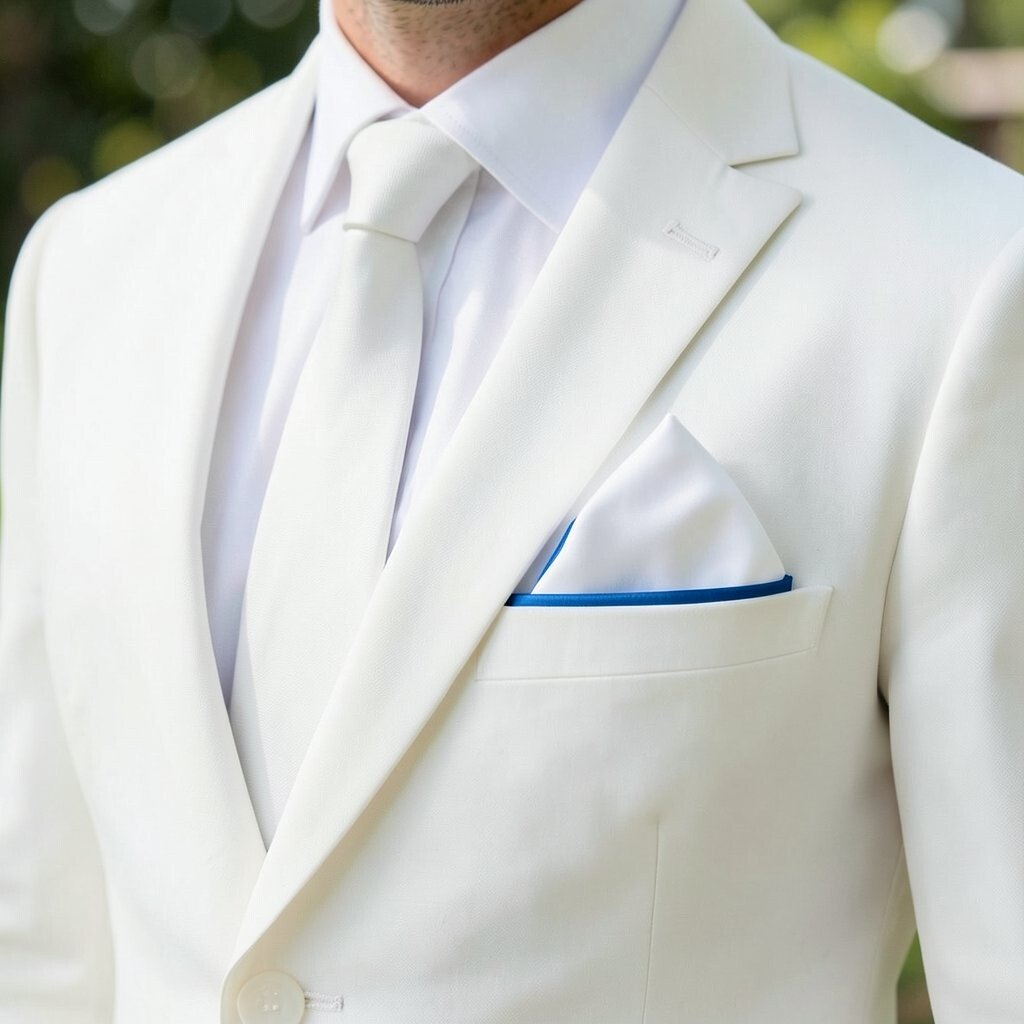
A white pocket square instantly sharpens your jacket, even when the suit fabric is simple. Adding a colored edge gives it a neat contrast that feels styled, not accidental.
This detail gives your outfit a polished finishing touch that shows up in close-up photos. It also helps your color scheme feel intentional from head to chest. For a practical tip, choose a fold that stays crisp and doesn’t bulk under the jacket pocket.
7. Tie Bar Metal Finish vs. Belt Buckle Finish
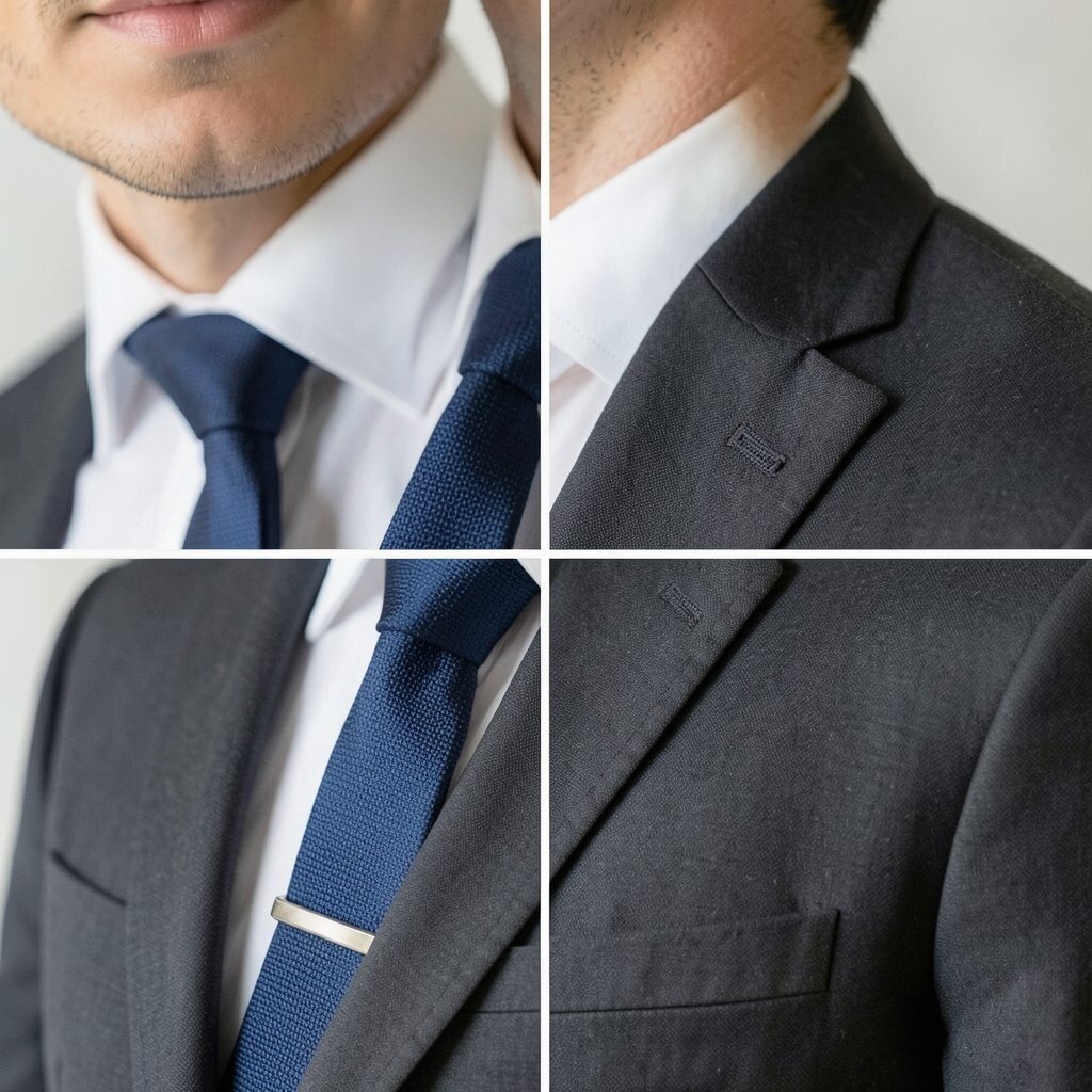
When your tie bar and belt buckle share the same metal finish, your outfit feels pulled together. Even small metal details can connect the look across your torso.
Go with silver, gold, or a dark gunmetal tone based on your wedding jewelry and cuff links. This contrast isn’t about lightness, it’s about harmony, and it makes everything look more expensive. For practical styling, keep the metal finish consistent across watches, rings, and wedding party accessories.
Personalize the shade to match your boutonniere pin or watch face. If you’re thinking about cost, you can often upgrade only one item like a tie bar rather than replacing a full outfit. Current styling favors coordination, and this is a simple way to follow that trend while staying comfortable. A neat trick is to polish your tie bar the night before so it looks bright in photos.
8. Dark Suit With a Light Waistcoat
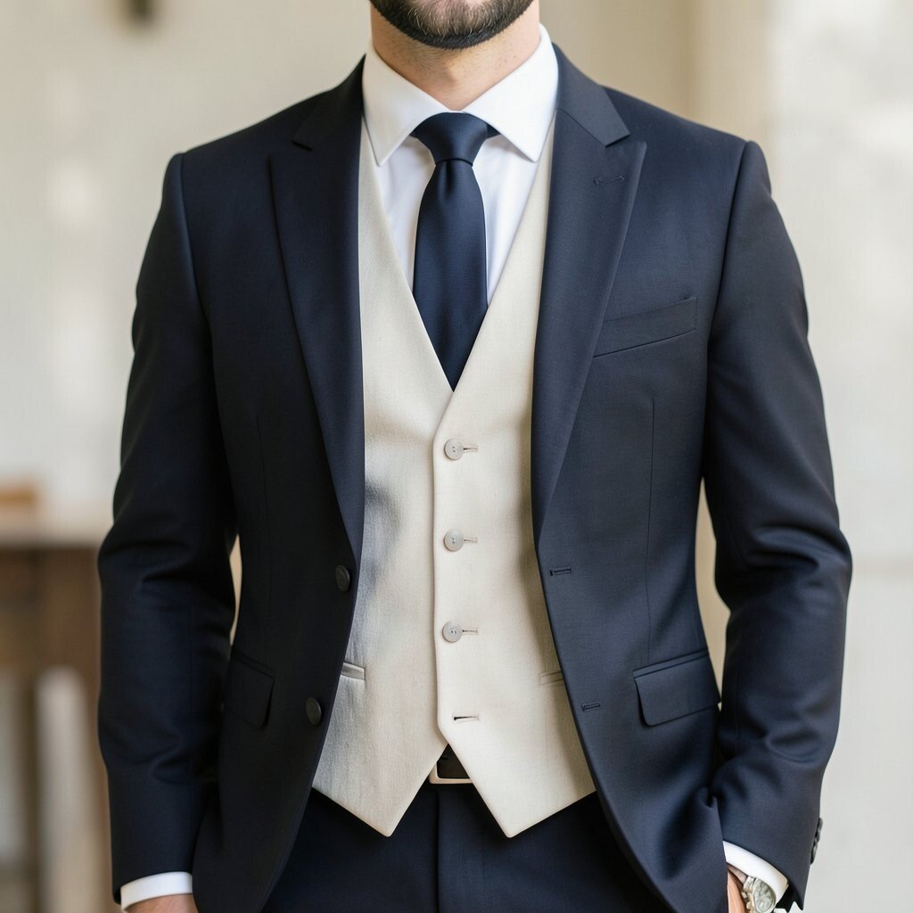
A dark suit looks bold, but a light waistcoat creates a crisp contrast. The waistcoat lifts the outfit and adds a touch of tradition with a modern twist.
This works especially well for weddings with warm lighting because the waistcoat adds brightness around your center. It also creates depth in photos, making your silhouette look more structured. For a practical tip, make sure the waistcoat buttons match the tie or belt tone so the contrast looks intentional.
Personalize it by choosing a light waistcoat in oatmeal, pale gray, or soft blue. Those shades keep the contrast classy instead of stark. If you want cost control, you can pair a waistcoat with an existing suit jacket if your style allows it, since many weddings are flexible about uniform matching.
Right now, layered looks with waistcoats are trending because they photograph beautifully and add warmth without heavy outerwear.
9. Button Color Contrast: Mother-of-Pearl vs. Standard
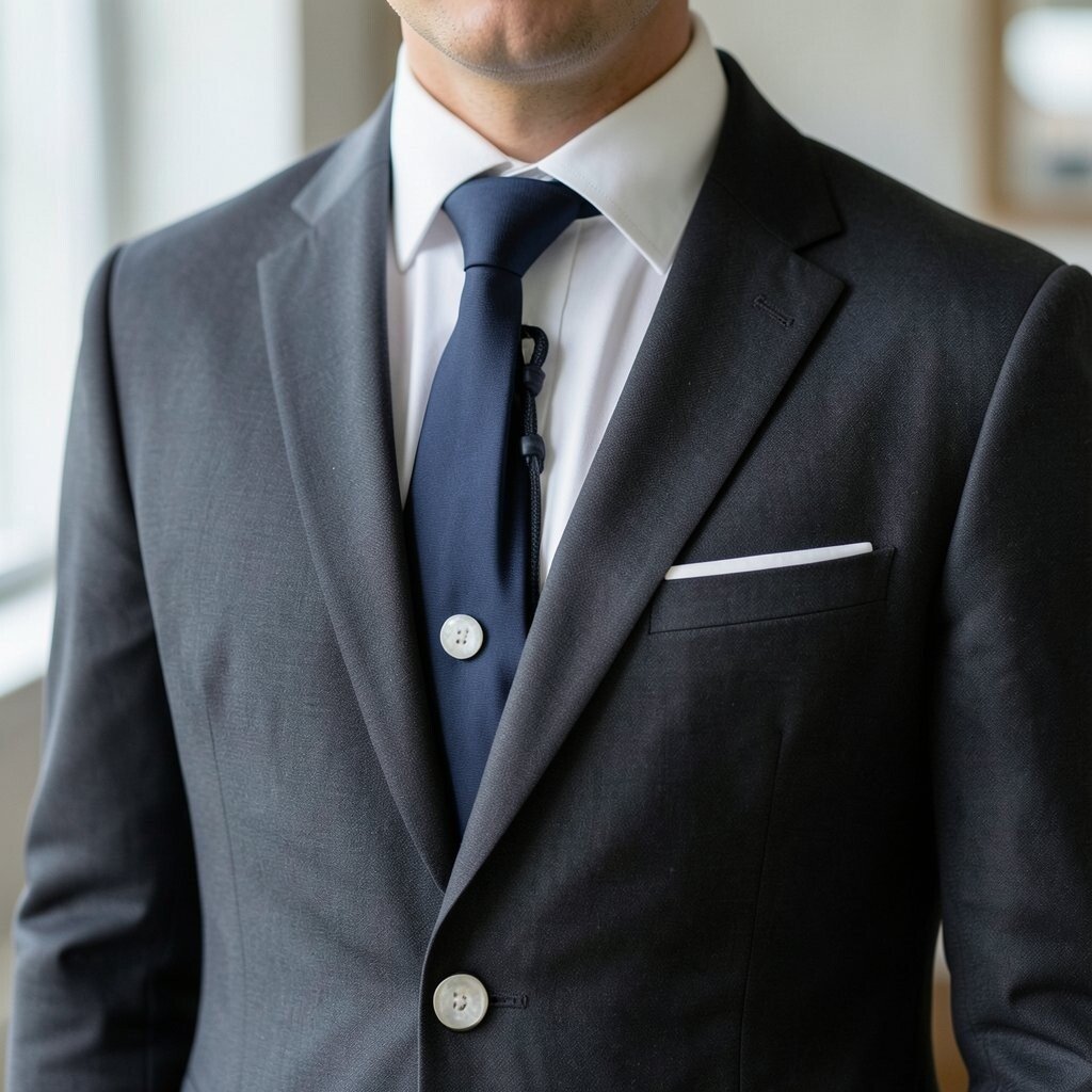
Buttons may seem small, but they can create a smart style contrast. Mother-of-pearl buttons add subtle shimmer, while standard buttons keep the look plain and straightforward.
Choose mother-of-pearl when you want your suit to feel elegant in close photos. That tiny shine draws attention to the jacket area and gives a refined feel without adding bulk. For practical wear, make sure the buttons match your cuff links or other accessories so the shimmer looks cohesive.
Personalize your contrast by selecting button tones that fit your wedding lighting. Cooler buttons look great with silver metals, while warmer tones feel rich with gold finishes. Cost considerations matter too, since a suit with specialty buttons may cost more, but it can be worth it because it elevates your whole look. Many modern grooms prefer these quiet details because they feel timeless and less trend-dependent.
10. Minimal Stripes vs. Bold Checks on Trousers
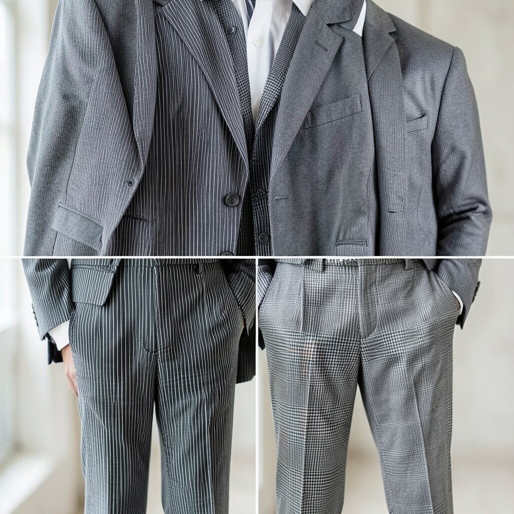
Plain trousers create a calm, classic base for your suit. Bold checks add energy and show off confidence in a clean, controlled way.
If you’re nervous about patterns, start with checks only on trousers and keep the jacket solid. That contrast makes your outfit feel designed, yet still easy to style. For a practical tip, keep your shirt color neutral so the pattern doesn’t clash in photos.
Personalize by choosing checks that relate to your wedding palette. A muted check can match earthy themes, while a sharper contrast works for modern city venues. Cost can be managed by selecting trousers with a subtle pattern from a suit separate collection rather than buying a full patterned suit. Current trends often feature statement trousers, especially paired with simple shoes and clean socks.
11. Black Shoes With a Brown Belt Contrast
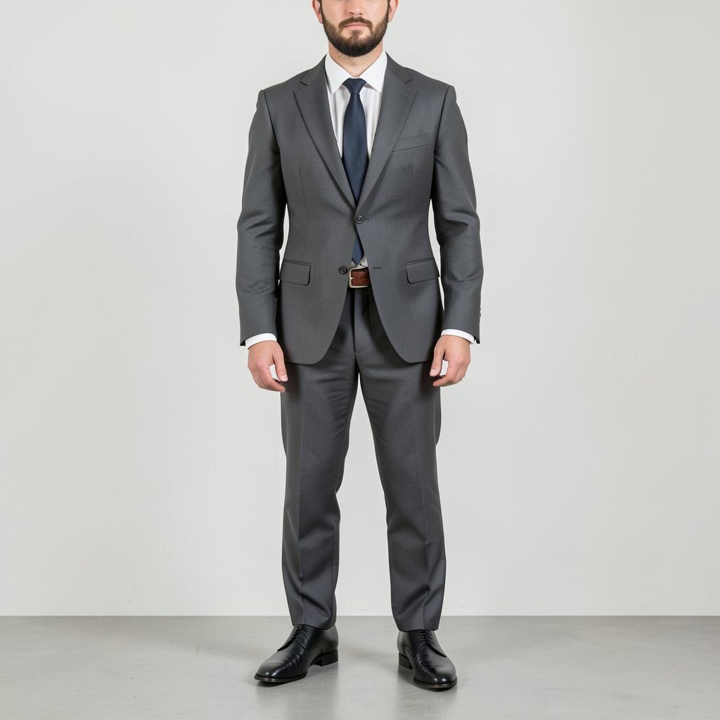
Matching black shoes and black belt looks safe, but mixing black shoes with a brown belt can feel fashion-forward. The contrast creates a layered look that feels intentional and grown-up.
This combination works best when your tie or pocket square includes hints of both tones. It also gives you flexibility, especially if you already own a brown belt for daily wear. For practical styling, choose shoes with a clean finish so the contrast looks high-end, not mismatched.
Personalize by picking the brown shade that matches your hair tone or wedding wood elements. If you’re budget-minded, reuse what you own and focus on making sure both pieces are well maintained. The current trend leans toward subtle rule-bending, and this contrast is a great way to do it without going too far.
12. Oversized Lapel vs. Narrow Lapel

An oversized lapel reads bold and modern, while a narrow lapel feels classic and sharp. The contrast in width changes the vibe of your entire jacket.
If your wedding is in a trendy venue or you love contemporary style, wider lapels can make you look fashion confident. If you want a timeless feel, narrow lapels keep the suit elegant and balanced. For practical buying, pay attention to your jacket fit first, because lapel width works best when the shoulders and sleeves are right.
Personalize by pairing wider lapels with a simple tie knot and a clean shirt collar. A narrow lapel looks great with a slimmer tie and a tidy pocket square. Cost considerations are real here since jacket style swaps can be harder than swapping accessories, but buying a jacket with the right lapel width can prevent future alterations. Current fashion often favors a slightly broader lapel, so it’s a smart option if you want to look current in photos.
13. Contrast Stitching: Color Thread Along Seams
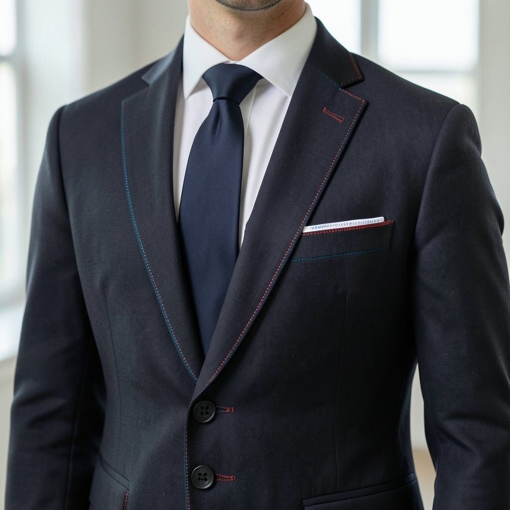
Contrast stitching is like a hidden signature inside your suit. When the thread along the seams is a different color, the craftsmanship shows through.
This detail adds uniqueness without turning the suit into loud fashion. It also benefits you in real life because the stitching emphasizes the garment structure, making the suit look more tailored. For practical tips, check how the thread looks in natural light, since some colors pop in sunlight but fade under indoor lighting.
Personalize by choosing a stitching color that matches your wedding accent, like green, burgundy, or navy. If cost matters, look for stitching details on blazers or modern slim-fit suits that already include this design element. Current trends celebrate maker craftsmanship, and contrast stitching fits that vibe beautifully while still feeling wearable. A simple way to keep it grounded is to pair the suit with neutral accessories and a solid tie.
14. Shirt Collar Contrast: Wing Tips vs. Standard Spread

A wing tip collar creates a formal, almost vintage look with extra points that frame your tie. A standard spread collar feels cleaner and more modern.
Wing tips make your neckline area look more structured, which is a nice benefit for photos from different angles. Standard spread collars are also practical because they work with many tie knots and feel comfortable for long celebrations. Choose your collar based on ceremony style and how often you expect to be in close photo coverage.
Personalize the collar choice by matching it to your tie width and knot shape. For example, wing tips pair well with classic knots, while spread collars can handle slimmer knots. Cost considerations are gentle here because shirts are usually less expensive than suits, and you can buy one standout shirt for the wedding. This is a subtle trend too, since vintage-inspired collars keep showing up in groom fashion shoots.
If you plan to wear cuff links, make sure your sleeves are measured so the contrast collar looks balanced, not crowded.
15. Watch Strap Match: Leather vs. Metal Bracelet
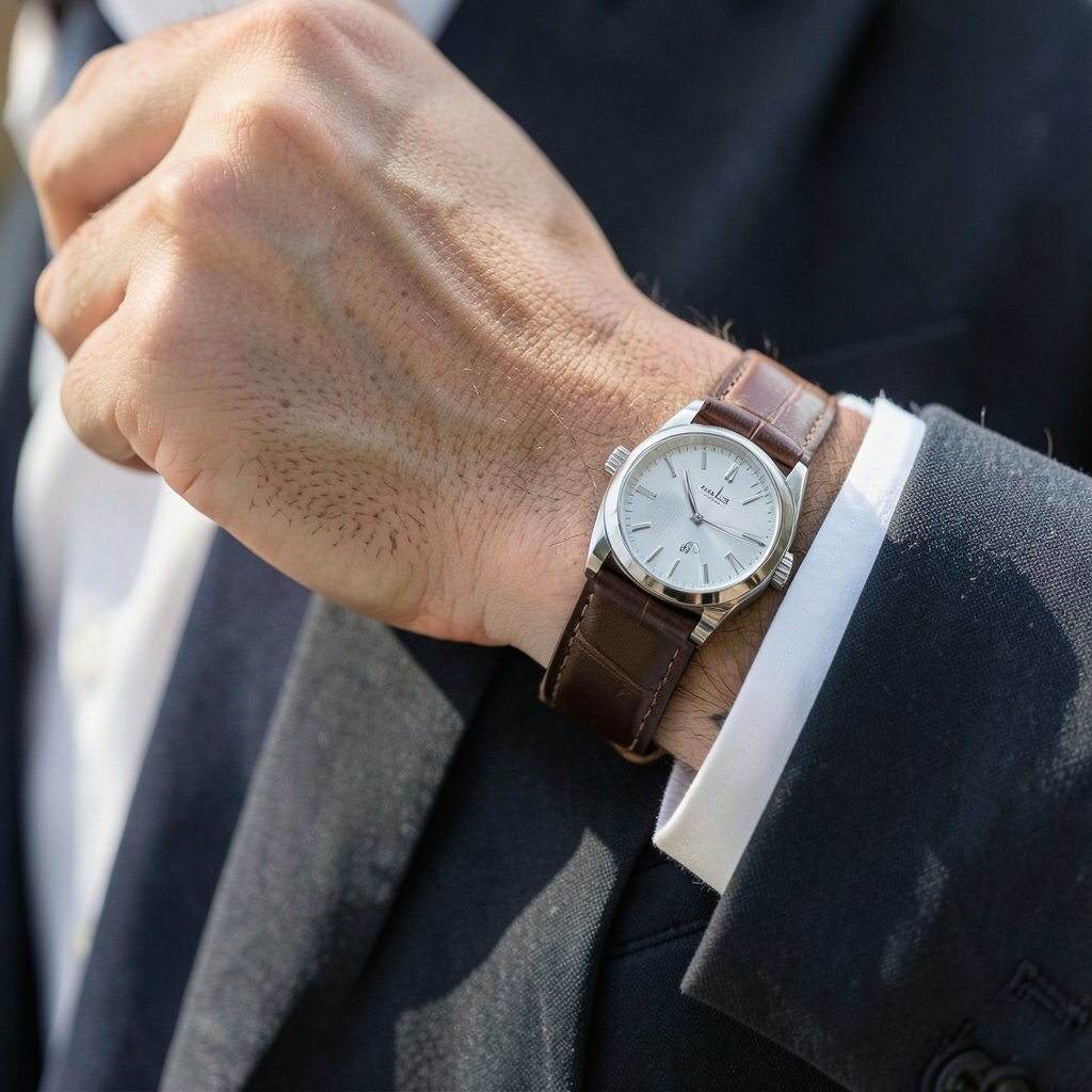
Your watch strap can either blend in or create a cool contrast with your suit. Leather straps look classic and warm, while metal bracelets feel sharp and modern.
If you want the suit to look traditional, choose a leather strap in brown, black, or deep espresso. If you want a fresh look, a metal bracelet with clean links can echo the tie bar finish and cuff links. For practical comfort, ensure the watch doesn’t sit too loose because weddings involve a lot of movement and hand gestures.
Personalize by selecting strap color based on your belt and shoe tones, or intentionally contrast it if your accessories already connect the palette. Cost can be managed because swapping a strap is often easier than replacing a full watch. Current trends show more men wearing mixed materials, like leather accessories with sleek metal details, and this is a great way to do it tastefully.
16. Socks Contrast: Patterned Socks With Neutral Shoes

Most people remember the front view, but patterned socks can be a fun contrast when you sit, walk, or dance. Neutral shoes keep the look classy while socks add a pop of personality.
This detail benefits you in a practical way because it’s easy to swap for comfort and style without major wardrobe changes. Pick sock patterns that match your tie color, your wedding colors, or your boutonniere accent. Keep the sock height right so you don’t worry about it during photos.
For personalization, choose a pattern that reflects your personality, like small stripes, micro checks, or a subtle geometric print. If you want cost control, socks are an affordable way to bring in variety when you’re working with a limited budget. Current trends encourage playful details, and socks are the perfect place for it since they don’t dominate the whole outfit. A quick tip is to buy a pair that stays in place and feels breathable for the whole day.
17. Colorful Boutonniere Stem vs. Neutral Suit Colors
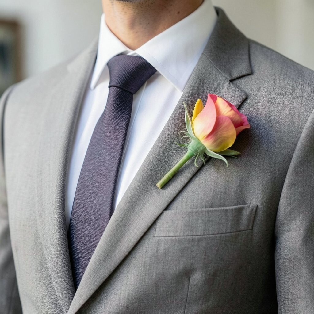
A boutonniere adds contrast at the exact spot where eyes naturally focus. When your suit is neutral, a colorful stem and bloom create a striking focal point.
Choose flowers and greenery that stand out in your wedding lighting, especially if you’re doing outdoor photos. The benefit is that your face and upper chest look more lively, and your outfit feels complete. For practical planning, secure the boutonniere well so it doesn’t droop while you shake hands and move through the ceremony.
Personalize by matching the flower tone to your tie, pocket square edge, or even your wedding arch colors. If you’re mindful about cost, consider seasonal flowers since they often look just as rich and can be easier on the budget. Current trends lean toward textured natural greenery and slightly imperfect arrangements, which look modern and authentic in pictures. A smart idea is to carry a spare pin and a small lint remover so your lapel stays tidy until the last photo.
Pair this contrast with clean grooming and a well-pressed shirt collar so the boutonniere can truly shine.