
The color choices you make can set the mood before anyone even sits down. Small weddings shine when the palette feels personal and effortless.
With the right shades, your micro celebration can look styled, not stressful.
1. Blush and Soft Champagne Glow

Think of blush petals with a gentle shimmer, like evening light catching the edge of satin. Pair it with soft champagne tones so everything feels warm and bright.
This palette flatters photos because blush adds softness while champagne keeps the look polished. It also works beautifully for tiny guest lists since you can keep décor simple and still feel intentional. For a practical touch, mix matte blush linens with a few metallic champagne details in candle holders or place settings.
To make it unique, add a single accent that feels like your story, such as dusty rose ribbon on napkins or champagne-toned stationery with a subtle floral pattern. Budget-wise, you can find many faux florals in blush shades and use real greenery sparingly for a fresh, not-overpriced feel. A current trend is mixing warm neutrals with one romantic pink, especially for intimate outdoor or indoor ceremonies.
2. Sage Green With Creamy Ivory Calm
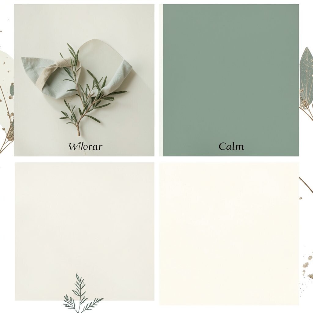
Sage green brings a peaceful, garden-like vibe without looking too bold. Combine it with creamy ivory for a clean, timeless base that feels airy and modern.
This combination makes small spaces feel larger because ivory brightens every corner. It’s also easy to style because you can reuse one dominant green across multiple elements like menus, signage, and table runners. Keep it practical by choosing one floral shape and sticking to it in sage and ivory for a cohesive look.
If you want personalization, weave in herbs or botanical textures, like a sprig of rosemary tucked into a napkin or a sage-colored ribbon tied around favors. For cost considerations, look for sale greenery and buy a few high-impact stems for the ceremony area, since you only need enough for photos and the couple’s backdrop. The current vibe favors muted greens over bright neon shades, especially for micro weddings that want to feel calm and grounded.
3. Dusty Blue, Powder White, and Silver Sparkle

Dusty blue feels gentle and dreamy, like a clear sky softened by clouds. Add powder white to keep the palette crisp, then sprinkle in silver for light-catching sparkle.
This color set creates a cool-weather elegance that photographs beautifully, especially in natural daylight. Since you’re working with a smaller guest group, you can afford to invest in a few standout details like silver-framed tablescapes or a shimmer runner. For practical tips, choose one shade for larger items and let the others appear in smaller doses so the look stays balanced.
Make it unique by using dusty blue in your stationery and ceremony signage, while keeping the florals mostly white with a few blue focal blooms. Cost can stay friendly when you rent or borrow silver décor and use affordable candles in mercury glass style containers. A trend right now is “quiet sparkle,” where metallics look subtle rather than flashy, which fits micro weddings perfectly.
When choosing outfits, dusty blue looks lovely with neutral hair accessories and soft makeup tones, so your guests feel cohesive without matching exactly. If you plan a winter or evening event, silver accents will look extra stunning as the light gets lower.
4. Terracotta, Warm Sand, and Olive Depth

Terracotta brings warmth and earthy charm, like sunbaked clay and cozy blankets. Pair it with warm sand for a soft base, then add olive for depth and a natural finish.
This palette is great for small gatherings because it feels inviting even with minimal décor. It also helps you avoid an overly “perfect” look, since the colors are naturally imperfect and organic. Try practicality by using terracotta for one main moment like your arch ribbon, then repeating it lightly across place cards and favors.
5. Charcoal Gray With Blush Accents for Modern Romance

Charcoal gray adds a sleek, grown-up feel, and blush accents keep it sweet instead of severe. The contrast looks stunning in photos and gives your micro wedding a “designed” look fast.
This palette benefits couples who want a modern theme without going all the way to black and white. It’s also easy to personalize because charcoal pairs well with almost any texture, from velvet to satin. For practical tips, choose charcoal as the background for signage and runners, then use blush in florals or napkins to bring the romantic energy back.
To keep costs reasonable, focus on one or two luxury-feeling materials like a blush satin ribbon and a few charcoal candles. You can also use printable blush cardstock for menus and table numbers so you don’t need expensive custom stationery. A current trend is combining moody neutrals with one blush or pink tone, especially for city venues, lofts, and evening receptions.
6. Emerald Green With Gold-Leaf Warmth

Emerald green looks rich and vibrant, like jewelry tones that feel special without extra fuss. Add gold-leaf accents to create a glow that feels celebratory.
This palette works well for micro weddings because it can look luxurious with fewer décor pieces. It also benefits your photography since deep green makes skin tones pop and adds depth to group shots. Use practical placement tricks by adding gold only where light hits, such as on candle lids, picture frames, or menu covers.
If you want uniqueness, choose florals with different shapes, like combining smooth roses with textured greenery, and let the green carry the theme. For cost considerations, you can swap real gold-leaf for affordable metallic foil stickers on invitations and place settings. Emerald with gold is still very popular because it feels timeless, and it’s especially perfect for indoor venues where you can control lighting.
7. Lilac, Soft Lavender, and White for Gentle Magic
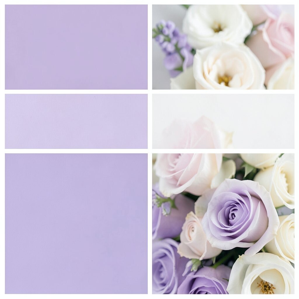
Lilac tones feel whimsical and sweet, especially when paired with soft lavender and clean white. This palette can look fairy-tale pretty while still feeling light and modern.
It’s a great choice for small weddings because it turns simple décor into a dreamy scene. The benefit is that lilac and white blend easily with many flower options, so you won’t feel trapped by one expensive bloom. For practical tips, use lilac in your fabric elements like table runners or chair sashes, then keep florals mostly white with a lilac center.
To personalize, add a hint of your favorite scent with lavender sachets tucked into favor bags. Cost can stay under control by choosing one larger floral arrangement in lilac and using smaller white bouquets elsewhere. A current trend is using soft purple hues for spring weddings, especially in minimalist venues where color needs to do the heavy lifting.
If you’re considering an outdoor ceremony, lilac looks extra magical against greenery and pale stone walls.
8. Coral, Peach, and Cream With Sunlit Energy
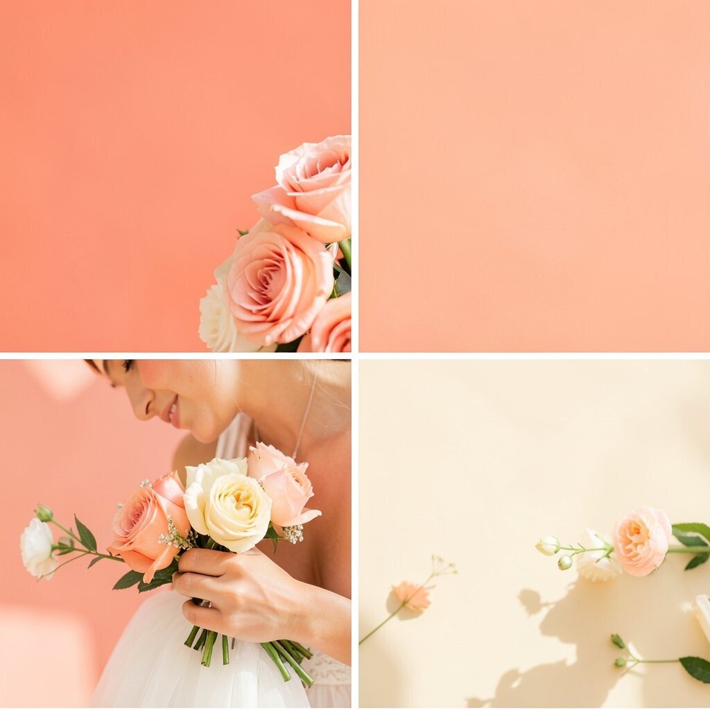
Coral and peach create a sunny mood that feels fun and friendly, even for a small guest list. Add cream to soften the look so it feels elegant rather than loud.
This palette benefits couples who want celebration energy without going too neon. It’s also unique because coral and peach can lean vintage, tropical, or modern depending on your textures. A practical way to style it is to mix coral napkins with cream plates, then add peach in the floral focal points like a bouquet or centerpiece.
Personalize your wedding with small “sun” details such as citrus-shaped place cards or a peach-toned ribbon tied to favors. To manage costs, buy cream décor pieces first and then add coral accents through paper goods and flowers, which are often easier to find in budget-friendly shades. Coral palettes remain a current trend because they feel warm and flattering in both bright daylight and indoor golden lighting.
9. Black Cherry, Burgundy, and Warm Gold for Evening Glam

Black cherry and burgundy bring deep, romantic drama that looks amazing at night. Add warm gold accents so your micro wedding feels like a real celebration, not just a quick gathering.
This palette is great for intimate events because it feels bold even with fewer decorations. It benefits your photos by creating rich contrast and making any candlelight look extra cozy. For practical tips, keep the main fabric dark and let gold appear in small details like cutlery polish, frame edges, or mini ornaments.
To keep it unique, choose one unexpected texture like a velvet table runner in burgundy and pair it with glossy deep berry accents. Cost considerations are easier when you limit expensive décor to one or two focal points such as the ceremony backdrop and a statement centerpiece. Burgundy and cherry tones are a current favorite for fall and winter micro weddings because they feel luxurious and seasonal.
10. Classic Navy, White Linen, and Sky-Blue Pop

Navy feels timeless and clean, like a crisp suit and a perfectly pressed shirt. Add white linen for a fresh base, then include a sky-blue pop for a cheerful touch.
This palette benefits you because it’s flexible for many venues, from seaside rooms to city halls. It also helps guests visually separate from the décor, since white and navy create clear contrast in group photos. A practical approach is using navy for table linens and signage, and saving the sky-blue for flowers or small decorative items.
For personalization, add a navy-and-sky-blue ribbon tied around napkin bundles or favor boxes. If you’re planning a coastal vibe, look for sky-blue accents in seashell-themed stationery or even a simple blue wax seal for letters. Cost can be kept friendly by using white dishes and letting your color live in printed materials and a few flower clusters, which is often cheaper than building color into every item.
11. Canary Yellow, Pale Gray, and White for Cheerful Simplicity
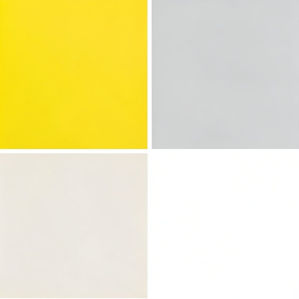
Canary yellow brings instant cheer and makes even a small ceremony area feel lively. Pair it with pale gray and crisp white to keep the look balanced and modern.
This palette benefits micro weddings by adding brightness without needing lots of décor. It’s also unique because yellow can feel fresh and playful when paired with soft neutrals rather than heavy dark tones. For practical tips, use canary yellow sparingly in your centerpieces and let white table settings carry most of the clean look.
To personalize, choose yellow accents that match your story, like a favorite flower in yellow or a small charm attached to favors. Cost considerations are usually manageable because yellow flowers can be seasonal and you can use bright paper goods for larger visual impact. Yellow weddings are a current trend when they feel “soft sunshine,” meaning the yellow is warm and not harsh, which works beautifully for intimate celebrations.
If you worry about yellow being too bold, choose mustard-canolike shades and keep the rest light and airy.
12. Rosewood Pink, Nude, and Soft Gold Accents
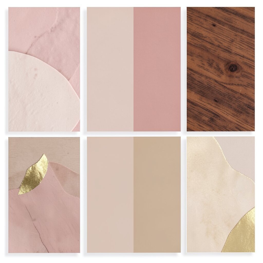
Rosewood pink gives a sophisticated blush-like tone that feels romantic but grounded. Pair it with nude shades and soften everything with soft gold accents for a subtle glow.
This palette benefits couples who love romance but want something more grown-up than bright pink. It also works well with many skin tones because nude and soft gold are naturally flattering in photos. For practical tips, use rosewood in your florals or bridesmaid-style ribbon, then keep tableware neutral and let gold appear in tiny touches like candle labels and card holders.
To make it unique, pick one signature element such as rosewood foil on invitations or a nude-colored backdrop with rosewood greenery. Cost considerations improve when you choose affordable neutral décor and add only a few gold-toned pieces, since metallics can be concentrated in one area. A current trend is using “soft metallics,” where gold looks gentle and warm rather than stark.
13. Teal, Seafoam, and White With Coastal Freshness
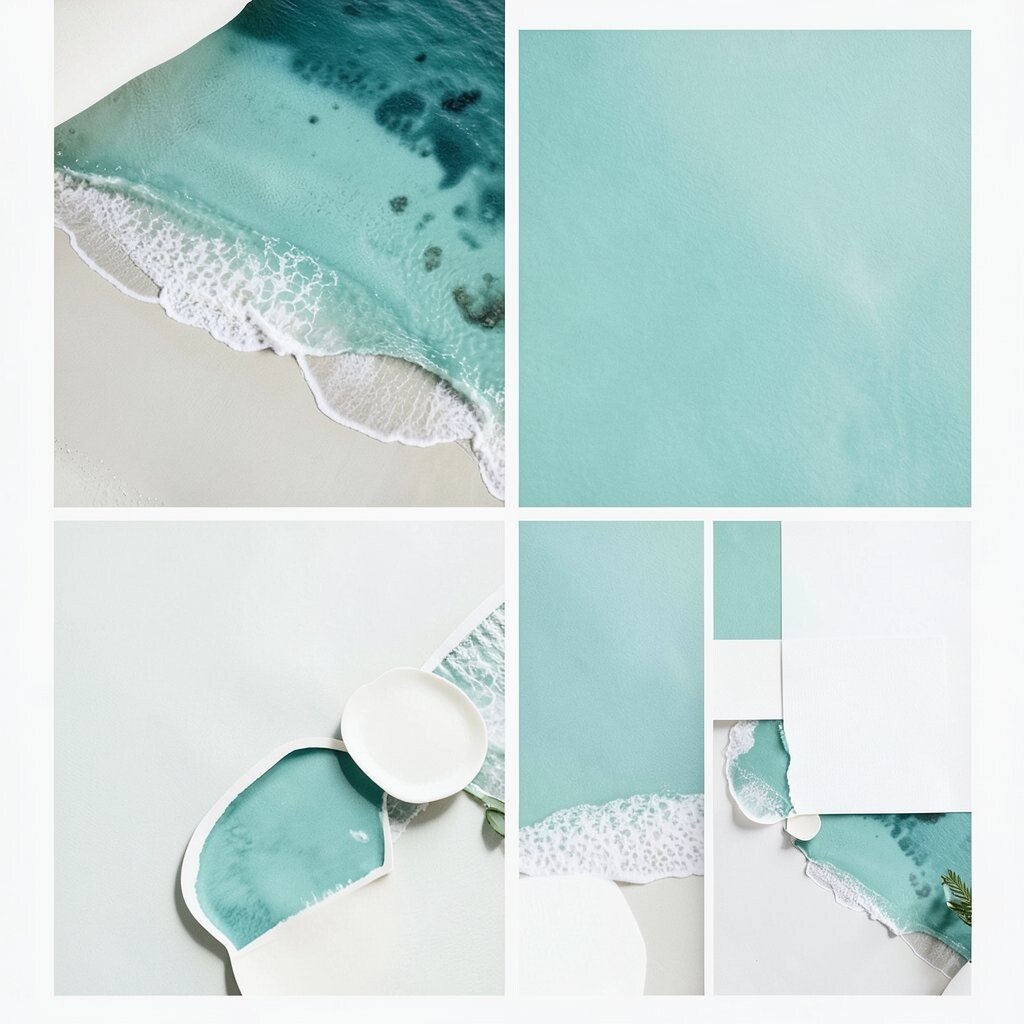
Teal and seafoam bring ocean energy that feels calm and refreshing. Add white so the palette stays bright, breezy, and photo-ready.
This combination benefits micro weddings by making your décor look cohesive even when you keep things simple. It also creates uniqueness because teal has a depth that feels more interesting than basic beach neutrals. For practical tips, use teal for your backdrop or ceremony signage and seafoam for table details like napkins, vases, or menu cards.
Personalize the look with coastal-inspired touches such as driftwood-style frames, subtle wave patterns on stationery, or tiny shells used sparingly for visual texture. Cost can stay under control by focusing on paper goods and one statement centerpiece, since teal and seafoam already do a lot of visual work. A trend worth considering is pairing ocean colors with modern, clean typography for a polished coastal vibe.
14. Deep Plum, Dusty Rose, and Antique Brass Charm
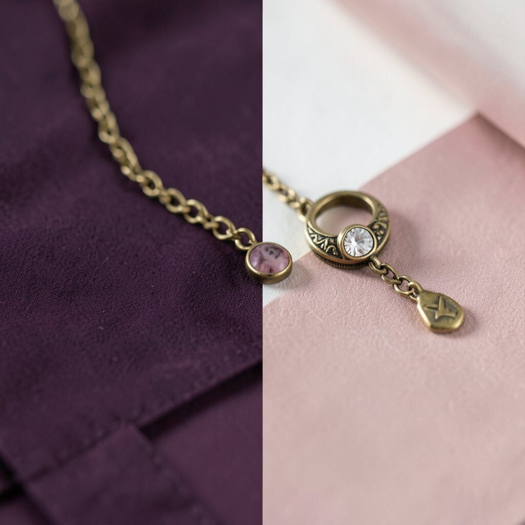
Deep plum feels elegant and artsy, especially when paired with dusty rose for a softer romantic layer. Add antique brass so everything looks warm and a little vintage.
This palette benefits couples who want something rich without using black as the main color. It also looks unique in both indoor and outdoor light because plum shifts beautifully across shades. For practical tips, keep plum in larger elements like table runners and large floral forms, then sprinkle dusty rose in smaller blooms and antique brass in frames and candle finishes.
To personalize, consider using your favorite fabric pattern on one or two pieces such as chair sashes or a veil-like backdrop in dusty rose. Cost considerations can be managed by choosing affordable brass-toned décor and using real greenery to keep floral arrangements full without high-priced blooms. Plum and vintage metal tones are a current trend because they feel distinct from the usual pastels.
If you’re worried about plum looking too dark, balance it with plenty of white in table linens or in your florals.
15. Forest Green, Cream, and Natural Wicker Texture
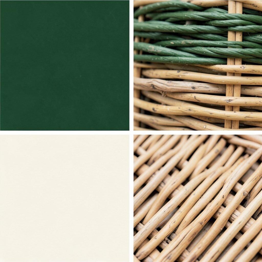
Forest green feels classic and grounded, like a walk through a shaded path. Pair it with cream for warmth, then bring in natural wicker texture for a rustic modern finish.
This palette benefits micro weddings by creating an earthy look that still photographs cleanly. It’s also unique because texture does a lot of work, so you don’t need a huge variety of colors to feel styled. For practical tips, use forest green in the greenery arrangements, cream in linens, and wicker in trays, chargers, or small serving pieces.
To personalize, add handmade touches like small wood tags with your names or a cream-colored ribbon tied around wicker baskets. Cost considerations are often favorable because natural textures can be sourced affordably at craft stores and thrift shops, then refined with paint or ribbon. The current trend favors “warm natural” palettes that feel intentional and cozy, which is perfect for intimate ceremonies.
16. Blazing Red-Orange, Soft Peach, and Creamy White Pop
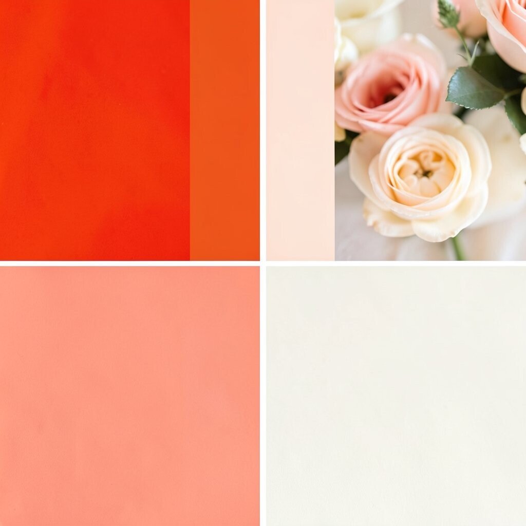
Red-orange adds bold excitement, while soft peach keeps the mood friendly and inviting. Finish with creamy white so the palette stays bright and elegant instead of overwhelming.
This palette benefits micro weddings by making your photos feel energetic and full of life. It’s also unique because it leans into warmth without being strictly traditional red, which feels fresh and modern. For practical tips, use red-orange as an accent in florals or napkins and let cream do the calming work across table settings.
Personalize your wedding with meaningful color reminders, like using red-orange spices as part of favors or adding a peachy ombré effect to paper goods. Cost considerations can be managed by selecting seasonal orange-peach blooms and supplementing with greenery and affordable filler flowers. A current trend is using warm “sunset” tones for small celebrations because they look stunning in both indoor evening light and outdoor golden hour.
When you style outfits, encourage neutral makeup and simple accessories, so the colors feel cohesive instead of competing.