
Every wedding skirt can feel like a whole story on its own. The right pattern makes the look feel special without trying too hard.
1. Vintage Lace Overlay With Soft Rose Motifs
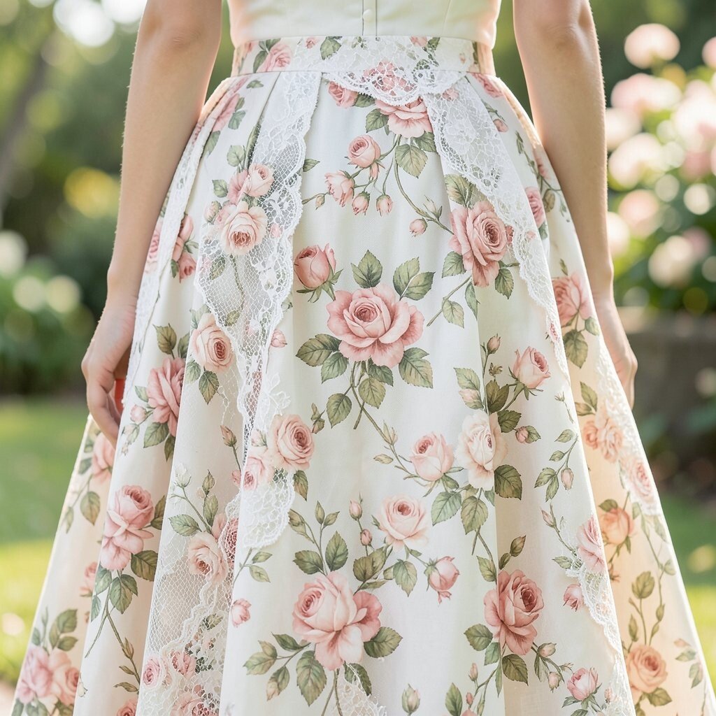
Picture a wedding skirt that looks like it was pulled from a dreamy old postcard. The lace overlay falls in gentle waves, and tiny rose motifs catch the light as you move.
This kind of pattern feels romantic and timeless, which means it pairs well with classic styling. It also flatters many body types because lace adds texture without adding harsh lines. Choose a skirt with a slightly heavier lace for structure, especially if you want the fabric to hold its shape during photos. If you plan to wear heels, check that the lace hem lands at a flattering spot so the bottom edge looks crisp in every pose.
2. Watercolor Florals On A Flowing Tulle Base
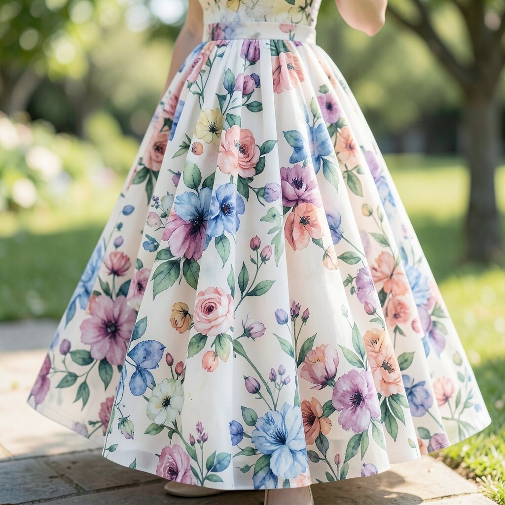
Imagine walking into a room and seeing your skirt look like a soft watercolor painting in motion. The florals blur into each other with dreamy edges, and the tulle makes everything feel airy and light.
This pattern brings an easy, fresh vibe that feels modern while still feeling romantic. For practical comfort, pick a tulle layer that doesn’t itch and consider lining that feels smooth against your skin. To personalize the look, match your bouquet tones to the strongest colors in the print. If you want extra drama, add a simple satin belt in a color from the watercolor palette.
3. Bold Gingham Panels In Pastel Checks
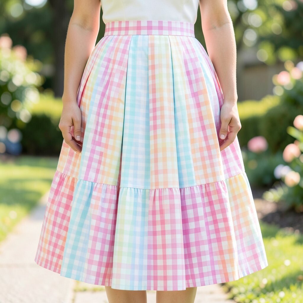
A skirt with gingham panels can look playful and elegant at the same time. The checks feel crisp, and the pastel shades create a gentle pop that still looks refined.
This is a great choice when you want a clear pattern without needing heavy embellishments. Since gingham has clean lines, it can make the silhouette look neat and tailored. Keep it practical by choosing a fabric with good drape so the checks don’t look stiff when you sit. For personalization, use embroidery thread or small appliqués that echo one check color, tying your accessories together.
When it comes to cost, printed fabrics can be easier on the budget than heavily embroidered options. Look for quality printing with even color and sharp edges, because fuzzy checks can look cheaper in photos. Current seasonal trends often mix classic patterns with softer colors, which means gingham fits right in. If you’re hosting outdoor photos, the light pattern can look extra charming against greenery.
4. Abstract Brushstroke Layers In Neutral Earth Tones
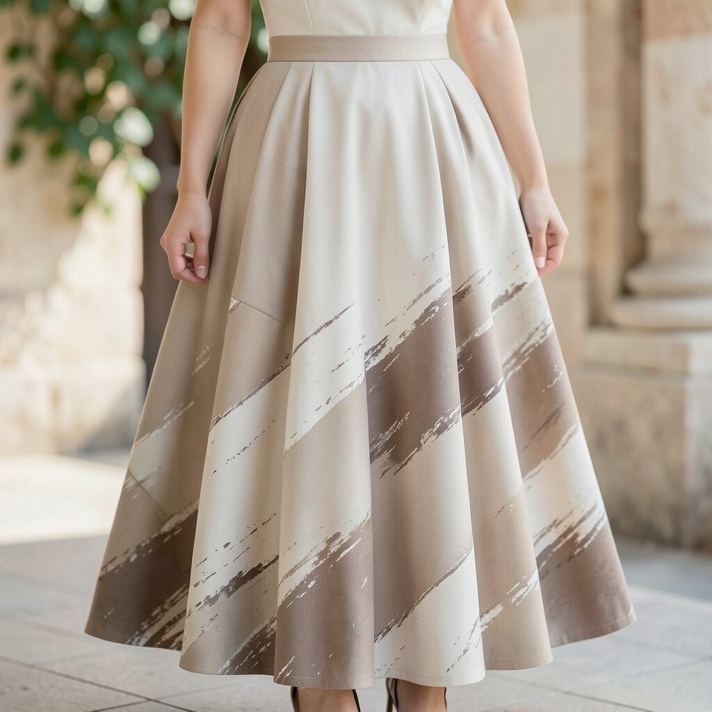
Think of a wedding skirt that looks like an artist brushed color across it, but in warm, calm shades. Earthy tones like clay, sand, and cocoa make the pattern feel grounded and elegant.
This kind of abstract design works beautifully if you want uniqueness without loud colors. The layered brushstrokes add visual depth, which can make your outfit look fuller even if you choose a lighter fabric. For practical styling, pair it with a simple fitted bodice so the skirt stays the focus. If you like a polished look, go for satin or crepe accessories that match the undertones of the print.
To keep it comfortable, choose a skirt with movement, such as a soft A-line or a lightly flared shape. When you want cost control, look for digitally printed fabrics, which often cost less than hand-painted details. For personalization, select earrings or a hair clip in one of the brushstroke shades. Current trends lean toward artsy, modern wedding looks, and abstract patterns fit perfectly into that mood.
5. Classic Polka Dots With Pearl-Like Texture
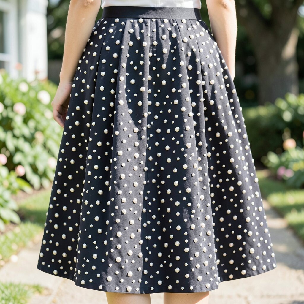
Polka dots can feel sweet and clean, especially when the dots look like tiny pearls. The texture catches light, and the pattern adds a playful rhythm as you walk down the aisle.
This skirt idea gives you built-in charm, which means your styling can stay simple. For benefits, the repeating pattern helps the whole outfit look balanced, even if your bodice is detailed. Choose a dot size that matches your height and proportions, and test how it looks when you stand in front of a mirror. If you’re planning lots of movement, look for a fabric that doesn’t snag easily on jewelry or veils.
To personalize the look, coordinate your shoes with one dot shade and add a small satin ribbon at the waist. For cost considerations, pearl-like texture can be more affordable in printed form than true beading. Keep an eye out for quality stitching so the dots don’t peel or fade with time. This style also follows current trends that favor “quiet statement” pieces that look fun yet elegant.
6. Floral Scrollwork On Scalloped Hem Panels
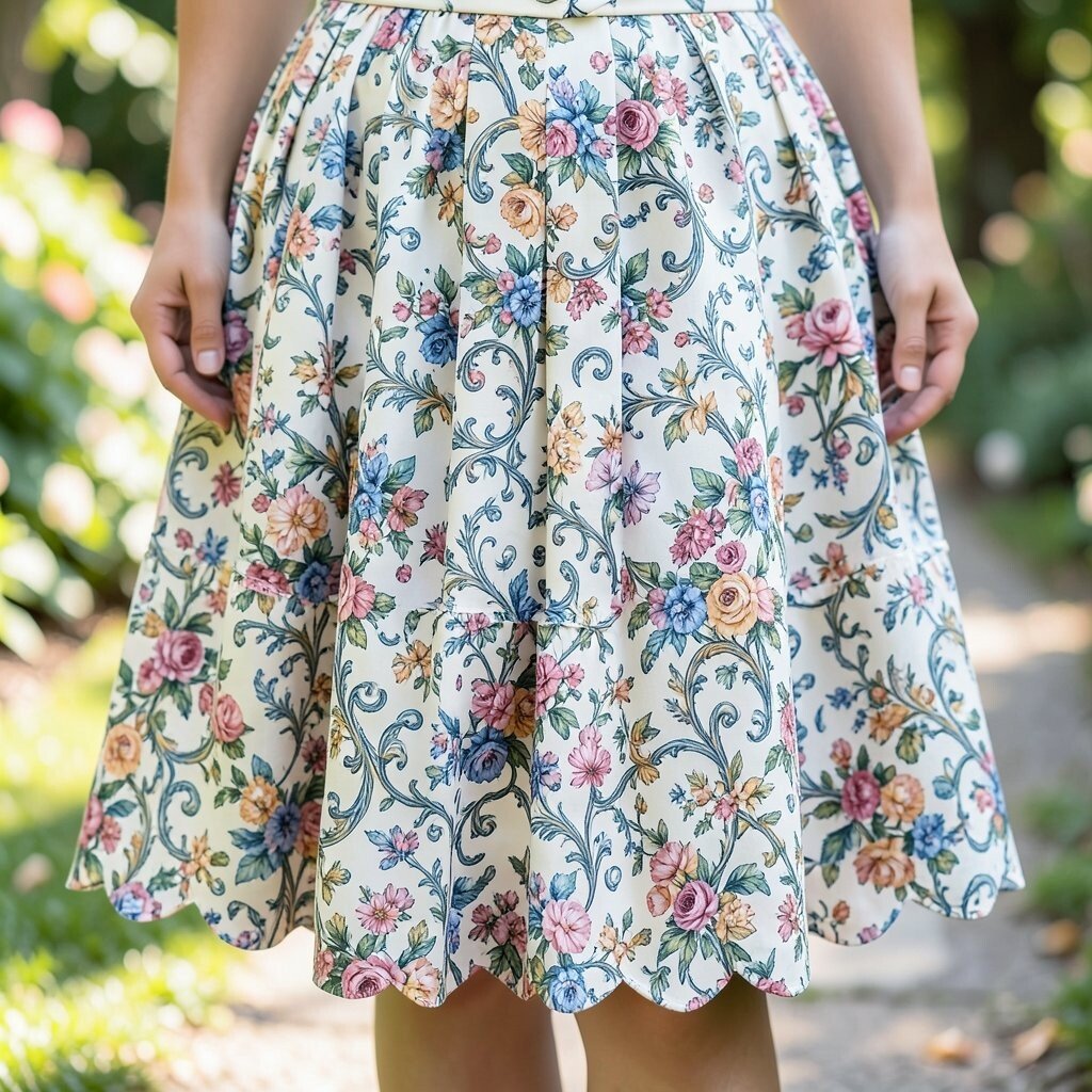
Picture floral scrollwork placed along scalloped hem panels, creating a soft border that frames your steps. The pattern feels like a decorative bracelet wrapping around the skirt’s edges.
This design is wonderful for photos because the hem becomes a focal point when you turn or walk. It adds uniqueness in a subtle way, since the main print appears in flattering zones rather than across the whole skirt. For practical tips, pick a skirt with a sturdy lining so the scallops keep their shape. Consider wearing shoes with a similar tone to the hem border so the pattern looks intentional from top to bottom.
7. Geometric Triangle Quilt Pattern For Modern Charm
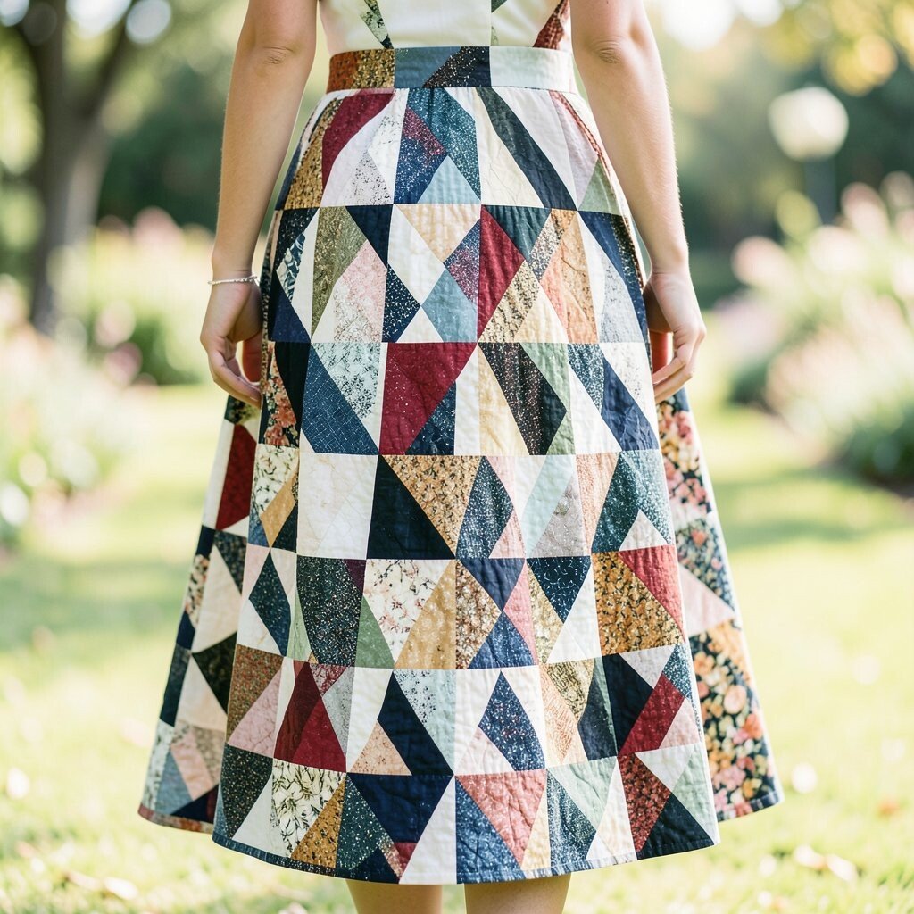
A triangle quilt pattern brings instant modern energy to a wedding look. The lines feel structured, and the shapes create movement that looks great in both natural light and flash photos.
This is a smart choice if you want a skirt that feels bold yet still neat. Geometric designs can also create a flattering visual path, which helps the silhouette feel intentional. For practical personalization, choose a color palette that matches your venue, like warm neutrals for barns or cool tones for city halls. If you love variety, coordinate your veil or headpiece to one triangle color for a tied-together look.
Cost varies based on how the pattern is made, so printed quilt-style fabrics can be budget-friendly. If you’re going for stitched-looking details, expect the skirt to cost more, but it also tends to feel extra luxe. A current trend is mixing modern patterns with classic accessories, which means you can pair this skirt with a timeless veil and elegant earrings. To prevent pattern mismatch, keep your bodice fabric simple and solid rather than competing with prints.
8. Sunburst Stripes That Gradually Fade In Color

Sunburst stripes that fade from bold to soft can look like a gentle sunrise on your skirt. The rays feel dynamic, while the fade keeps the look romantic and wearable.
This pattern is great for benefits like drawing attention upward and giving your outfit a light, uplifting vibe. The gradual color shift also helps hide minor wrinkles, which is useful on busy wedding days. Choose a waistline style you love, then let the skirt do the interesting work. For practical tips, steam the skirt well before the ceremony so the fade lines look smooth and even in photos.
If you’re thinking about personalization, match your bouquet ribbons to the lighter end of the fade for a soft tie. For cost considerations, ombré-style prints can be less expensive than heavy embroidery, while still looking high-end. This style feels very current, since many brides are choosing “sun-kissed” color stories and movement-heavy textiles. Add a simple belt or sash in a neutral shade to keep the transition polished.
9. Botanical Leaf Print With Elegant Dark Base
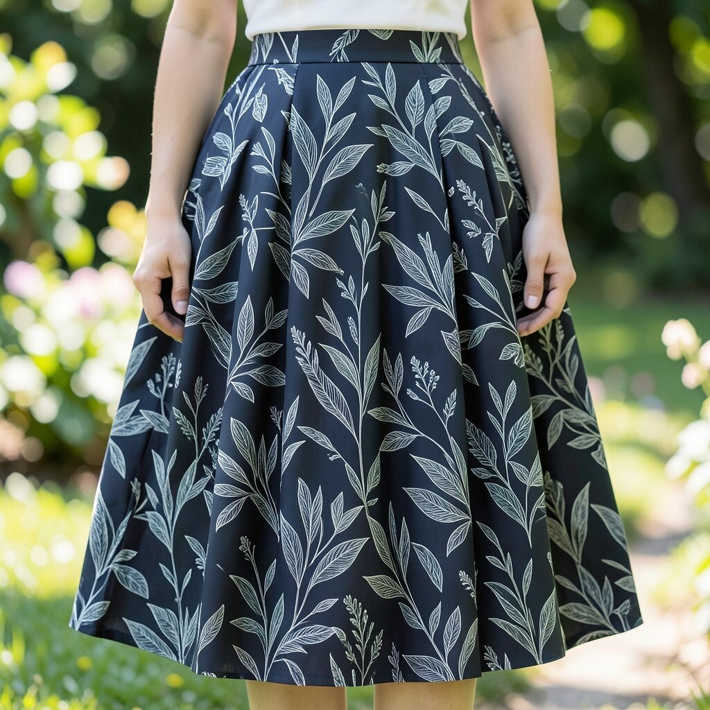
A botanical leaf print on a darker base can feel rich, graceful, and a little mysterious. Leaves create soft curves across the skirt, and the contrast makes the pattern stand out.
This is a beautiful option if you want uniqueness that isn’t just bright color. The dark base also brings practical benefits, since it can look forgiving and less showy with small scuffs from venue surfaces. Look for a leaf pattern that feels balanced, with enough spacing so it doesn’t blur into one block of print. For personalization ideas, pick a hair accessory in a leaf-like shape or choose earrings that match the green tones.
10. Dramatic Abstract Waves In Monochrome
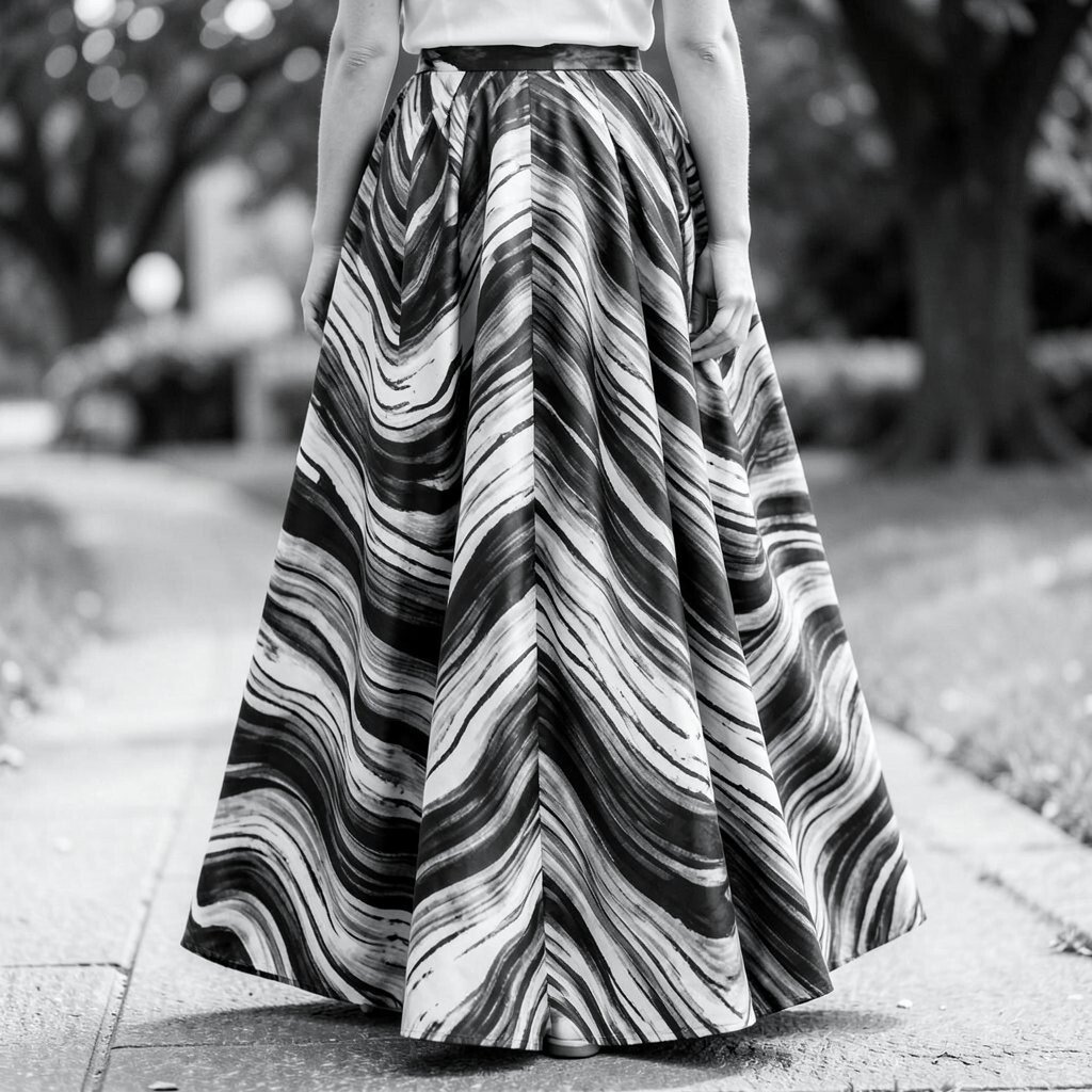
Monochrome abstract waves can look like fabric was made from flowing ink. The pattern moves in curves, and the skirt feels sleek and modern without losing romance.
This style is ideal when you want a clean, elegant look that still feels artistic. The wave pattern can add visual flow, which helps the outfit look graceful during movement. For practical tips, keep the bodice simple and smooth so the pattern stays the star. If you want extra personalization, choose a veil that adds texture, like soft tulle, to balance the bold print.
Cost considerations are often favorable with monochrome printed designs, since you can get a strong look without heavy decoration. Look for crisp edges and consistent color depth across the panels. Current trends include monochrome fashion stories, and a wave pattern gives that trend a bridal twist. Finish the outfit with jewelry in silver or matte gold to keep the palette cohesive.
11. Retro Deco Fans With Metallic Thread Effect
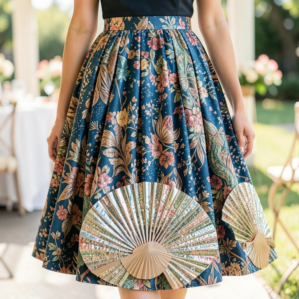
Retro deco fan patterns can feel glamorous in a bold, structured way. The design often resembles classic fan shapes, and a metallic thread effect adds sparkle without needing full-on sequins.
This skirt delivers a uniqueness that looks instantly special, especially in evening light. The metallic effect gives practical benefits too, because it can highlight movement and make photos look lively even in dim venues. Choose a fabric blend that won’t feel too stiff, so the fans don’t fight your movement when you sit or dance. For personalization, match your earrings to the metal tone in the skirt, and keep your neckline jewelry minimal so the skirt stays balanced.
If you’re managing cost, look for skirts that use subtle metallic printing or thread effect rather than full beadwork. Those options can keep the look fancy while staying more budget-friendly. Current trends favor art deco touches in weddings, and fan motifs fit right into that spirit. If your venue has geometric architecture, this skirt pattern will look like it was made for the setting.
12. Subtle Chevron Confetti For A Light, Playful Silhouette
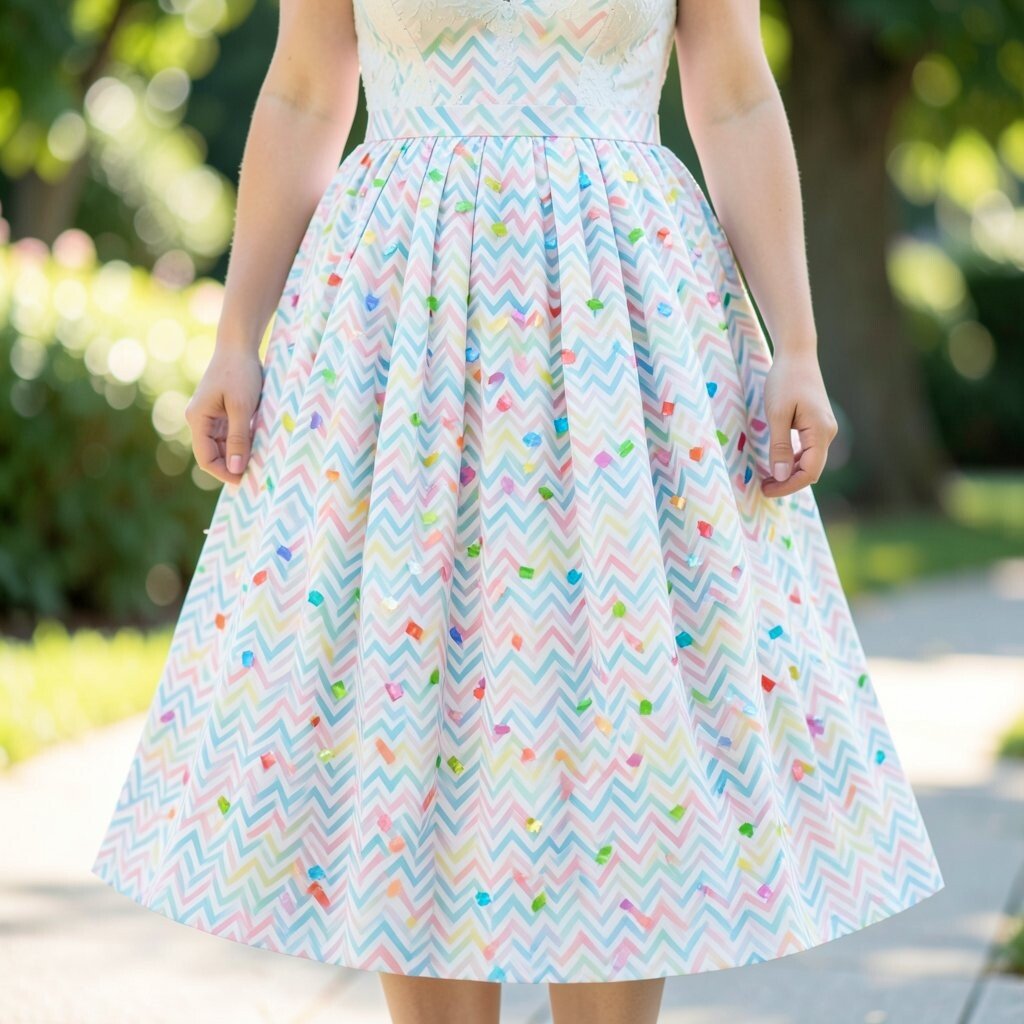
Chevron confetti is like a gentle party made from triangles and tiny bursts of pattern. The chevrons create energy, while the lighter placement keeps the skirt soft and approachable.
This is a fantastic option if you want a skirt that feels cheerful but still wedding-appropriate. The pattern can also help visually define the silhouette, giving a flattering line as the skirt falls. For practical tips, choose chevrons that are not too dense so the fabric still moves freely and doesn’t feel heavy. To personalize your look, coordinate your bouquet wrap or ribbon with one color from the confetti pattern.
On cost considerations, subtle prints are often more affordable than fully embellished skirts, while still looking eye-catching. Make sure the pattern placement is aligned across panels, since uneven prints can show in photos. Current trends often celebrate playful details that aren’t too busy, and chevron confetti fits that style perfectly. Finish with simple accessories in a solid tone so the pattern gets full credit for the look.