
The invitation you choose sets the mood before anyone even steps into your venue. When woodland details show up on paper, guests instantly feel warm, grounded, and excited.
From soft leaves and earthy inks to forest critters and rustic paper choices, these invitation styles help your day feel personal and unforgettable.
1. Pressed Fern Romance

Think of invitations that look like real pressed greenery, with delicate fern textures layered into the design. The overall feel is airy, romantic, and a little bit wild in the best way.
For visual impact, use deep moss green printing plus subtle cream paper so the “leaf” effect looks natural. Guests benefit from clear event details because the fern pattern can sit behind key text while still staying gentle. This style feels unique for spring weddings and nature-themed gatherings, and it also photographs beautifully in outdoor light. Keep it practical by choosing a high-contrast font for addresses and times so nothing gets lost against the botanical background. If you want personalization, swap the fern for locally meaningful leaves from your region or even your favorite garden plant. Costs usually stay manageable when you use printed leaf textures instead of real botanicals, and you can reduce expenses further by going with flat cards rather than heavy multi-layer designs.
2. Whispery Watercolor Pines
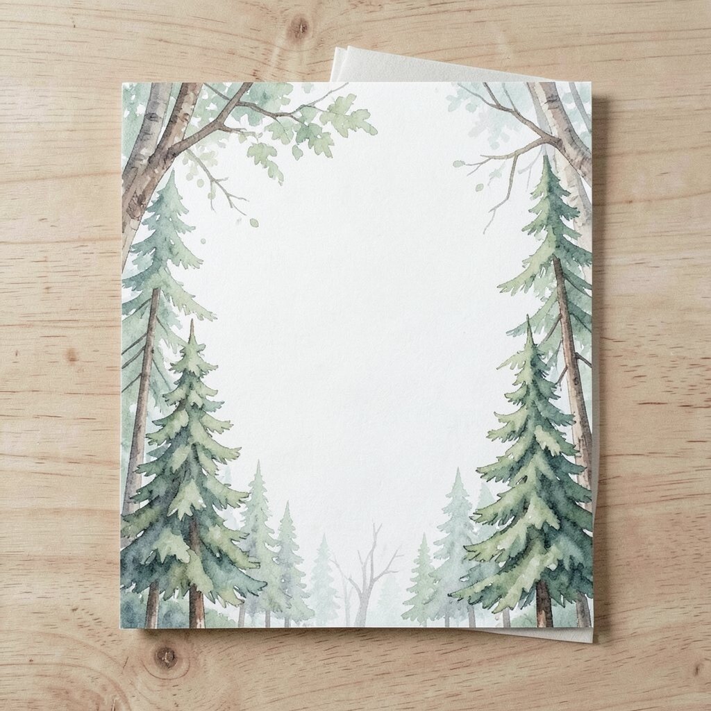
Soft watercolor pines create a calm, dreamy invitation that looks like it was painted with misty morning air. The color palette often includes sage, slate blue, and warm stone tones.
This look is easy on the eyes and feels modern compared to traditional forest prints. Guests enjoy the gentle vibe, and you can keep the layout spacious so details feel effortless to read. Make it practical with a simple background fade and darker ink for your names and dates, especially if you expect daylight reception photos. For uniqueness, include a small pine branch illustration at each corner that frames the information without crowding it. Personalize by matching watercolor tones to your wedding florals, like blush roses with green-gray leaves. Cost considerations are usually friendly because watercolor effects can be created digitally with fewer special steps, and you can choose one main card plus a separate enclosure card for maps.
3. Acorn Seal Letters

Picture a cream or kraft invitation finished with a seal that resembles an acorn cap. It gives a classic woodland charm with a satisfying, hands-on detail.
Guests will love the little ritual of opening the invitation, which makes it feel special before they even read the first line. The acorn motif also works as a guide for your overall theme, especially if you repeat it on menus or table numbers. For practicality, keep the main card readable by placing the seal on the flap or back so your front text stays clean. To make it unique, choose a slightly uneven seal shape and pair it with matching typography that feels warm and friendly. Personalize by sealing the envelope with a custom monogram in the acorn’s center, such as your initials or wedding date. Costs may rise if you add foil or real wax seals, but you can keep it budget-smart by using adhesive “wax-look” stickers or a printed seal texture that still feels premium.
If you’re on a tight schedule, order envelopes that are pre-printed with the acorn pattern so assembly is quick and consistent. And if you want a current touch, consider matte finishes and subtle metallic highlights rather than heavy glitter or busy patterns.
4. Woodland Blueprint Coordinates

Try an invitation design that looks like a gentle map with soft lines, stamped coordinates, and tiny compass accents. It feels like a craft project, yet still looks polished on a cardstock base.
This style benefits guests by clearly showing directions and nearby landmarks while keeping everything on theme. It’s also unique because it combines “forest wander” energy with helpful planning. For practical tips, use a legible street label font and include a QR code for the latest route, especially if weather might change travel times. Personalize by adding the exact latitude and longitude of your ceremony site, then match the ink color to your color palette. Cost-wise, you can keep printing straightforward by using one or two inks and avoiding too many layers. A current trend is mixing functional design with mood, so a blueprint look can feel both useful and modern.
5. Stag Silhouette Invitations

Imagine black-and-olive invitations featuring a calm deer or stag silhouette in profile. The image feels bold but elegant, like the forest is speaking in a quiet voice.
This design benefits guests by creating instant visual focus, so names and dates stand out right away. It’s also unique because animal silhouettes can feel timeless, especially when paired with tasteful typography. Keep it practical by placing event info in a clear center block with strong contrast, rather than letting text overlap the figure. For personalization, include a small paw-print or leaf icon near each section like ceremony, dinner, and reception. Cost considerations are often good because a simple one-color silhouette is cheaper than full watercolor scenes, and it prints cleanly on standard cardstock. If you’re following current trends, consider using a modern sans-serif font with a single serif accent line so it feels current without losing the woodland mood.
For an extra touch, add a matching enclosure card sized for RSVP so guests can send replies easily.
6. Mossy Botanical Border
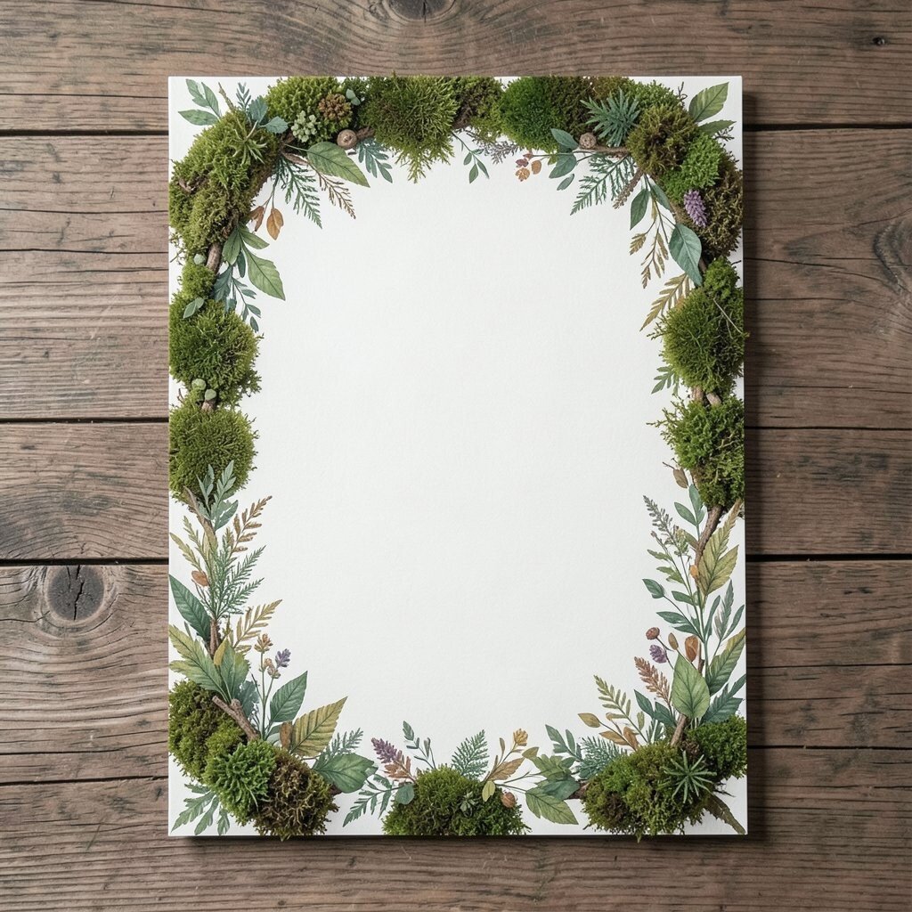
A border of moss and tiny botanicals can frame your invitation like a natural picture frame. Think small leaves, slender stems, and a soft green wash that never feels too busy.
This approach benefits guests because the center stays clear and easy to read. It’s also uniquely flexible, since the border can be tailored to your season, venue, or favorite plants. Keep it practical by using a thicker line weight for the text area so nothing looks faint on darker envelopes. Personalization is simple: pick plants that match your bouquet, like eucalyptus, olive branches, or seasonal wildflowers. Cost can stay reasonable if you choose a repeating border pattern printed once on the edge, rather than custom botanicals for each detail. A current trend is combining minimal layouts with nature elements, and a border design fits that style perfectly.
7. Rustic Seed Paper Cards

Seed paper invitations are made to be planted, so after the celebration you can turn the card into something alive. They usually feel textured and earthy, with speckles that look like tiny seeds already waiting their turn.
Guests love the idea of keeping a memory in the form of a future garden. This option benefits the environment too, especially if you encourage planting after the event. For practical tips, keep text and ink coverage strong because seed paper can be more absorbent than smooth cardstock. Personalize by printing your artwork in a deep brown or forest green, then choose a simple layout that lets the seed texture shine. Cost considerations vary by vendor, but you can manage it by ordering a standard size and avoiding too many custom inserts. A current trend is “meaningful keepsakes,” and seed paper is one of the most talked-about woodland-inspired choices.
If you want to keep the budget steady, use seed paper for the main invitation only and put maps on regular cardstock.
8. Lantern-Lit Night Meadow

For a cozy evening vibe, choose an invitation that shows lanterns glowing through branches. The colors often include warm amber, deep charcoal, and soft pine green highlights.
This design benefits guests because it sets expectations for lighting, dress code, and mood without needing extra explanations. It’s unique because “night woodland” themes feel romantic and cinematic, especially for fall weddings. Keep practical details front and center by using a darker overlay behind your names and schedule items so they remain readable. Personalize by adding a small moon icon near the time, or by including a favorite path description like “by the river lights.” Cost-wise, you can often get this look with a printed gradient and simple icons instead of complex illustration. A current trend is warm, story-like stationery, so lantern imagery pairs well with modern typography and subtle gold accents.
9. Wildflower Whisper Enclosures

Use wildflower illustrations that spill gently across the border, with tiny blooms like tiny daisies, asters, or meadow herbs. The invitation feels fresh, light, and a little carefree.
This style benefits guests by making the card feel cheerful while still giving plenty of space for key wording. It’s unique because meadow florals look less “themed” and more like real life. Keep it practical by matching the flower colors to your event palette so your RSVP and address lines remain consistent. Personalize by choosing blooms that are meaningful to you, such as the ones growing near your childhood home. Cost considerations are often moderate because floral printing can be done efficiently, especially when you keep the design to one consistent illustration set. If you want current trends, consider adding a subtle line-art bloom that echoes your wedding arch or cake topper.
You can also include an enclosure card that folds out for weekend schedule details, which helps guests stay organized.
10. Tree Ring Year Mark

Tree rings can become a stunning background pattern, circling outward like a timeline of growth. When paired with clean typography, it looks both rustic and modern.
This design benefits guests by giving a visually calm backdrop while your main information stays crisp. It’s unique because the ring pattern feels like a secret code for woodland lovers. Keep practical tips in mind by using lighter text on darker ring sections or vice versa, so contrast stays strong. Personalize by adjusting ring spacing to reflect your ceremony location or by adding a small leaf graphic inside one ring. Costs can be managed since it’s mostly a repeat pattern and doesn’t require many separate elements. Current stationery trends often favor textured geometry, and tree rings fit that trend with a natural twist.
11. River Stone Minimalism

A minimal woodland invitation can still feel rich when it uses stone-gray textures and muted green ink. Imagine smooth, pebble-like shading behind your names and a simple leaf line above the date.
This style benefits guests because clarity is built in, and the layout feels easy to scan. It’s uniquely calming, especially for ceremonies with a modern lodge or lakeside vibe. For practical tips, choose one accent icon like a single sprig or tiny branch so the design stays neat. Personalize by matching the stone texture color to the suit or dress tones, like taupe or soft charcoal. Cost considerations are usually low to moderate because minimal printing uses fewer colors and fewer design changes. A current trend is quiet luxury stationery, and river-stone textures create that effect without going flashy.
12. Branch Knot Lettering

Branch knot designs blend woodland charm with a clever twist of twisting lines. The result feels like a vine learning to braid itself, with a handcrafted vibe.
This style benefits guests by adding warmth without losing readability, especially when you keep the knot lines thinner around the edges. It’s unique because “knot” visuals suggest connection, which is perfect for marriage. For practical tips, keep the main text area open and place the knot pattern only on corners or as a small top ornament. Personalize by including a tiny initial knot, using your initials woven into the design as a subtle highlight. Cost can stay reasonable since corner ornaments are easier to print than full-coverage art. If you want something current, pair the knot style with modern spacing and a clean typeface so it doesn’t look old-fashioned.
13. Foxglove Frame Details
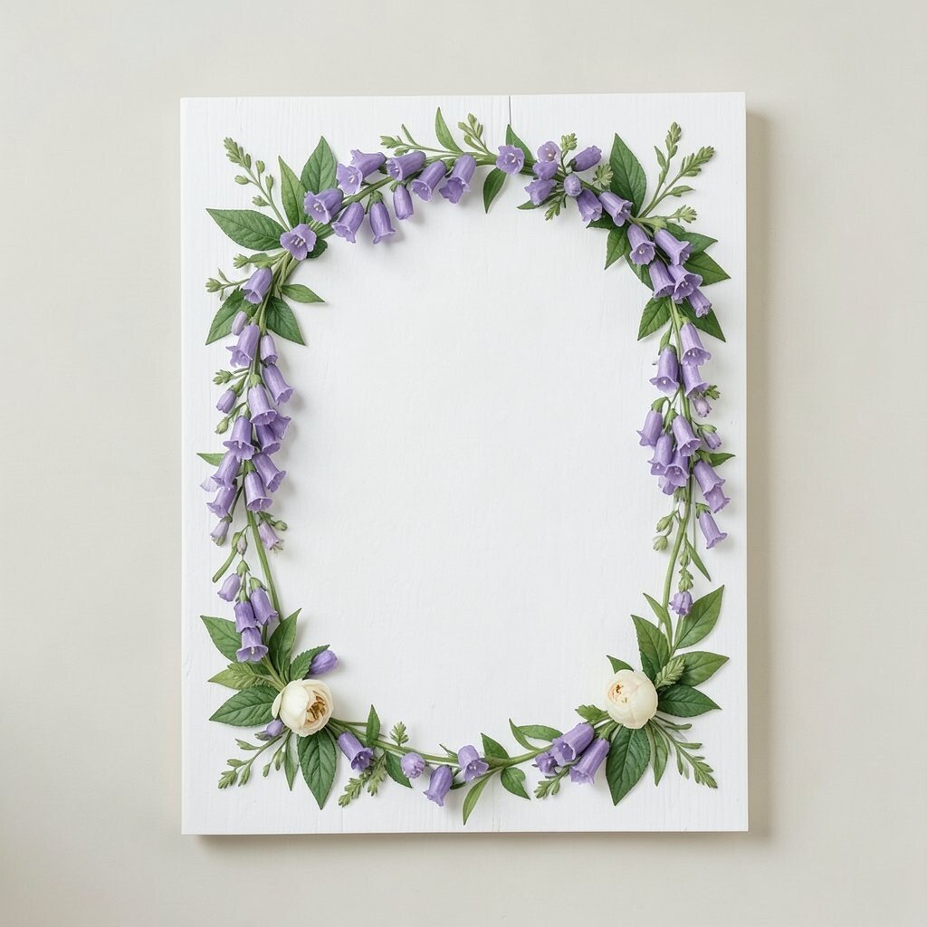
Foxglove and tall flower illustrations can create an elegant frame that looks like it’s growing up the sides of your card. The vertical lines help your invitation feel graceful and organized.
This design benefits guests by naturally guiding their eyes toward names and dates, which makes the invitation feel effortless. It’s unique because foxgloves are a bit unexpected compared to common roses and daisies. Keep practical details visible by using a simple center layout and choosing darker ink for all event info. Personalize by tying the flower color to your bouquet, like dusty pink, pale lavender, or deep magenta accents. Cost considerations often stay moderate because botanical frames can be printed with limited color palettes. Current trends favor tall, editorial-style florals, and foxgloves bring that fashion feel into woodland weddings.
For personalization in a small way, add a tiny insect illustration near the bottom corner, like a moth or beetle, to bring the scene to life.
14. Weathered Log Card Stock

Paper that mimics weathered wood grain instantly gives your invitation a rustic, lodge-ready feel. It can include subtle cracks and warm brown shading that looks authentic.
This style benefits guests by setting expectations for a cozy, outdoorsy day while keeping everything sturdy and durable. It’s unique because the “log” look pairs well with both classic and modern fonts. Keep it practical by ensuring your ink colors contrast strongly against the grain, since light text can vanish into texture. Personalize by adding a small leaf crest or custom seal in the upper corner. Cost considerations are often balanced because wood-grain textures can be printed without special materials, but you may want to choose slightly thicker cardstock to avoid flexing. A current trend is tactile stationery, and log-texture invites fit that perfectly.
15. Moon and Mushroom Lettering

Mushrooms under a soft moon create a whimsical invitation that feels like a storybook forest. Think little toadstools, gentle dots of light, and a calm night palette.
This design benefits guests by adding a fun, playful personality, especially if your crowd enjoys themed but not too childish details. It’s unique because it goes beyond generic leaves and creates a memorable scene. Keep practical tips in mind by using simple typography and keeping the mushroom illustrations small enough that they don’t compete with the schedule. Personalize by choosing mushroom styles that match your region’s wildlife, or by swapping in a tiny forest animal instead if mushrooms aren’t your thing. Cost can be reasonable if the art is limited to a single illustration set rather than multiple custom scenes. Current trends often lean into “fairy-tale modern,” so clean fonts paired with playful art can look very fresh.
16. Evergreen Monogram Medallions

Turn your initials into a medallion surrounded by evergreen sprigs. The look is timeless, symmetrical, and feels like it belongs in a forest chapel.
This style benefits guests because monograms make the invitation instantly personal and recognizable. It’s unique because medallion designs bring a formal feel without becoming stiff. For practical tips, place the medallion above the key text so everything else remains uncluttered and easy to read. Personalize by using your wedding date inside the medallion or by adding a small leaf that matches your bouquet color theme. Cost considerations can be managed by choosing one medallion style and repeating it across the suite, including RSVP cards and thank-you notes. If you follow current trends, consider using subtle embossing or a light foil accent instead of heavy metallic everywhere.
To keep assembling easy, order coordinating envelopes so the monogram placement lines up nicely.
17. Pinecone Pattern Suite
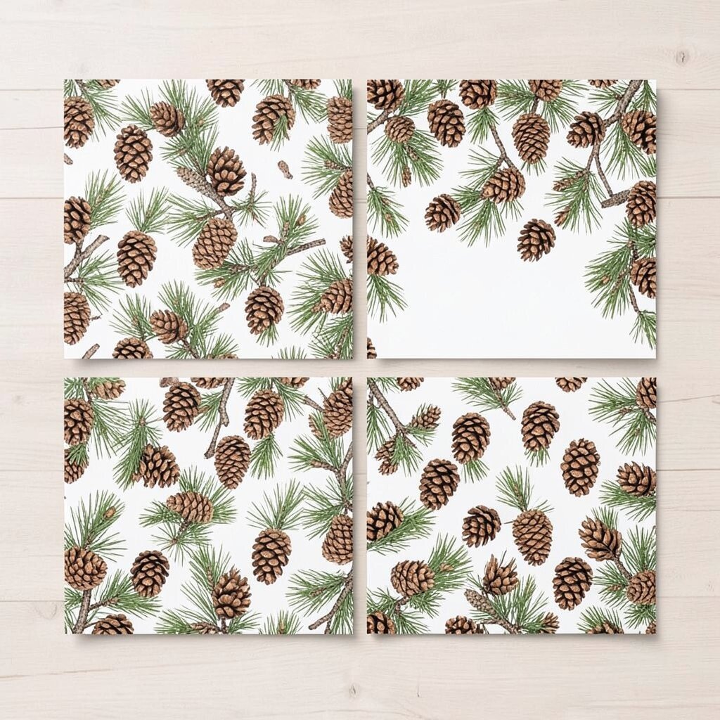
A repeating pinecone pattern can cover the invitation edge or act as a subtle background. It feels traditional woodland while still looking tidy and intentional.
This design benefits guests because consistent patterning helps the suite look cohesive across all pieces. It’s unique because you can keep the center plain and let the pattern act like a signature. For practical tips, test ink contrast on your chosen paper so the pattern doesn’t fade into the background. Personalize by varying the pinecone size slightly throughout the pattern, like a natural rhythm. Cost considerations are usually good since repeating motifs are efficient to print, and you can avoid multiple separate illustrations. Current trends favor matching texture across stationery, so a pinecone pattern can also coordinate with menu cards and place cards.
If you want to save money, consider a single printed insert instead of separate liners for every envelope.
18. Forest Path Directionals

Design your invitation as if it’s pointing down a forest path, using a gentle line that curves from the top corner to the event details. It feels like a guided walk without needing a map on the front.
This style benefits guests because it creates natural flow, helping them read in the right order. It’s unique because the invitation becomes part of the story of getting there. Keep it practical by including a clear address line and a separate enclosure card with full directions for people who need step-by-step help. Personalize by adding a short phrase tied to your venue, like “follow the lantern path,” then keep the font consistent across the suite. Cost can stay reasonable because the path graphic is simple and doesn’t require many colors. Current trends include story-forward stationery, and path directionals feel both charming and functional.
19. Feathered Fern Lettering
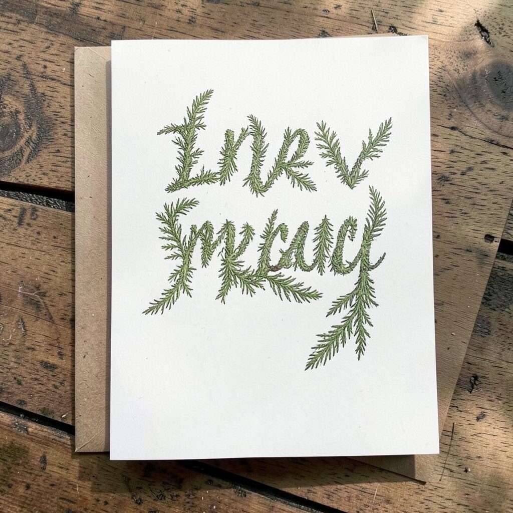
Let your text feel like it’s carried on fern fronds by using feather-light lettering and delicate line drawings. The invitation can look elegant while still fully woodland.
This design benefits guests because delicate typography can be beautiful, but readability still needs strong spacing and contrast. It’s uniquely modern when you pair a script-like style with a clean uppercase subheading for names and dates. Keep it practical by limiting script to short lines, while using a plain, easy font for times and locations. Personalize by matching the fern line drawings to your invitations’ color theme, like using the same green tone as your bridesmaid dresses or boutonniere wrap. Cost considerations are often moderate since most designs depend on printing style rather than expensive materials. A current trend is combining handwriting-inspired fonts with minimal icons, giving the whole suite a gentle, human feel.
For an extra touch, add a small fern sprig near the RSVP line so the invitation feels complete and intentional.
20. Woodland Waterfall Backdrop
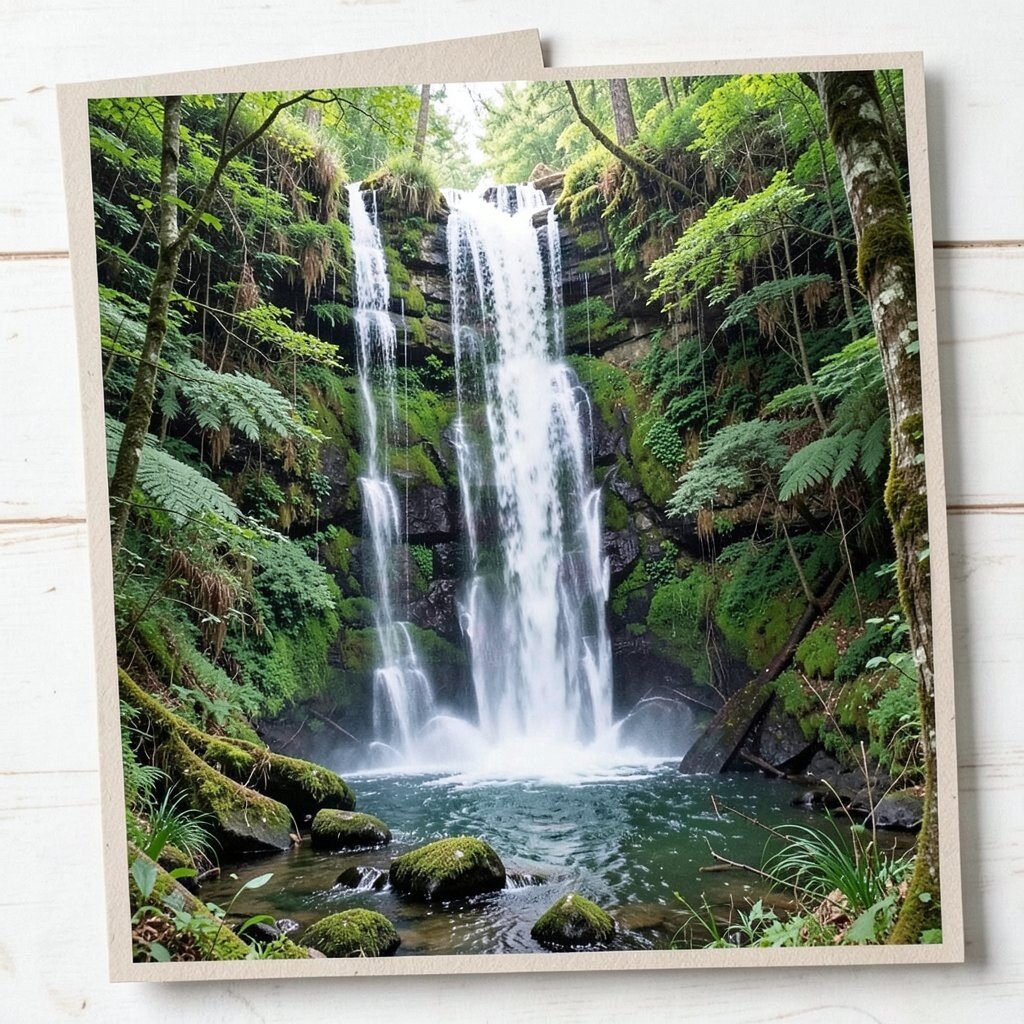
Create an invitation with a soft waterfall scene or misty cascade effect in the background. Even a simple representation can make the whole card feel like a calm forest sanctuary.
This style benefits guests by bringing a relaxing mood that fits outdoor venues near rivers, waterfalls, or lakes. It’s unique because it adds movement and atmosphere instead of only leaves and trees. Keep practical details readable by using darker text and a gradient fade behind the main information block. Personalize by matching the water color to your color palette, like teal accents paired with slate gray. Cost considerations can be friendly if the waterfall is a single gradient print rather than detailed illustration. Current trends show more cinematic backgrounds in stationery, and misty waterfall art is a great way to follow that trend without being too busy.
21. Burlap and Lace Rustic Layer
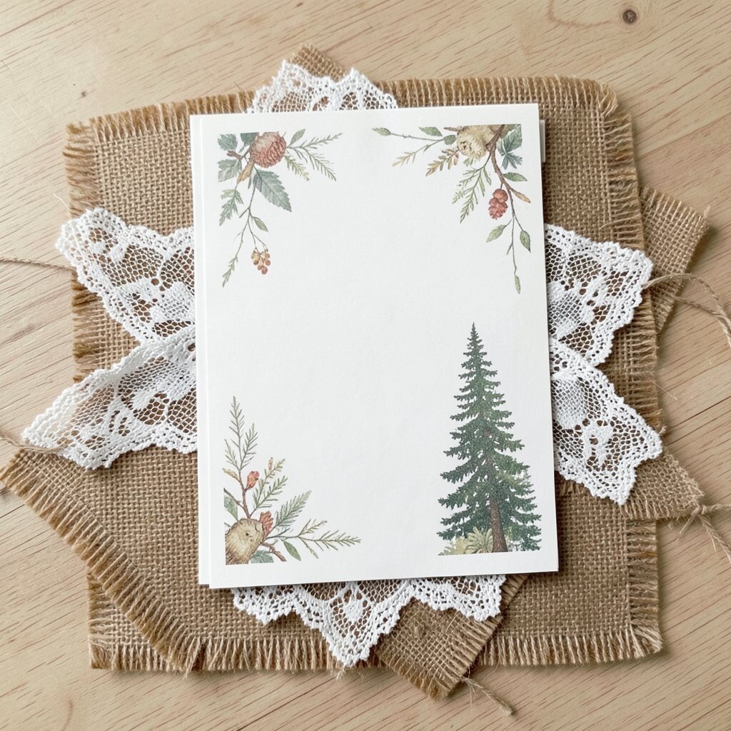
Layered invitations that combine burlap texture with delicate lace-like edges bring classic rustic charm. The look feels vintage, cozy, and perfect for barn or garden ceremonies.
This style benefits guests by delivering a clear “event vibe” right away, which helps people picture the day’s comfort level and atmosphere. It’s unique because woodland themes can feel fancy, not just outdoorsy, when texture is used well. Keep practical tips in mind by choosing printed faux burlap or lightweight texture so shipping stays easy and the card doesn’t become too bulky. Personalize by adding a tiny leaf charm on the twine tie or by printing your names across the lace edge in a neat style. Cost considerations can rise if you add real lace and extra material layers, but you can reduce cost by using printed textures and focusing on one or two tactile elements. A current trend is using “soft rustic” materials, so this layered style fits beautifully when you keep the color palette earthy and clean.
22. Branch-Stamped Night Sky
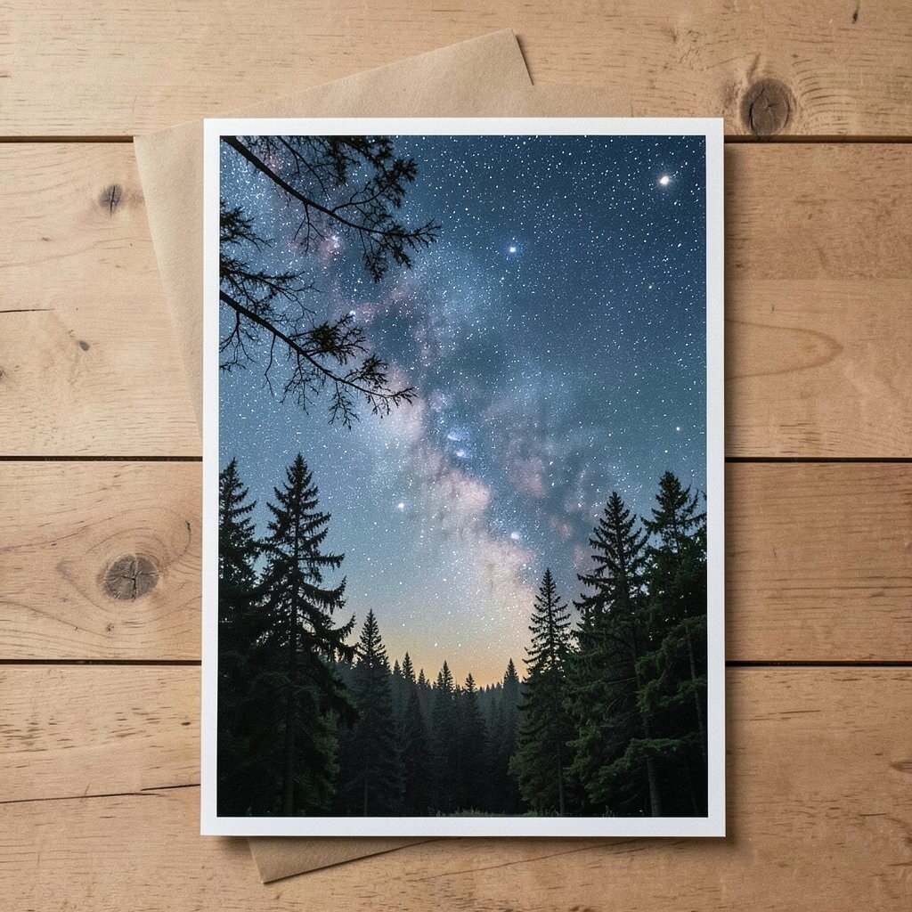
A night sky background stamped with small branch silhouettes can feel magical and grounded at the same time. The deep blues or near-black tones make your names pop like stars among trees.
This design benefits guests by creating a clear, high-impact look that still stays readable for older eyes when you use strong contrast. It’s unique because it mixes celestial mood with woodland symbols, which feels special for evening ceremonies. Keep practical tips simple by using a matte finish to reduce glare in photos and choosing a font size that’s comfortable. Personalize by adding a tiny constellation-like arrangement that represents a meaningful date, like your anniversary or the day you met. Cost considerations are often manageable since a sky gradient with stamped silhouettes usually prints efficiently. If you’re following current trends, consider pairing this look with modern foil accents in a limited way, such as a small border or date highlight, so it feels upscale without overspending.
To make the whole suite cohesive, match RSVP and menu cards with the same branch-stamp style so guests feel the theme everywhere they look.