
Color pairs can change the mood of a fashion shoot fast. The right mix can help clothes stand out and make a set feel fresh.
1. Olive Green and Soft Pink
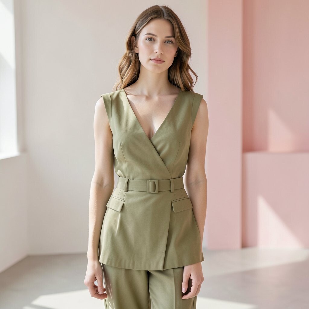
Olive green and soft pink make a calm but fresh look on camera. The green feels grounded, while the pink adds a light touch that keeps the frame from feeling too heavy.
This pair works well for street style, garden sets, and clean studio shots. It is also easy to style with low-cost pieces, since both colors show up in thrift stores and basic fashion lines.
Try matte fabrics for a soft feel, or use shiny fabric if you want more contrast. This mix is nice for shoots that need a gentle but modern look.
2. Cobalt Blue and Rust
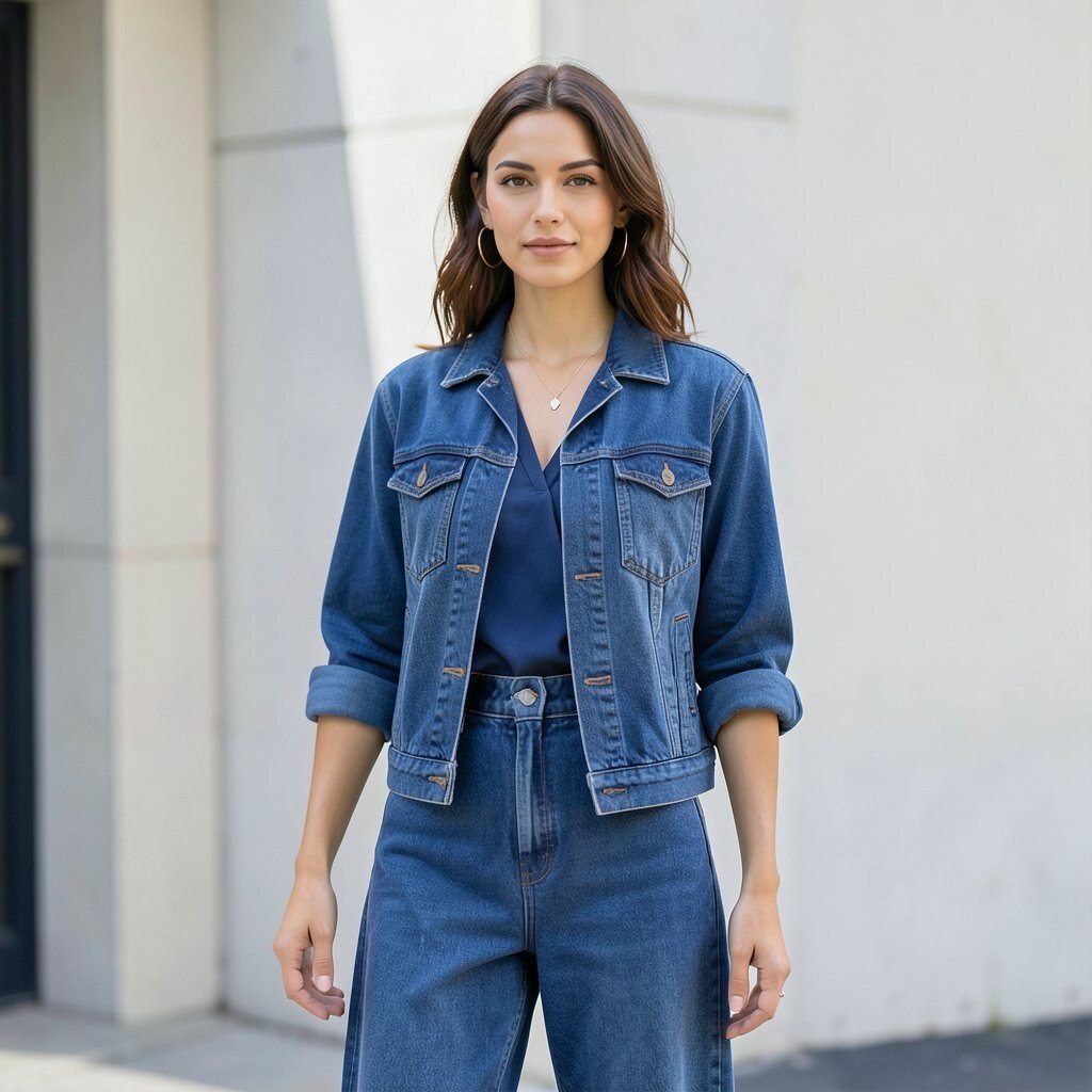
Cobalt blue and rust can make a strong visual hit without looking too busy. The cool blue and warm rust sit across from each other in a way that feels bold and balanced.
This combo is useful when you want one piece to stand out, like a coat, dress, or bag. It also works well with simple backdrops, so the clothes stay in focus.
Many stylists like this pair because it feels current and easy to shape for fall or winter shoots. You can keep costs down by using one bright item and one earth-tone item from a basic closet.
3. Butter Yellow and Charcoal Gray
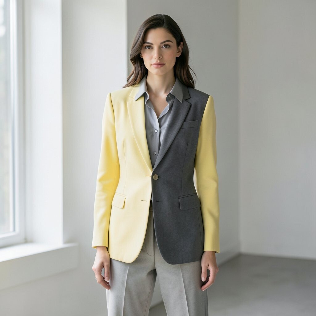
Butter yellow and charcoal gray create a soft glow with a solid base. The yellow brings warmth, while the gray keeps the look neat and easy to read.
This is a smart choice for shoots that need a clean, calm mood. It works well with natural light and simple props, which helps keep the setup low cost.
Use this pair for knitwear, tailored looks, or relaxed daywear. If you want more personality, add a small bag or shoe in a third color, but keep it quiet.
4. Teal and Coral
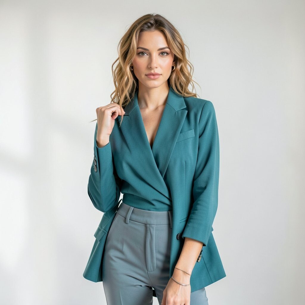
Teal and coral give a bright, fresh look that feels lively on film. The cool teal and warm coral make each other pop without needing much else in the frame.
This color mix is a good fit for summer shoots, beach sets, and playful fashion stories. It is also a favorite for social media images because it reads fast and looks clear on small screens.
You can use this pair in bold prints or as two plain blocks of color. If your budget is small, even simple tees or scarves in these shades can make a strong shot.
5. Lavender and Mustard
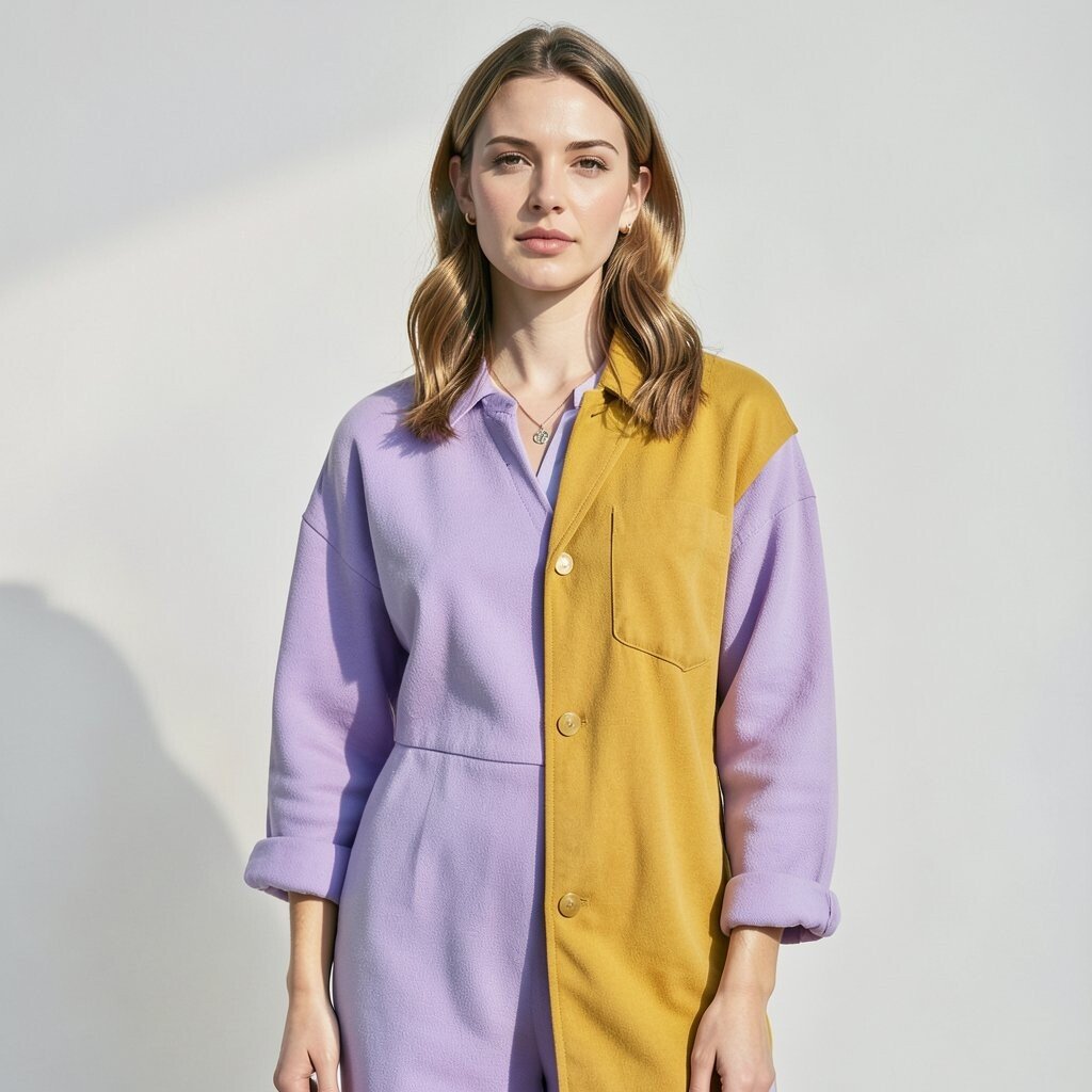
Lavender and mustard may sound odd at first, but they work well together in fashion photos. The soft purple feels light, and the mustard adds a warm, rich note.
This pair can make a set feel a bit artsy without going too far. It is good for vintage looks, studio portraits, and outfits with texture like wool or corduroy.
Try this mix when you want something less common than pink and blue. It can help your shoot stand out while still feeling easy to wear and style.
6. Red and Pale Blue
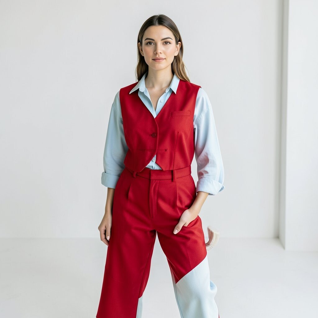
Red and pale blue create a crisp look that feels both fresh and strong. The red brings energy, while the pale blue gives the eye a place to rest.
This pair works well for sharp fashion shots, sporty clothes, and clean editorial layouts. It is also a nice choice for shoots with white walls or open skies, since the colors stay clear.
To make it feel modern, keep the shapes simple and the makeup clean. A small touch of silver or white can help, but the main pair already does most of the work.
7. Brown and Sky Blue
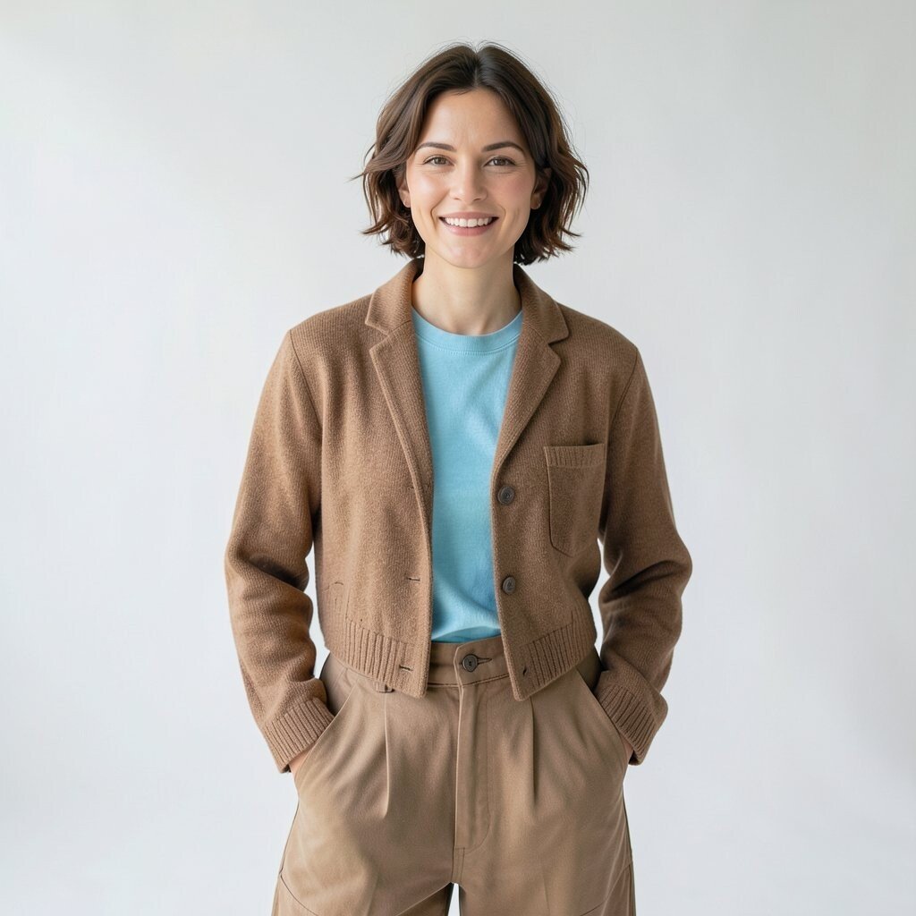
Brown and sky blue make a soft, easy look that feels natural on camera. The brown adds warmth and depth, while the sky blue keeps the frame light.
This mix is useful for casual fashion shoots and outdoor scenes. It also fits well with current style trends that use more earth tones and calm color groups.
You can make it feel more personal by choosing a warm tan, dark chocolate, or faded denim blue. That way, the pair can match the model’s style and the mood of the shoot.
8. Lime Green and Cream
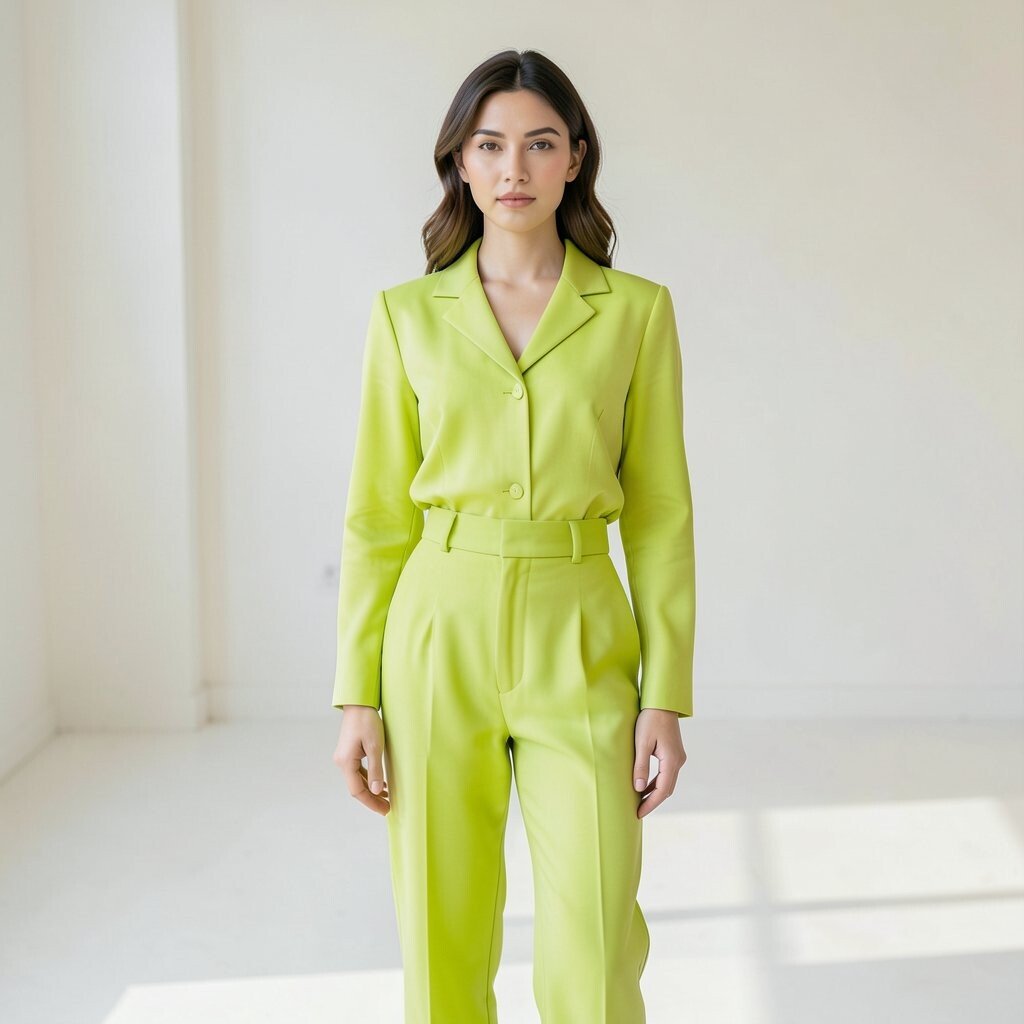
Lime green and cream make a fresh, clean pair that gets attention fast. The cream softens the bright green, so the look feels lively but not harsh.
This is a good choice for shoots that need a modern edge. It works well with simple shapes, clear light, and plain sets, which helps keep the focus on the clothes.
If you want to keep costs low, use lime in small pieces like shoes, bags, or trim. Cream items are easy to find, so this combo can be built without spending much.
9. Plum and Mint
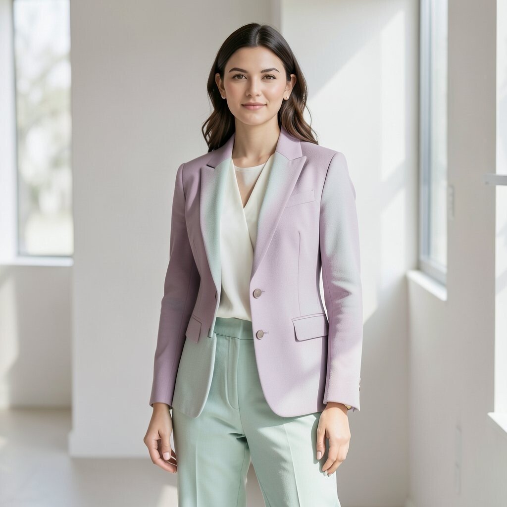
Plum and mint give a cool, rich look with a soft twist. The deep plum adds weight, while the mint brings in a light and airy feel.
This pair is nice for beauty shots, dressy looks, and fashion stories with a calm mood. It also works well in spring because the colors feel fresh without being too bright.
Use smooth fabric if you want a clean finish, or use fuzzy texture for a cozy style. The combo feels a little unusual, which can help your shoot look more original.
10. Black and Bright Orange
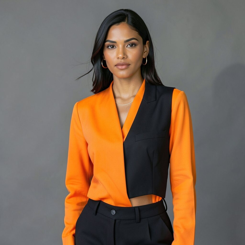
Black and bright orange make a bold pair that shows up well in photos. The black gives a strong base, and the orange adds a loud, clear point of focus.
This mix is useful for streetwear, night shoots, and images that need a strong edge. It is also easy to style because black items are common and orange can be added in small bits.
For a balanced look, keep the shapes clean and avoid too many extra colors. This pair can feel very current, since sharp contrast is still a big trend in fashion images.
11. Dusty Rose and Forest Green
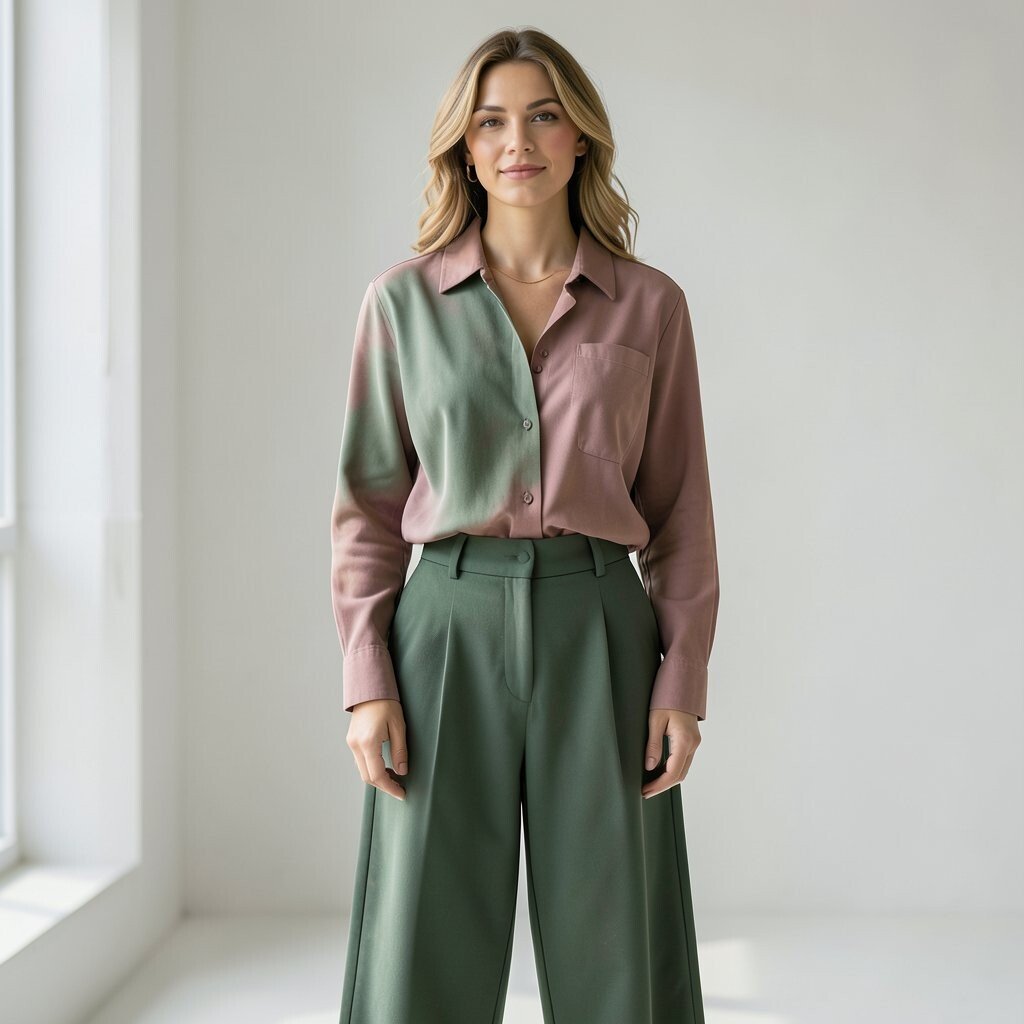
Dusty rose and forest green make a soft but rich color pair. The rose feels warm and gentle, while the green adds depth and a bit of drama.
This combo works well for moody portraits, fall shoots, and looks with a classic feel. It can also fit romantic styles without looking too sweet or too formal.
If you want more cost control, use dusty rose in makeup, a scarf, or a shirt, then bring in forest green with pants or a jacket. That gives you a full look without needing a lot of new items.
12. White and Neon Green
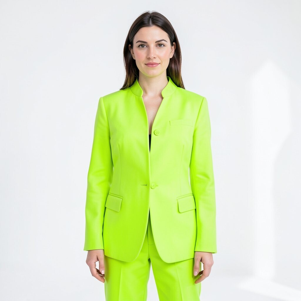
White and neon green create a sharp, clean look with a modern feel. The white keeps things simple, while the neon green adds a flash of energy.
This pair is great for high-fashion street shots and sporty outfits. It also works well with digital-looking sets, where bright color can make the image feel current.
Use this mix with care, since too much neon can take over the frame. A small neon detail can be enough if you want a lower-cost shoot that still feels bold.
13. Navy and Peach
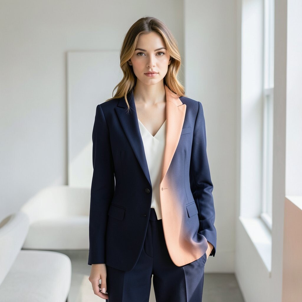
Navy and peach make a soft, polished pair that is easy on the eye. The navy gives a neat, steady feel, and the peach keeps the look warm and friendly.
This combo is useful for workwear, simple dresses, and clean lifestyle fashion shots. It also fits well with natural light, which helps the peach stay soft and the navy stay deep.
For a more personal look, try different peach tones, from light blush peach to a deeper apricot shade. Small changes like that can make the shoot feel more like your own style.
14. Silver and Lilac
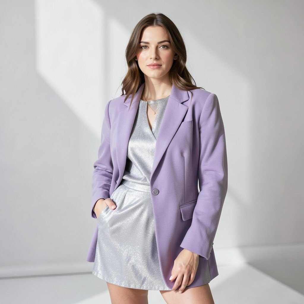
Silver and lilac give a cool, dreamy look with a touch of shine. The silver adds a sleek edge, while the lilac keeps the frame soft and light.
This pair works well for future-looking fashion, party wear, and beauty stories. It is also a good choice when you want a set that feels new but still easy to look at.
Metallic fabric, shiny shoes, or a silver bag can help without raising the budget too much. Lilac is a color that many brands use now, so it can also feel on trend.
15. Tan and Deep Purple
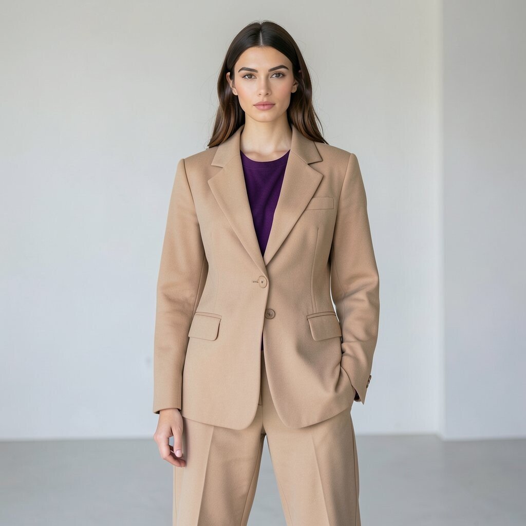
Tan and deep purple make a warm and rich pair that feels a little unexpected. The tan is calm and natural, while the purple adds a strong color note.
This mix works well for autumn shoots, layered looks, and settings with wood or stone. It can help clothes stand out without needing a bright backdrop or many props.
Try this combo if you want something that feels mature but not dull. It is easy to make it your own by changing the shade of tan or picking a purple with more red or blue in it.
16. Ice Blue and Chocolate Brown
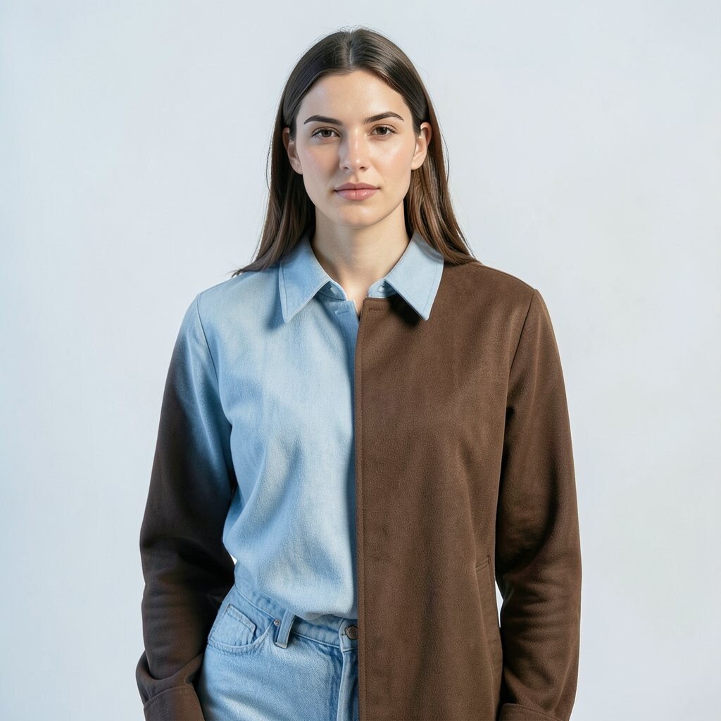
Ice blue and chocolate brown create a cool-and-warm balance that looks good in many settings. The ice blue feels clean and fresh, while the brown gives the image a strong base.
This pair works well for tailored clothes, denim looks, and winter fashion shoots. It is also a smart choice if you want a color story that feels calm but not plain.
Many stylists like this mix because it is easy to build from basic pieces. A brown coat with a pale blue shirt, for example, can look polished without much cost.
17. Red Orange and Pale Gray
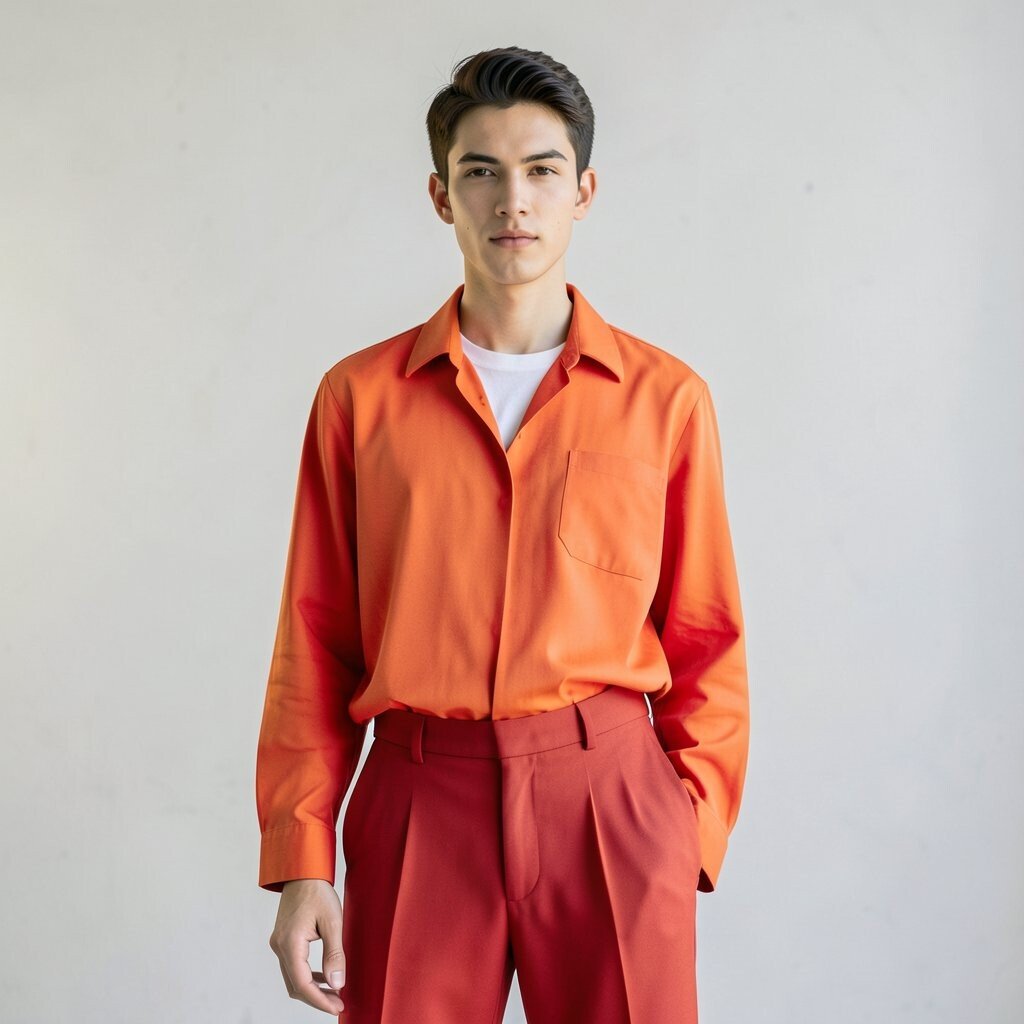
Red orange and pale gray make a bright pair with a soft break in the middle. The red orange brings heat, and the pale gray keeps the look from feeling too loud.
This combo is useful for active fashion, simple studio work, and bold portraits. It also works well when you want the clothing to feel lively but still neat.
Use pale gray in larger pieces and red orange in smaller ones if you want a lighter touch. That can help the shoot feel balanced and make styling easier on a small budget.
18. Sage Green and Hot Pink
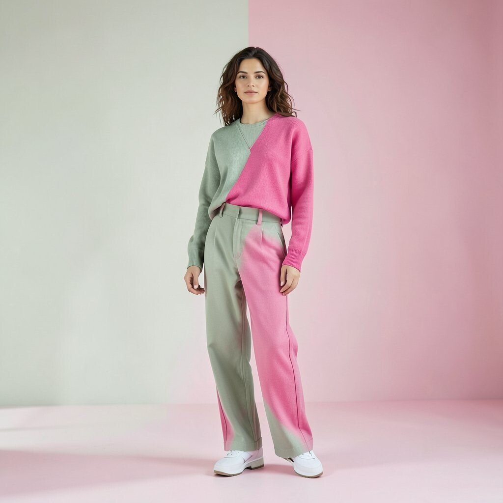
Sage green and hot pink make a fresh pair that feels both soft and loud. The sage green calms the eye, while the hot pink adds a strong pop.
This mix is good for shoots that want a fun but still clean look. It can work in fashion editorials, social posts, or even simple outdoor scenes with plants and light walls.
Because the colors are so different, the pair can make even plain clothes look more interesting. Try it with simple cuts first, then add prints only if the set still feels too quiet.
19. Burgundy and Pale Yellow
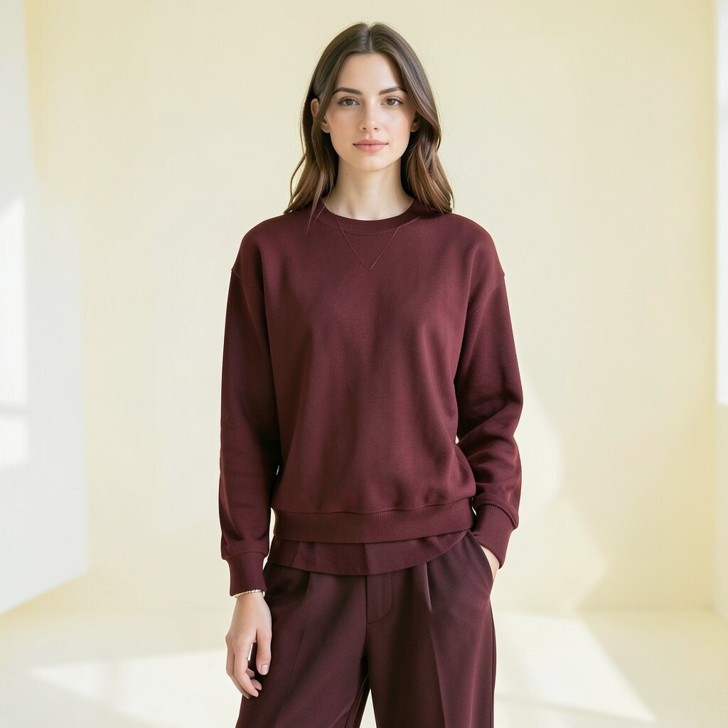
Burgundy and pale yellow create a rich, soft mix that feels a little old-school in a good way. The burgundy adds depth, and the pale yellow brings a gentle light.
This pair is nice for knitwear, layered looks, and indoor shoots with warm light. It can also help create a cozy mood without using dark colors only.
If you want a low-cost version, use burgundy lipstick or a bag with a pale yellow top. Small details like that can still give the whole shoot a clear color idea.
20. Aqua and Taupe
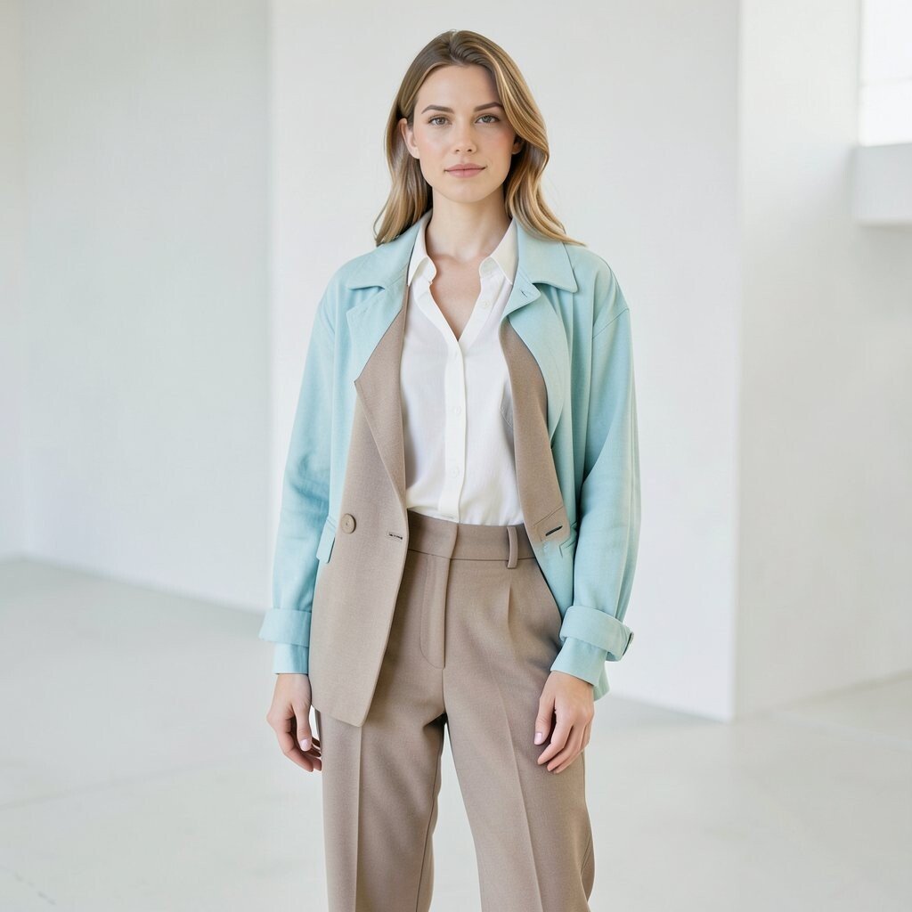
Aqua and taupe make a clean, quiet pair that still has enough color to feel fresh. The aqua gives a cool touch, and the taupe keeps the look grounded and soft.
This combo works well for simple fashion stories, resort wear, and clean catalog-style shoots. It is also easy to use with beige sets, white walls, or light wood floors.
For a more personal feel, try a bright aqua for a playful mood or a muted aqua for a calmer one. Taupe is easy to find in many price ranges, which makes this pair simple to build.
21. Marigold and Slate Blue
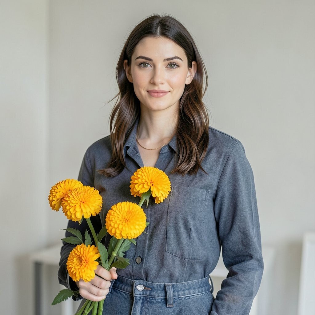
Marigold and slate blue make a strong pair that feels both warm and cool. The marigold adds a sunny note, while the slate blue gives the frame a steady, modern base.
This mix is useful for fashion shoots that need a clear color story. It works well in studio setups, on city streets, or in places with old walls and soft light.
Trendy color blocking often uses pairs like this because they stand out fast. You can keep the look affordable by using one marigold item and one slate blue item, then adding simple shoes or jewelry.
22. Mauve and Olive
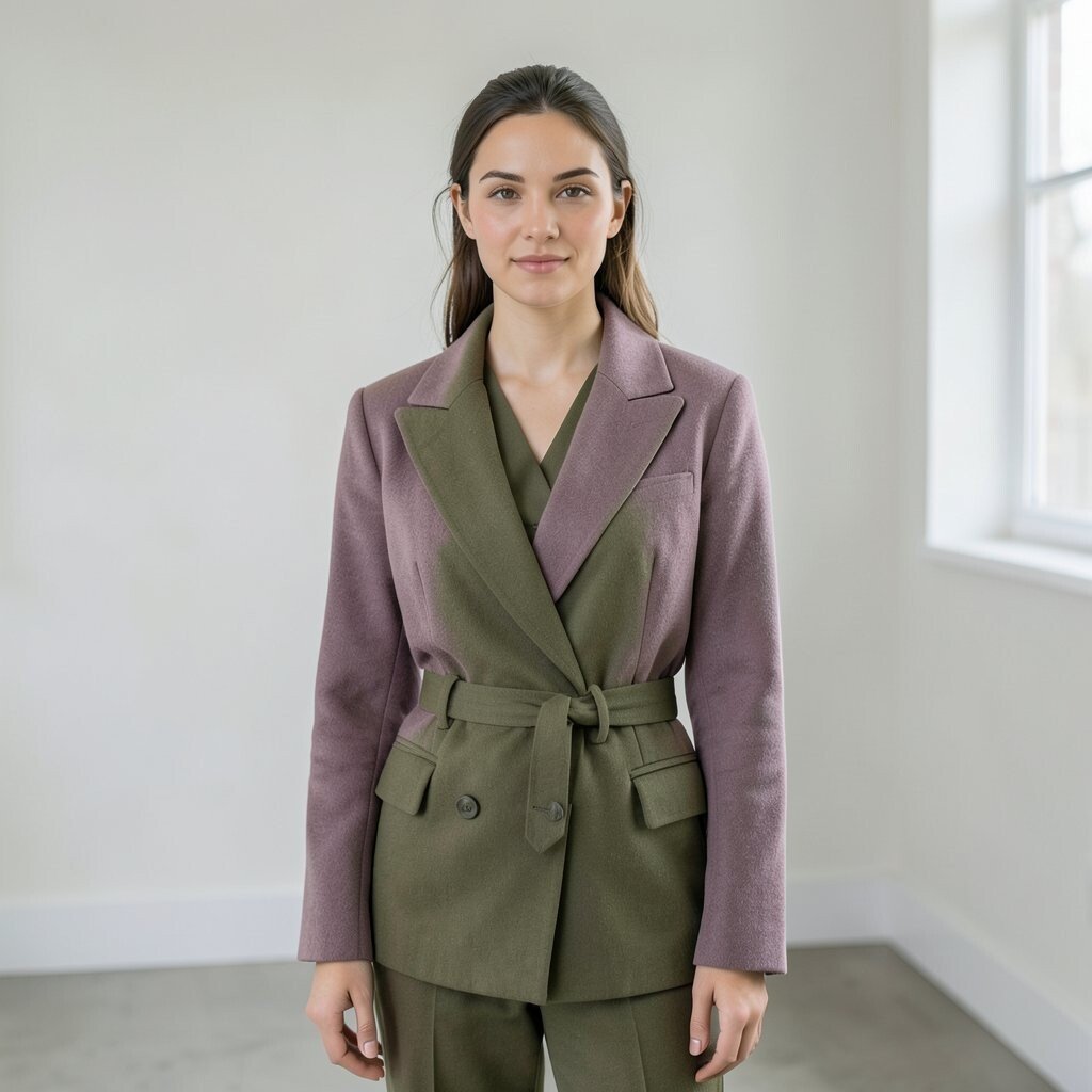
Mauve and olive give a calm, stylish look that feels a bit different from common fashion pairings. The mauve is soft and muted, while the olive adds an earthy note.
This combo works well for layered outfits, relaxed poses, and photos with a slow, quiet mood. It also fits well with current taste for soft colors and natural tones.
Use this pair when you want something that feels easy to wear but still looks thought out. It can help a shoot feel personal, since the colors are not too loud and can match many skin tones and settings.