
Every special moment deserves a look that feels unforgettable from the first glance. Your invitation suite can set the mood, spark excitement, and guide guests with style.
1. Botanical Foil Frame Invitations
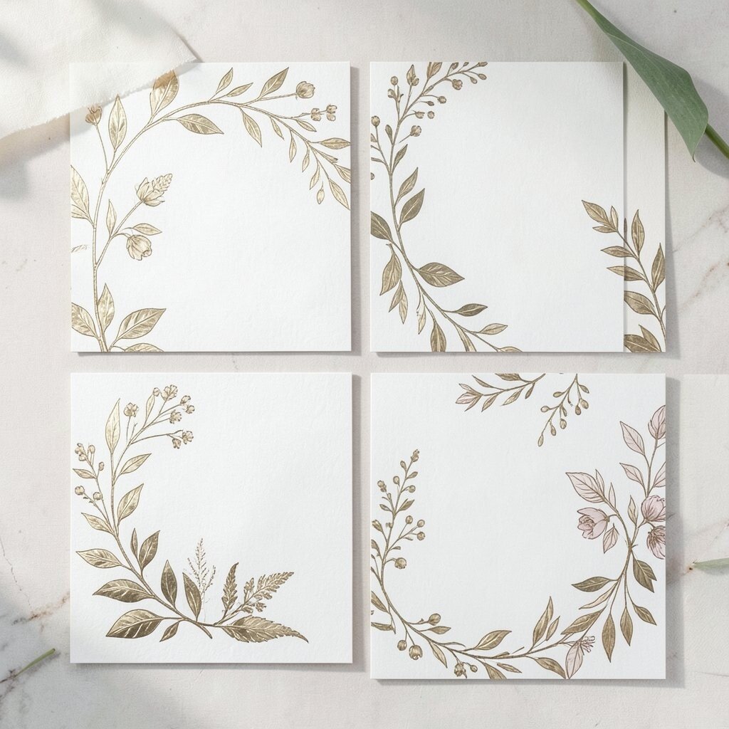
Picture soft greenery printed in crisp ink, then wrapped with a delicate foil border that catches light when guests open the envelope. The overall effect feels fresh, romantic, and a little bit luxurious without being too loud.
This style looks amazing for garden parties, bridal events, and nature-themed celebrations. It also helps you keep a consistent look across RSVP cards, details inserts, and place for addresses. Choose a muted palette like sage and cream, and add a tiny pressed-leaf accent in the corner for personalization. If you’re keeping costs in check, limit foil to just the frame or one phrase, and use a thicker paper stock to make everything feel high-end.
2. Art Deco Monogram With Layered Cards

Think sharp lines, geometric patterns, and a bold monogram that sits at the center like a signature. When you layer cards inside the suite, the design gains depth and feels extra intentional.
Guests will love the way the theme carries from the front cover to the RSVP and reception info. For a practical approach, keep the main layout simple and let the typography and ornament do the work. Personalize by matching the monogram letters to the couple or host’s initials and choosing a metallic ink that matches your decor. Current trends lean toward black and champagne gold, and printing in those colors can help you stay within a reasonable budget.
3. Watercolor Envelope Liner Crests

Open the envelope to find a watercolor crest blooming in gentle gradients across the liner. It feels like a hidden gift, and the colors feel light and artsy.
The benefit is that your suite looks unique even when the outer card is minimal. Use the liner as the spot for playful personalization like first-name initials, a small date ribbon, or a subtle location illustration. For special occasions that need calm elegance, choose dusty rose, sky blue, or soft lavender. To manage cost, print the main invitation in one color with a clean font and spend more on the liner, since it creates the biggest “wow” with less overall complexity.
When you coordinate the same watercolor palette on the RSVP card, the whole suite feels like one artwork. Consider adding a small matching seal sticker so guests instantly recognize what to do next.
4. Minimalist Black-Ribbon RSVP Suites

Imagine a clean, white invitation with a narrow black ribbon tied around a belly band. The look is modern, neat, and instantly timeless.
This design feels practical because it keeps everything together and helps guests find important cards fast. A ribbon also adds personality when you choose a texture like satin for formal events or grosgrain for a casual-chic tone. Personalize by stamping the ribbon ends with initials or using a ribbon color that echoes your bridesmaid dresses or wedding party outfits. If your budget is tighter, use ribbon only on the invitation cover and skip extras, then invest in good card alignment for a premium finish.
5. Seashell Letterpress With Soft Sand Tones

Visualize letterpress impressions in warm sand and pale seafoam, like the coast pressed into paper. Each raised line feels tactile, which makes guests slow down and actually enjoy the invitation.
This is a wonderful choice for beach weddings, anniversary weekends, and seaside vow renewals. Letterpress can be cost-conscious if you keep the design to fewer colors and avoid complicated artwork. Personalize with a small shell silhouette or a coordinate-style line that matches your venue. For practical guidance, confirm your printer can match fine details, since light shells and thin lines look best with careful artwork setup.
Keeping the typography simple helps the paper texture stand out. If you want a current look, pair letterpress with a modern sans-serif date and keep the rest elegantly understated.
6. Luxe Velvet Ink Script Invitations
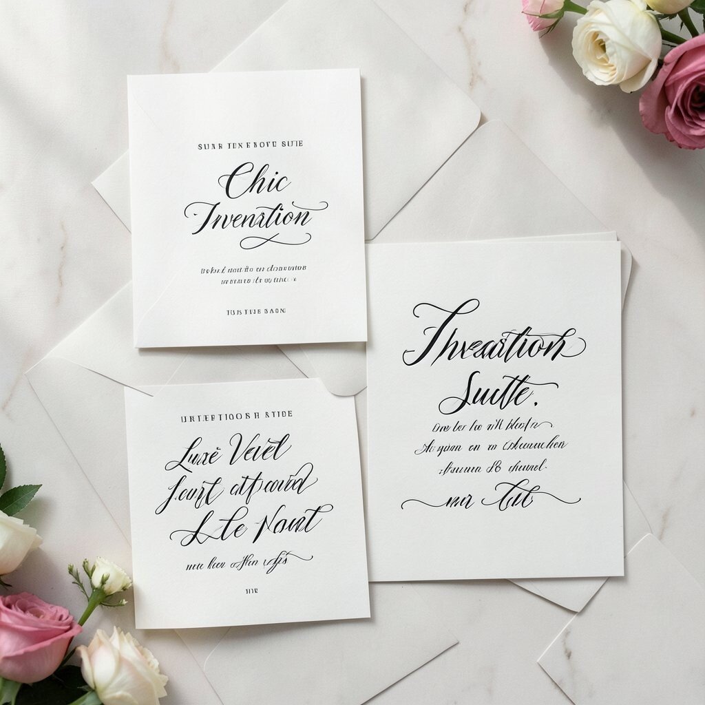
Picture a smooth script in deep ink that almost looks like it’s been painted by hand. When you add a rich, dark background card, the result feels dramatic and cozy at the same time.
This suite works beautifully for winter celebrations, upscale dinners, and gala-style birthdays. It benefits guests because the text stays easy to read when you choose high contrast between background and lettering. Personalize by using the family name, a short meaningful phrase, or a guest-friendly schedule that fits neatly on the page. Cost can be managed by printing fewer custom elements, like keeping the velvet ink only on the name line while using standard ink for the rest.
For current trends, many hosts are choosing bold script for the main line and then switching to clean, readable type for addresses and event details. That mix gives you glamour without sacrificing clarity.
7. Vintage Map Insert With City Coordinates

Slip an old-style map insert into the envelope so guests feel connected before they arrive. Add faint route lines and a tiny compass flourish to make the theme feel lived-in and personal.
This idea brings uniqueness because it ties the event to a place that matters, like where you got engaged or where the celebration will happen. Practical value comes from adding helpful directions and transit notes on the insert in a friendly way. Personalize with your coordinates, a favorite neighborhood name, or a small “meet-up spot” note for timing. On cost, you can use one printed map style for everyone and keep personalization to a simple coordinate line.
Pair the insert with a clean cover so the suite doesn’t look crowded. If you’re following current styles, try muted vintage tones and let one small icon guide the eye.
8. Celestial Foil Constellation Cards

Imagine tiny star dots joining into constellations that match your story, like a quiet secret in shining foil. The cards feel dreamy, especially when placed against black or deep navy paper.
This suits vow renewals, graduation nights with a big future, and engagements with a night-sky theme. The benefit is clear communication, since you can print event details in clean fonts below the constellation graphic. Personalize by using actual star positions at a meaningful date or by turning the couple’s initials into a constellation-like arrangement. For cost considerations, use foil only for the stars or a small area behind the main text, and keep the rest matte for contrast.
To keep everything practical, double-check the readability of fine star lines. If needed, simplify the constellation so it prints crisply at normal invitation size.
9. Monochrome Floral Borders On Heavy Stock

Picture black-and-white floral line art drawn around the edges of a crisp invitation. The look feels classy, editorial, and easy to match with many decor themes.
This suite stays timeless for showers, formal dinners, and anniversary milestones. It’s uniquely versatile because you can keep the outside monochrome while changing only your RSVP color or ribbon. A practical personalization move is adding the guest’s name in a matching serif font on address cards. If you want to stay budget-friendly, choose a single ink color for the floral border and use a thicker paper to create the premium feel people notice.
Current trends often favor minimal ink designs paired with bold cardstock and clean layouts. This is a great way to get “high end” without adding too many extras.
When you align the border size across the invitation and details card, everything looks intentionally designed.
10. Playful Polaroid-Style Photo Panels

Envision invitations that include photo strips styled like instant pictures, complete with soft faux edges. They make the suite feel friendly, personal, and full of warmth.
Guests get the benefit of a story right away, especially if you include a short caption about the moment. For uniqueness, choose one signature photo per card, like engagement snapshots, family moments, or the venue vibe. Personalize by using different dates or short lines that match each phase of the event day. Cost can stay under control if you use one high-quality photo template and keep printing to one color correction style.
To make the suite practical, keep the photo panel as a design element while your event details remain in a clear block. This also helps guests scan fast, which matters on busy weekdays.
11. Handwritten Look Address Cards In Script Fonts

Think beautifully styled envelopes with an address that looks like it was written with care. The suite feels intimate even before guests open anything.
This approach is beneficial because it boosts first impressions and makes everyone feel personally invited. It can be uniquely chic when paired with a modern invitation card that’s clean and simple. Personalize by choosing a script style that matches your theme, then coordinating ink color with the invitation palette. To manage cost, consider printed address labels if hand lettering would stretch your budget, but pick a premium font and use high-quality label paper so it still looks special.
Current trends like “soft handwriting” and slight variations in letter weight help the suite feel human rather than robotic. Add a small wax-seal sticker to one corner if you want extra charm without too many custom steps.
12. Candlelight Cream Foil And Minimal Icons
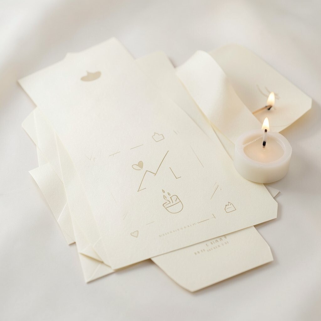
Imagine an invitation in warm cream with tiny foil accents and a few minimalist icons like a candle, match, or gentle sparkle. The vibe is cozy, elegant, and perfect for nighttime celebrations.
This suite benefits guests by keeping information organized and easy to find. Uniqueness comes from the icon choices, which can match your specific event moments like ceremony time, dinner start, or a “meet the host” note. Personalize by using icons that reflect your venue, such as a lantern for a garden entrance or a star for evening vows. Cost can be considered by keeping foil to a small element and using a single accent color for icons.
13. Art Poster Typography For Modern Anniversaries

Picture invitation text that looks like a small event poster, with bold hierarchy and playful spacing. It feels youthful, graphic, and great for modern couples or big milestone celebrations.
This design is uniquely chic because it uses typography as the main artwork. Practical value is strong since the date and location can be placed large and readable, which helps guests remember key details. Personalize by adding a short “theme line” that matches your story, like a favorite lyric or a signature phrase you both use. For cost considerations, choose one background color and print in two inks, then avoid layered printing that adds complexity.
To follow current trends, mix one bold display font with a clean small-cap font for details. Keep margins generous so the card looks like it belongs in a gallery.
For a smooth guest experience, include a separate insert with timing so nobody has to squint.
14. Satin Ribbon Belly Bands With Color Stories
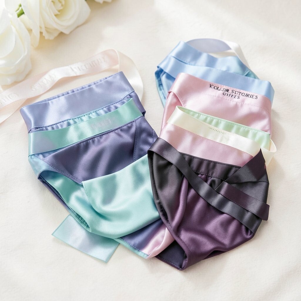
Visualize a slim invitation held in place by a satin belly band in a color that matches the event mood. The band adds motion and makes the suite feel like a gift.
This style works well for weddings, engagement parties, and elegant graduations. The benefit is that it protects the cards and keeps the suite neat in mailing and handling. Uniqueness comes from building a color story across the suite, such as blush and gold for romantic themes or emerald and cream for a bold seasonal palette. Personalize by tinting the ribbon shade to your florals and using matching address label colors.
For cost, you can reuse one ribbon style across the entire guest list while personalizing only names and dates. That keeps production steady and helps you stay within your plan.
15. Floral Corner Watercolor With Clean Layouts
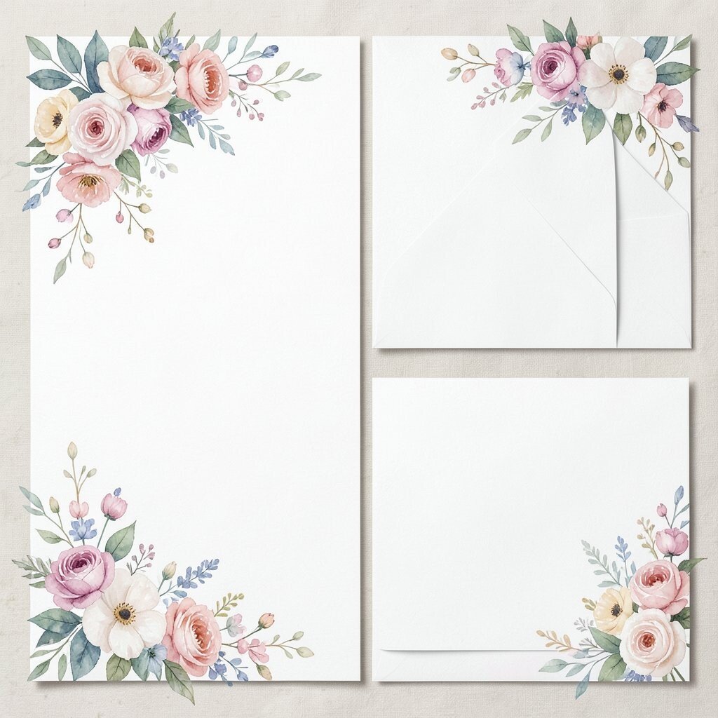
Imagine delicate watercolor blossoms tucked into one corner of a crisp card. The rest stays clean, so the invitation feels airy and not cluttered.
This suite is beneficial because it keeps the text easy to read while still adding a memorable visual touch. It’s uniquely personal when you choose flowers that reflect your season and venue, like peonies for spring or dahlias for fall. Practical tips include using a corner placement on every related card, so RSVP and details feel like part of the same design set. Personalize by matching flower names to a meaningful connection, like blooms from a childhood garden or a hometown florist.
To manage cost, keep the watercolor simple with few colors and print it on standard cardstock that won’t require specialty finishing. The trend right now is soft color accents and lots of breathing room, and this idea fits that perfectly.
You can also include a matching mini sticker on the envelope flap for extra charm.
16. Gold Foil Initials With Clear Acrylic-Style Frames
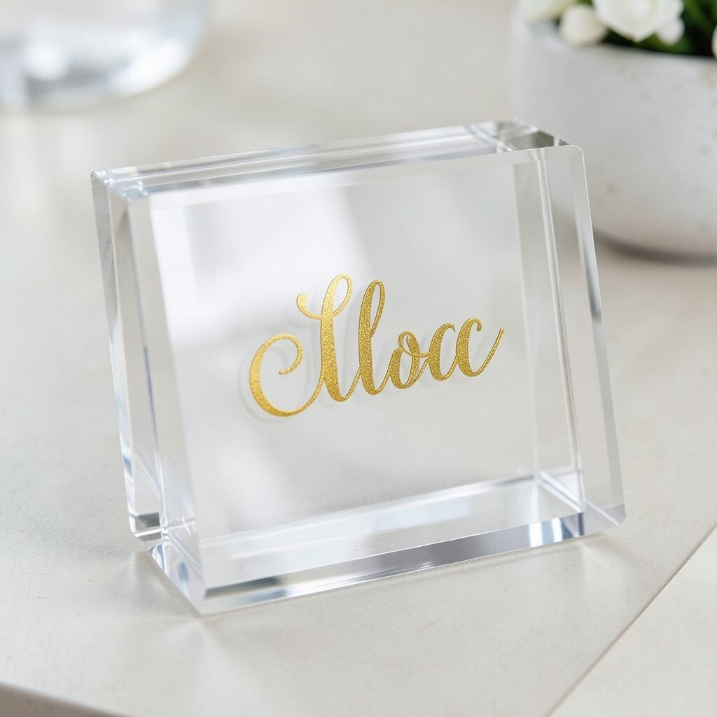
Picture invitations where your initials sit inside a “frame” look, like clear acrylic, with a gold foil outline. The result feels modern, glossy, and instantly elevated.
This suite benefits guests because it creates a clear visual focus while keeping other text structured and readable. Uniqueness comes from the frame effect, which feels like custom signage even when it’s printed. Personalize by using initials, a small monogram crest, or a frame color that matches your event palette. Cost considerations matter here, so choose foil only for the initials and rely on print design for the rest of the frame illusion.
For practical production, keep lines thick enough so the frame doesn’t look fuzzy. If you want a current trend, pair the gold frame with minimal modern fonts and plenty of white space.
17. Linen-Look Paper Invitations With Embossed Hearts

Imagine a linen-textured invitation that looks and feels refined, with tiny embossed hearts catching light in a gentle way. Guests will notice the texture the moment they touch it.
This is a great option for anniversary events, weddings, and vow renewals where you want classic romance. The benefit is that linen-look paper hides small imperfections and gives a naturally elegant feel. For uniqueness, emboss hearts or a heart-shaped date feature, then keep your text layout simple and centered. Personalize by adding a short line that feels like you, such as “always home” or “meet me at sunset,” written in a soft script.
Cost considerations depend on paper choice, but you can keep expenses reasonable by using embossing only on one area like the name line. Current trends often lean into tactile materials rather than heavy visuals, and this idea delivers that trend in a practical way.
18. Interactive Map RSVP Cards With Checkable Stops

Visualize RSVP cards that include a small map-style graphic with check boxes next to key stops like parking, ceremony location, and dinner venue. It’s like a guided plan that guests can follow.
This suite benefits guests by reducing questions and helping everyone arrive smoothly. Uniqueness comes from the interactive layout, even though it’s printed. Personalize by naming the exact landmarks your guests should remember and adding a brief note about what to do first upon arrival. For cost considerations, you can print the map design once and keep personalization to a guest name line and a simple attendance choice.
To make it easy, choose large checkbox spacing and bold labels for each stop. Current trends favor helpful designs, and this one feels both chic and genuinely useful.
19. Minimal Marble Texture With Black Thread-Like Details
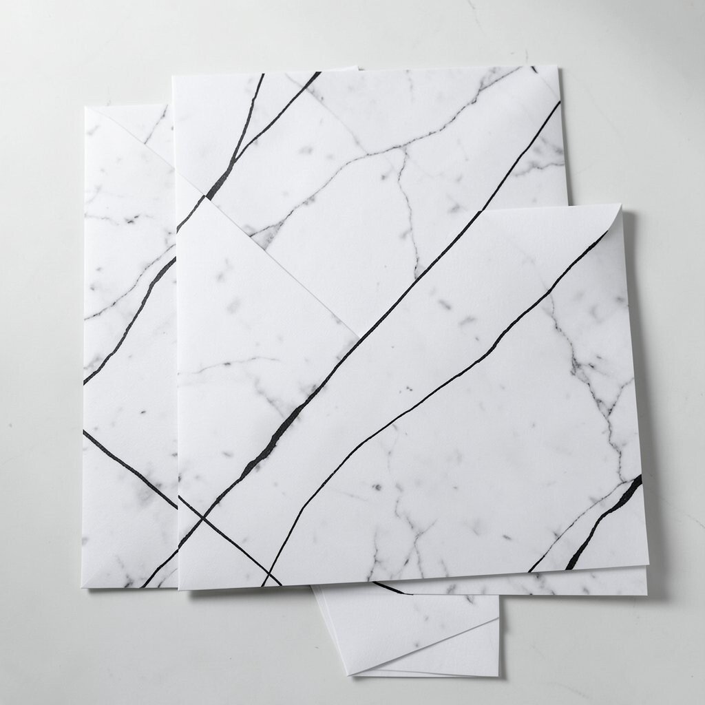
Imagine invitations with a subtle marble texture and sleek black details that look like thread. The look feels modern, clean, and perfect for upscale but understated celebrations.
This style works for formal birthdays, engagement events, and rehearsal dinners where you want elegance without too many frills. The benefit is clarity, because marble backgrounds can be kept light so text stays readable. Personalize by adding a date in a fine serif font and using a small icon like a ring or champagne flute. Cost considerations are usually manageable if you use one background texture and avoid multiple print layers.
For a practical approach, add a separate details card if you have a lot of information, so the main cover stays calm. Current trends lean into soft luxury textures, and marble fits right in.
20. Floral Monogram Stickers For Seamless Suite Matching

Picture a beautifully designed invitation suite where each card and envelope gets sealed with a floral monogram sticker. It ties everything together like a finishing touch.
This idea benefits guests by making the suite feel cohesive and easy to recognize among other mail. Uniqueness happens because the stickers become a signature element you can customize with your initials, a tiny floral pattern, or a date stamp. Personalize by matching the sticker’s flower outline to your invitation border and using the same ink color across all pieces. For cost, stickers are often a good middle ground since they create impact without adding big design complexity.
To keep it practical, make sure the sticker placement doesn’t cover barcodes or essential mailing elements on the envelope. Current trends also like “small detail branding,” and stickers are an easy way to get that look.
21. Chocolate Brown And Blush Layered Wraparound Designs

Imagine a layered wraparound invitation in rich chocolate tones, softened by blush accents like a gentle sunrise. It feels cozy, stylish, and memorable in photos.
This suite is uniquely charming for fall weddings, holiday dinners, and intimate celebrations that want warmth. The benefit is that layered design gives you space for personalization without turning the card into chaos. Practical tips include using one strong focal line for the names and date, then placing details on an inner card so guests can read without flipping too much. Personalize by adding a tiny “from us to you” note in the blush band, and match the inner card color to your menus or napkin shades.
Cost considerations usually come down to paper quality and how many layers you print. You can keep expenses steady by using one wraparound cover and one inner details card, then using a simple RSVP card separately.
22. Champagne Ticket-Style Invitations With Reply Tear-Offs

Picture invitations styled like elegant event tickets, with decorative borders, small typography, and a tear-off RSVP portion. It feels fun, polished, and full of personality.
This suite benefits guests because the reply action is built right into the invitation, which reduces missing cards. It’s unique because ticket styling can fit everything from engagement parties to graduation nights and holiday galas. Personalize by printing your venue name like a venue label, then adding a “time window” note in a clean, easy font. For cost considerations, keep the design to one ink color plus a small accent, and check with your printer about perforation options so the tear-off lines look crisp.
To keep things practical, include clear instructions on what to mail back and where to write names. Current trends favor interactive and playful paper, and this design delivers that feeling while staying chic and easy to read.