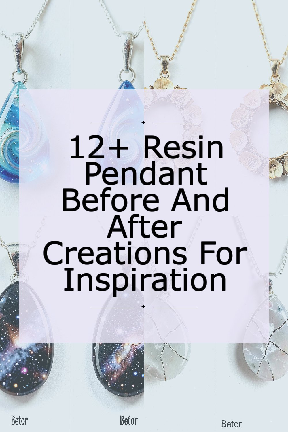
One batch of resin can change your whole look, fast. These before-and-after pendant stories show what small choices can create.
1. Ocean Swirl Teardrop Pendant That Learned to Glow

The first attempt looked cool but a bit cloudy, like it was underwater in the wrong season. You could see tiny streaks and a dull shine that made the teardrop feel flat, even though the color was pretty. After a reset, the pendant caught light in a smooth curve, and the swirl looked like a real ocean current. The surface became glossy and clean, and the edges finally held their shape.
One practical change was using a thinner resin layer for the base so bubbles had less room to hide. Another helpful move was stirring slowly to keep tiny ripples from forming while you pour. You can add glow by mixing in a small amount of mica or pigment designed for resin, then sealing it with a clear top coat for a glassy finish.
2. Dried Flower Frame Pendant With Edges That Stop Fraying

The before version had dried petals that looked charming, but the colors faded into the resin and the frame felt uneven. Some edges looked rough, and a few little bits lifted like they wanted to escape. In the after pendant, the flowers looked brighter, as if they were holding still for a photo. The frame became crisp, and the pendant looked finished instead of halfway done.
Try pressing flowers gently and sealing them with a light transparent layer first, so they don’t float around when you pour. Using a mold that supports the rim helps you keep clean lines, especially if your resin cures with less shrink. For personalization, choose flowers with meaningful colors and place them slightly off-center for a more natural look.
You can control how dramatic the floral effect becomes by keeping the petals flatter and using less pigment around the background. If cost is a factor, start with one small flower selection and make test batches instead of covering an entire mold with rare materials. The trend right now is “botanical nostalgia,” where people pair old-world dried plants with modern glossy resin for a jewelry-style keepsake.
3. Galaxy Marble Pendant That Went From Muddy to Starry
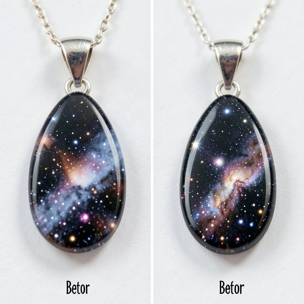
In the first pendant, the colors blended too fast and turned into a muddy gray-purple. The result was pretty in a sleepy way, but it didn’t feel like a sky. The after pendant looked like deep space, with swirling depth and tiny spark points that caught every angle. Instead of one flat color, it had layered movement you could see as you turned it.
To get that starry look, pour in layers and let each layer thicken just a bit before adding more color. A quick spritz of alcohol or a gentle pop with heat can help bubbles rise, but go lightly to avoid disturbing pigment. For personalization, try mixing ultramarine with a tiny dash of black and add metallic flakes only near the edges so the center stays deep.
Cost-wise, you don’t need expensive materials for a striking effect. A small bag of iridescent glitter and a reliable clear resin can go a long way when you use restraint. Current trends favor layered galaxies with a “marble” swirl, where the pendant feels like it has motion even when it rests on your necklace.
4. Minimal Geode Pendant With a Clean Crack Line

The before creation had a geode vibe, but the “cracks” looked messy, like the lines were drawn by shaky hands. You could still see the rock colors, yet the pendant felt busy and not very wearable. The after version became calmer and sharper, with fracture lines that looked intentional and balanced. The crystal-like shimmer stayed where it belonged, making the whole piece feel neat and modern.
A practical trick is to sketch your crack map lightly on the mold before you pour, then follow it with thin resin and mica mixed to a paste-like consistency. Keep metallic accents small so the pendant reads as elegant rather than overwhelming. If you want it more personal, pick stone colors that match your wardrobe, like deep green for earthy outfits or soft blush for everyday charm.
5. Vintage Photo Memory Pendant That Stopped Looking Washed Out

The before pendant used a photo, but the resin made everything look too bright and washed, like the memory lost its color. The paper edges also showed through, and the image didn’t feel crisp. After redoing it, the pendant looked like a tiny window, with warm tones and clear details that felt close to the original moment. Even the borders looked smooth, and the pendant felt sturdy instead of delicate.
To avoid washed-out results, use photo printouts made for glossy surfaces and apply a thin seal coat first. Make sure the print is dry and free of smudges, since resin can lock in tiny flaws. When you add resin, pour slowly and keep bubbles away from the photo area for that clean, “still image” look.
If you’re thinking about cost, you can print a single small copy and practice with a test piece before committing to a real photo. For personalization, try adding a word or date on a small backing card placed under the photo, then cover it with an extra-clear top coat. A current trend is “memory layers,” where people combine tiny printed moments with subtle color gradients for a modern locket feel.
6. Gold Leaf Bloom Pendant That Finally Looked Like Jewelry
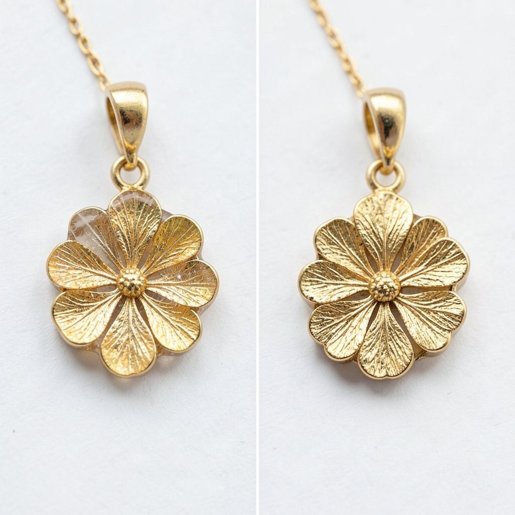
In the first bloom pendant, the gold leaf scattered in weird directions and covered too much of the flower. It looked more like craft confetti than wearable art. In the after version, the leaf settled into elegant veins, and the flower silhouette felt clearer. The shine looked purposeful, and the pendant felt like something you would keep on a special chain.
A simple practical method is to apply gold leaf on a slightly tacky resin surface so it sticks in controlled areas. Use a soft tool to nudge leaf into petal shapes, and leave some negative space so the flower still breathes. For personalization, pick a bloom style that matches your personality, like tiny daisies for gentle vibes or bold petals for statement energy.
Cost matters here because gold leaf can be pricey, so buy a small pack and save the leftovers for tiny accents. If you want the look without full gold leaf, try metallic ink as a budget-friendly stand-in for leaf effects. The current style trend blends nature and luxury, where handmade resin pieces borrow elegance from fine jewelry finishing.
7. Cherry Charm Pendant With a Fresh Red That Didn’t Bleed

The before pendant had a cherry-red charm, but the color spread unevenly and left faint streaks in the resin. The charm still looked sweet, but the shine felt patchy and the red looked tired. In the after version, the red stayed vivid and smooth, like candy under glass. The pendant also held a neat dome shape, so it looked more polished on the chain.
Choose pigments labeled as resin-safe, because some colorants can bleed or react and ruin your look. Stir thoroughly and mix small batches so the shade stays consistent across the whole pendant. If you want extra personalization, add a tiny seed-like dot texture by pressing a pin gently into the last thin top layer before curing.
You’ll save money by making test color swatches on scrap resin first, especially if your brand of pigment varies. Cherry and fruit pendants are popular right now because they feel playful and easy to style with both casual and dressy outfits. For a cost-smart upgrade, pair your red charm with a simple chain in a matching metal tone.
8. Crystal Clear Pendant With Fewer Bubbles and Better Depth

The first clear pendant looked stunning for a minute, then bubbles started showing like tiny trapped secrets. The surface also had faint ripples that made it less mirror-like. After the change, the pendant became truly transparent, with a deep shine and a smooth feel. You could see light traveling through it, and it looked expensive even when it was simple.
A practical route is to pour in thin layers and wait until the previous layer thickens so bubbles have a better chance to escape. Keep the workspace calm and still, since moving air can stir resin and hide bubbles for later. For personalization, place small embedded items like a single film of shimmer, a tiny bead cluster, or a thin strip of foil for a clean “museum glass” look.
9. Autumn Leaf Pendant That Went From Flat to Layered

The before leaf pendant had one layer, so the leaf looked like it was sitting on top instead of inside something special. The veins were visible, but the piece lacked depth. The after pendant had a layered effect, with darker veins and a warm glow around the edges. When you tilt it, the leaf almost shifts, like it’s catching autumn light.
To build depth, you can embed the leaf in the middle layer and then pour clear resin around it in two stages. That way, the leaf doesn’t get trapped under a thick slab that dulls texture. For personalization, choose leaves that match your favorite season colors, and consider adding a gradient background using alcohol inks made for resin.
On cost, you can use real leaves from safe-for-resin sources, but remember that some will darken as they cure, which can be a beautiful effect too. If you want consistent color, use dried leaves that are already lightly sealed or use leaf-like pressed shapes made for crafts. Current trends favor warm, cozy autumn pendants with layered “depth windows” that look great in daylight and at night.
10. Name Pendant With Cleaner Letter Edges and Better Shine

The before name pendant had letters that looked charming, but the edges were slightly fuzzy and not as crisp as you wanted. Some parts felt too thick and the shine didn’t catch evenly across the surface. After reworking it, the lettering looked sharp and tidy, like it belonged on a store-bought charm. The pendant also cured smoother, with light bouncing across the whole piece.
A practical approach is to use a mold or stencil designed for resin letters, and to pour a thin clear layer first so letters don’t sink. If you’re adding letters by hand, let the initial layer set to a gel stage before you pour the thicker top coat. For personalization, choose font styles that match your vibe, like simple block letters for modern looks or curvy scripts for romantic energy.
To keep costs down, reuse the same mold for multiple names by swapping color backgrounds rather than buying new molds. You can also buy a small set of pigment colors and create a signature palette that matches your jewelry collection. Letter pendants remain popular because they feel personal, giftable, and easy to wear every day.
11. Epoxy-Look Seashell Pendant That Finally Matched the Beach Dream

The first seashell pendant looked pretty on the bench, but once cured it felt a bit dull and the shell details softened. You could still tell it was a shell, yet it didn’t pop the way you imagined. In the after version, the shell looked crisp and brighter, with a smooth, glossy dome that highlighted its texture. The pendant gave off real beach vibes, and it looked like it belonged in a summer memory.
Shells need careful handling, so clean them gently and let them fully dry before embedding in resin. A helpful step is sealing the shell with a thin coat so resin fills tiny gaps and protects details. For personalization, choose a shell shape that matches your style, then add a faint tint to the background like pale aqua or warm sand beige.
Cost considerations are simple here because you can use small shells you already collected, but you’ll spend more if you chase rare shapes. To make it more budget-friendly, focus on one standout shell and surround it with clear resin for a “negative space” look. Current trends lean toward coastal minimalism, where a single natural element is framed by clean, glossy resin.
12. Rose Quartz Style Pendant With a Better Color Plan

The before pendant looked like a rose quartz guess, but the color plan was inconsistent and created muddy patches. The piece still had charm, yet it didn’t read as intentional stone. The after pendant looked more like real quartz, with blended pink streaks and gentle swirls. It felt soft and fancy, like a wearable decor piece you could carry with you.
To improve your stone effect, mix pigments slowly and apply them in controlled streaks, then swirl using a gentle tool without overmixing. Layering also helps, because it lets you build color depth without making the resin too thick. For personalization, try adding tiny pearlescent shimmer in small amounts so the pendant catches light like polished stone.
Budget-wise, resin-safe mica and a few pigment shades can create a range of stone looks without buying a whole new kit. You can also cut cost by making one larger pendant rather than several smaller ones, since time and materials scale quickly. The current trend is “stone aesthetics,” where handmade pendants mimic the calm, grounding vibe of gemstone jewelry.
13. Mixed Confetti Pendant That Learned to Behave in the Mold

The before confetti pendant was fun, but the bits drifted and clumped, so it looked chaotic in a way that felt hard to wear. Some pieces sat too close to the surface, while others disappeared under cloudy resin. The after pendant turned that messy idea into a balanced scatter, with confetti pieces placed where they look best. The shine stayed even, and the pendant looked lively without feeling messy.
A practical trick is to place confetti intentionally with a toothpick or tweezers after pouring a thin base layer, then top it with clear resin slowly. Let the base layer thicken slightly so the confetti doesn’t float away while you work. For personalization, match confetti colors to a theme, like holiday reds and greens, school pride shades, or pastel tones for everyday sweetness.
Cost can be manageable because you can reuse leftover craft confetti or mix small amounts of glitter from older projects. Just keep an eye on how fine the particles are, since some glitter types can affect clarity. Mixed confetti pendants are trending as playful statement jewelry, especially when they include clean domes and neat layering that make the sparkle look intentional.